The field service mobile app can be viewed with a completely new enhanced fresh look, This new mobile user experience (UX) feature allows technicians to use all the information they need at their fingertips and hence boost productivity.
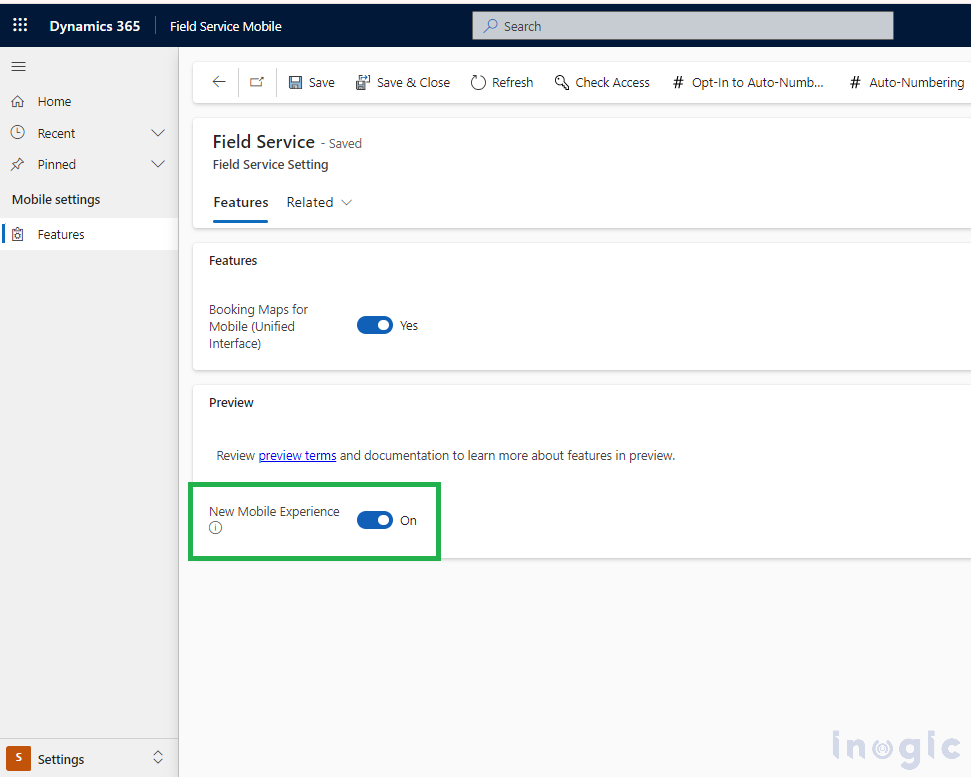
Field service admin can quickly enable the new mobile experience feature from a web browser, This new UX feature setting is app-specific, hence admin needs to open the appropriate app (E.g. Field Service Mobile in our scenario). Change the area to Settings > and then look for the “Field Service Setting” page where they need to turn on the PREVIEW feature named “New Mobile Experience” as shown below:
PREVIEW feature limitations:
Before enabling this PREVIEW feature, note that offline mode is not supported through this feature; hence, while exploring, make sure that the app for which you want to enable this new UX is not selected for the Mobile offline profile.
Customization and configuration capabilities are also not available yet. Here are a few known limitations of this feature. You can refer to this doc for more details.
Also, if you would like to add this feature in the custom app, then you need to additionally add this “Field Service Setting” page in the sitemap and then use this page to turn on the setting explicitly, as this setting is not available directly for the custom app.
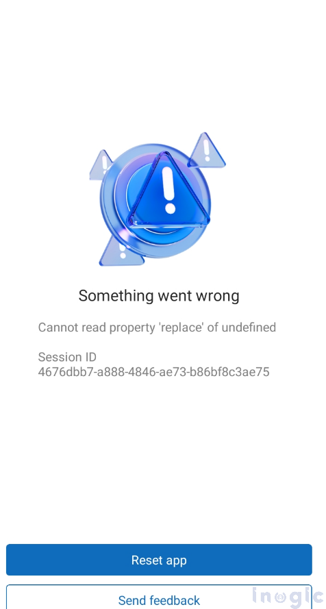
Though everything worked fine with respect to the new mobile UX experience in the custom app, I observed that when the “Field Service Setting” page was accessed from the mobile through the sitemap below, an error appeared:
This feature offers multiple advantages, a few are mentioned below:
- The Booking Agenda View page is the new interface enabled, which shows booking records in the past up to 90 days and in the future up to 90 days.
- Visibility improvements like quick visibility for status with colors. Without opening the booking record, the technician can view the booking data at a glance.
- Out-of-the-box, a few columns like booking status, start time, and duration will always be displayed in the Bookable Resource Booking table in card format within the agenda view. Which can then be further customized to show more columns as needed.
- The status of the booking record can be changed on the fly without opening the record.
New mobile UX experience:
After enabling this feature, when technicians access the mobile app, they will see the new mobile UX, and they can start taking advantage of this feature.
When technicians login to the “Field Service Mobile” app, under the Home page (which is the first page that can be seen from the bottom navigation of the app), you will observe all the booking records for the logged-in user.
Note that we can see booking records with today’s scheduling date highlighted in blue (as marked in #1) and all the past and future bookings displayed in grey (as marked in #2). As shown in the below screenshot, the status is shown distinctly in blue at the bottom of each booking record detail to prominently highlight the status of each booking for the technician.
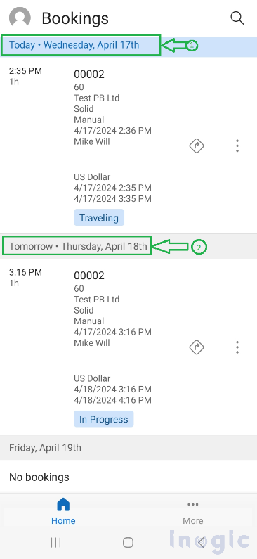
Technicians can scroll around the booking records page up and down and view the past and future booking records as per their needs. They can view past booking records for up to 90 days and future records for up to 90 days. E.g., if let’s say today’s date is 22-Apr-24, then the past booking records until 23-Jan-24 can be viewed, and future booking records until 21-Jul-24 can be viewed.
Bookings Agenda View:
Bookings Agenda view is the specially designed view when you access the new mobile UX. It shows Bookable Resource Booking table data in a card format within the agenda, as shown below:
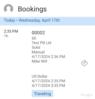
Note: Booking Status, Start Time, and Duration will always be displayed. You can edit this view anytime and add or remove columns as per your business needs. For customizing the view Go to Power Apps and navigate to Tables > Bookable Resource Booking > Views and then customize the Bookings – Agenda View as per the need.
Microsoft recommends keeping the number of columns below 10 to maintain readability and performance. Particularly for booking entity, you can’t set any other view as default other than “Bookings—Agenda View”. Refer to this doc for more details.
Automatically changing the Booking Status to traveling:
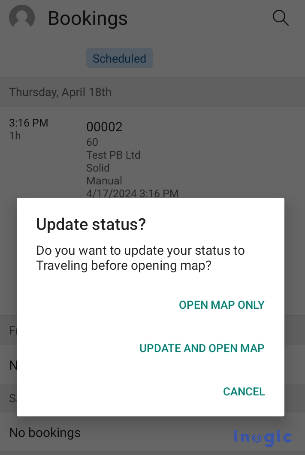
When you click on the direction icon beside the Booking record data highlighted below, it gives you a confirmation pop-up message as shown below:
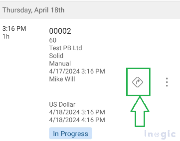
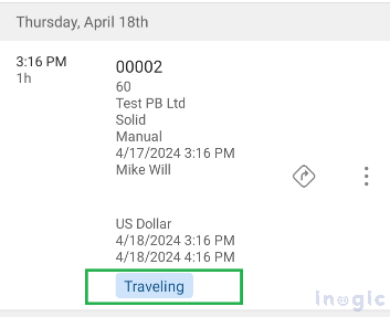
When you click on “Update and Open Map,” it will update the status of the booking record from “In Progress” to “Travelling” and will navigate you to the default mobile map app. If you click on “Open Map Only,” it will navigate you to the map without updating the status. Check out the details in this doc.
New Mobile UX List Views:
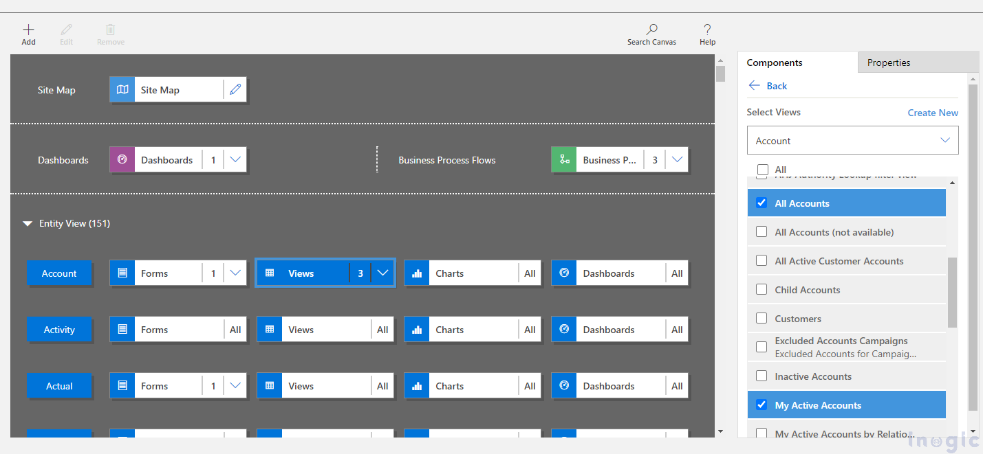
Other than the booking table, all other entities use the default view to display the records on mobile as a list view. Make sure that the default view will be shown only if that is enabled/selected for the “Field Service Mobile” app through the Power Apps portal.
In my scenario, though “All Accounts,” “Active Accounts,” and “My Active Accounts” were selected, “My Active Accounts,” being the default view, always gets preference while displaying among all.
If there is no default view selected for that app and, say, “All Accounts” and “My Active Accounts” views are selected, then while displaying preference taken over the other view, it depends upon the “Created On” date. The view that was created before takes preference over the others.
In the “Field Service Mobile” app, click on the “More” icon from the bottom navigation to see the other entities in the new mobile UX experience list view, as shown below:
List view with 5 columns (new mobile UX experience):
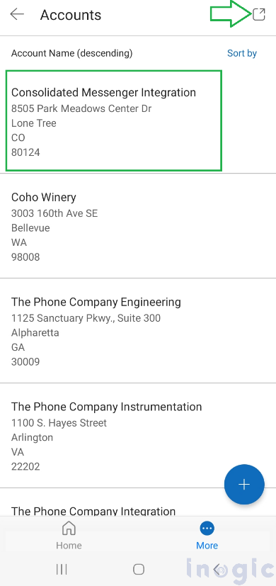
List views on mobile now support up to 5 columns while displaying, which was limited to 3 columns previously.
List view with 3 columns (classic UX experience):
An icon in the right-most corner (as shown with the arrowhead above) allows users to switch between the classic and modern UX. After clicking that icon, you will be navigated to the classic list view, as shown below:
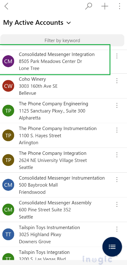
Few Observations:
- You can change the view from legacy (classic) UX, but as of now, there is no view selector available in the new UX interface. It always displays the default view, provided it is added to the app through Power Apps.
- The new list view experience is much more uniform, as icons that were shown in the legacy list view are removed, providing more white space and increasing readability.
Conclusion:
The new mobile UX offers technicians the capability to manage records quickly and easily without actually opening them. Technicians save valuable time by quickly updating the status of a booking on the fly. Makers can customize and choose up to five columns per table to display in the new mobile list view.
