This blog will guide you on how to enable copilot in Power BI Desktop. This will help you create DAX (Data Analysis Expressions) suggestions just by saying what you want in natural language. Power BI is nothing but the visualization of data to gain insights for business. Previously, you needed to create a dashboard manually by writing DAX Queries, but with the help of Copilot, you can describe what you want.
NOTES:
- This feature needs Power BI Desktop installed on your Windows.
- This feature is in private preview.
How to activate Copilot in Power BI Desktop?
To enable Copilot, you need to enable Quick Measure suggestions and Q&A for live connected Analysis Services Databases in Power BI Desktop or Power BI Service Admin Page. To enable both, the user must be a System Admin and follow the steps below:
- Log into your Power BI account first.
- Once you Log in to Power BI Desktop, Click on the File option > Select Options and Settings > Click on Options > then under Global Section, click on Preview Features > Turn on Quick Measure suggestions and Q&A for live connected Analysis Services Databases.
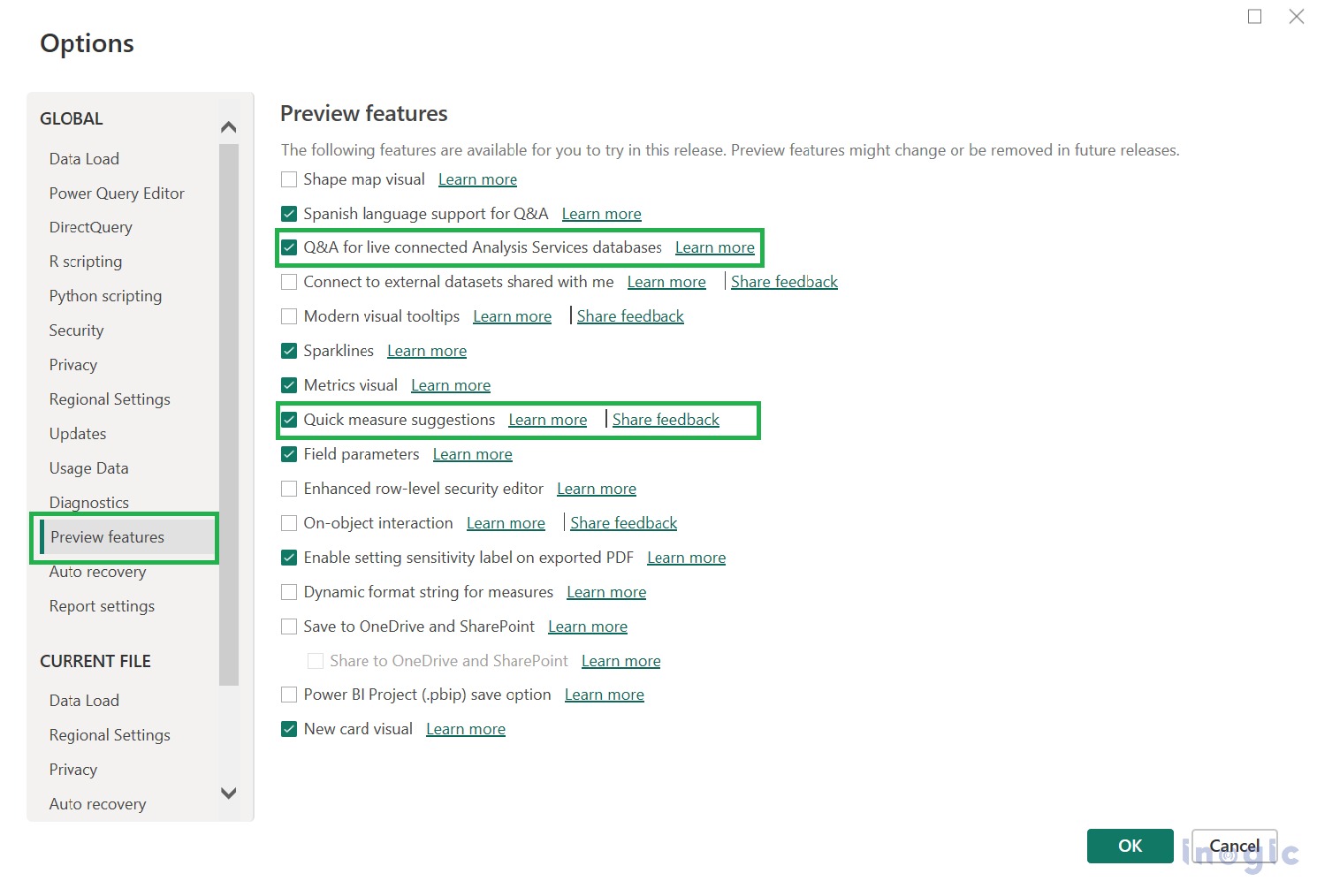
Let’s understand by considering the example:
Create a Dashboard to track and analyze sales across the country for Global Store.
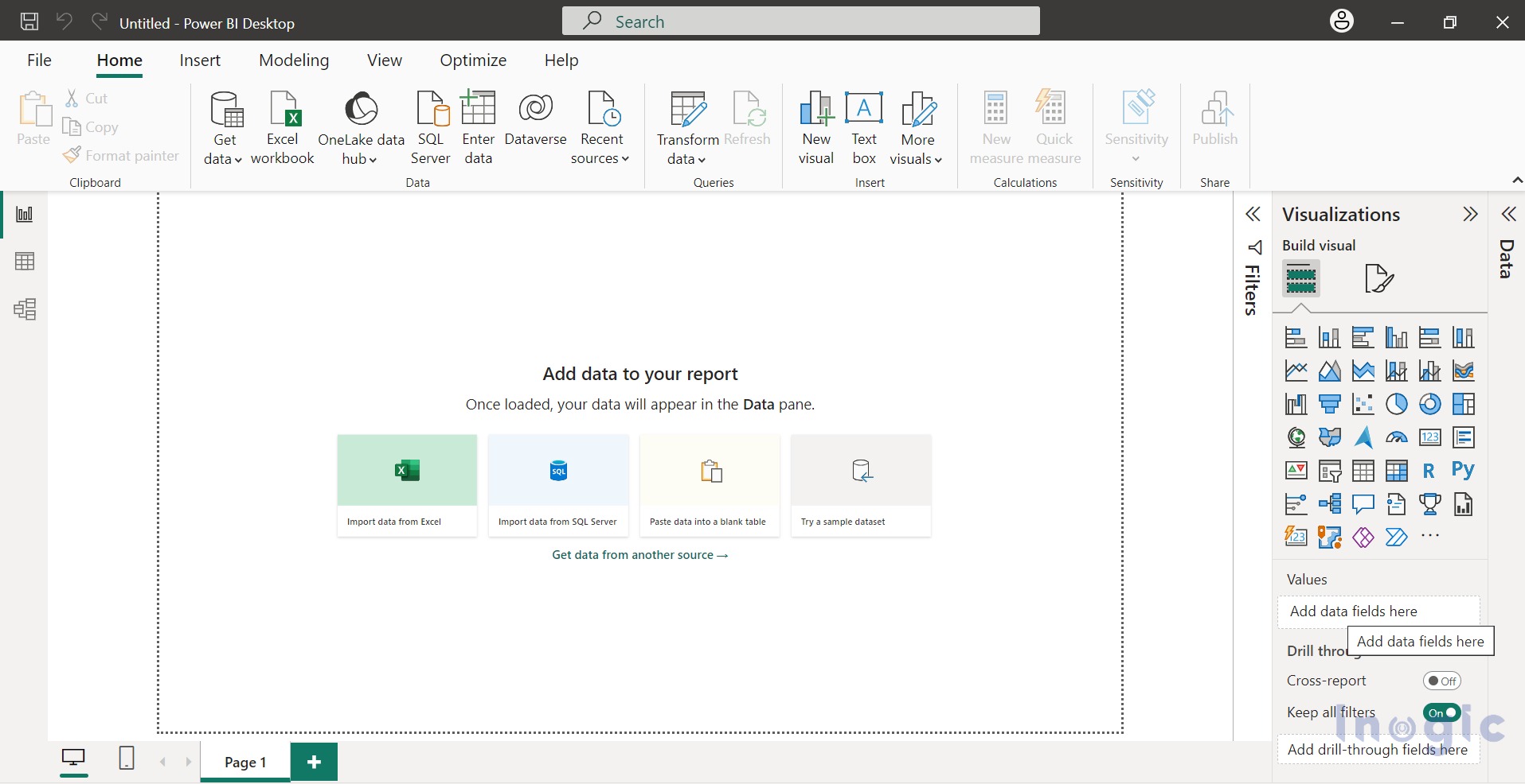
1. After logging in, you will see the Power BI Desktop Interface, as shown in the screenshot below:
2. Referring to the above image, you can see the Quick Measure Suggestions button is disabled. To enable it, you need to load the data. There are multiple sources to load the data choose the one that suits your needs.
Note: If you are importing data for 1st time then Transform data. Data should be consistent.
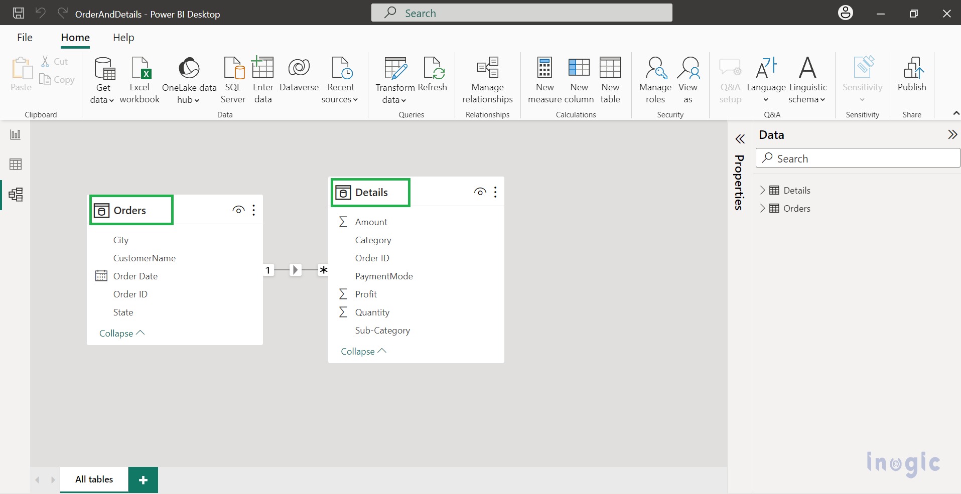
Here we have imported data through CSV files, i.e., Details.csv and Orders.csv.
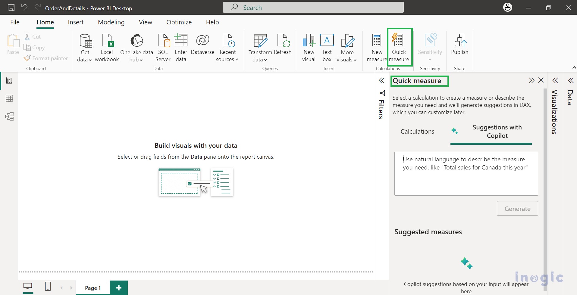
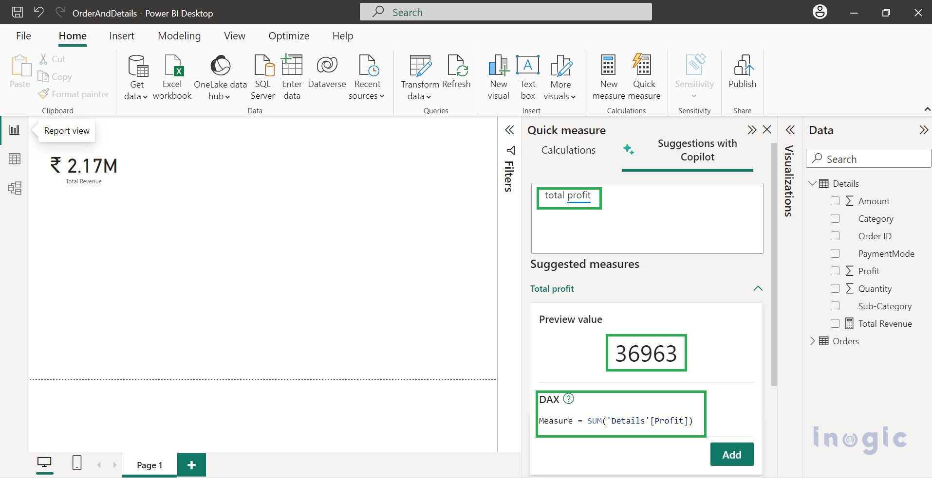
3. Now, from the Calculations section > click on Quick Measure suggestions. This will open a dialog window for Quick Measure Suggestions on the right side.
Let’s understand by considering some common DAX Measures Scenarios:
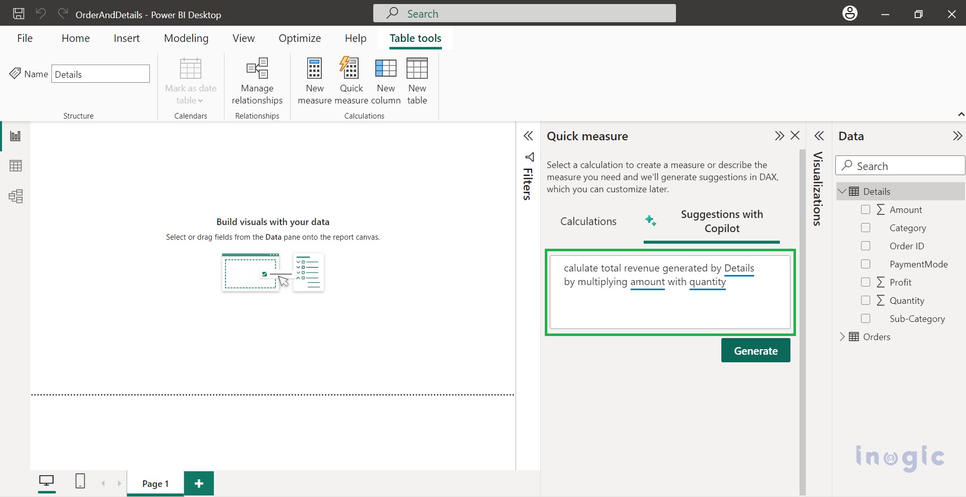
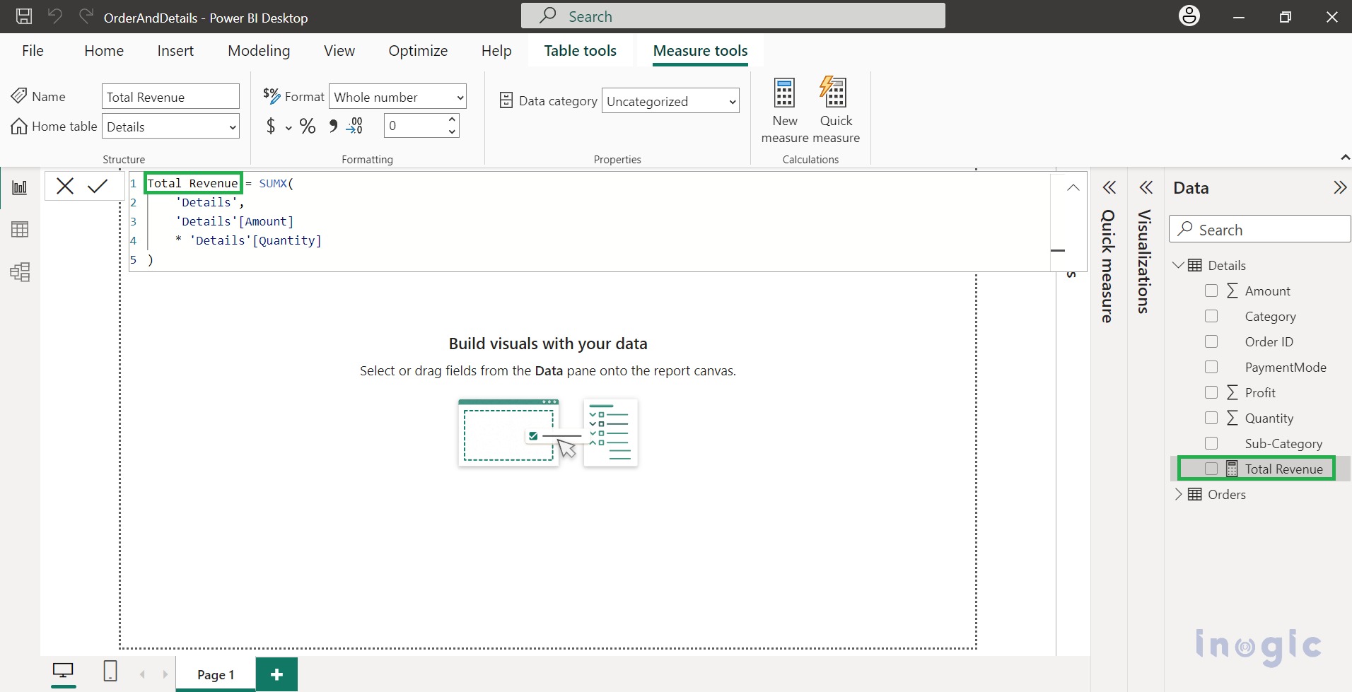
1. Mathematical Operations: Here, we calculated the total revenue from Details (table) by multiplying Amount(column) with Quantity(column).
After the description, click on Generate to get DAX suggestions.
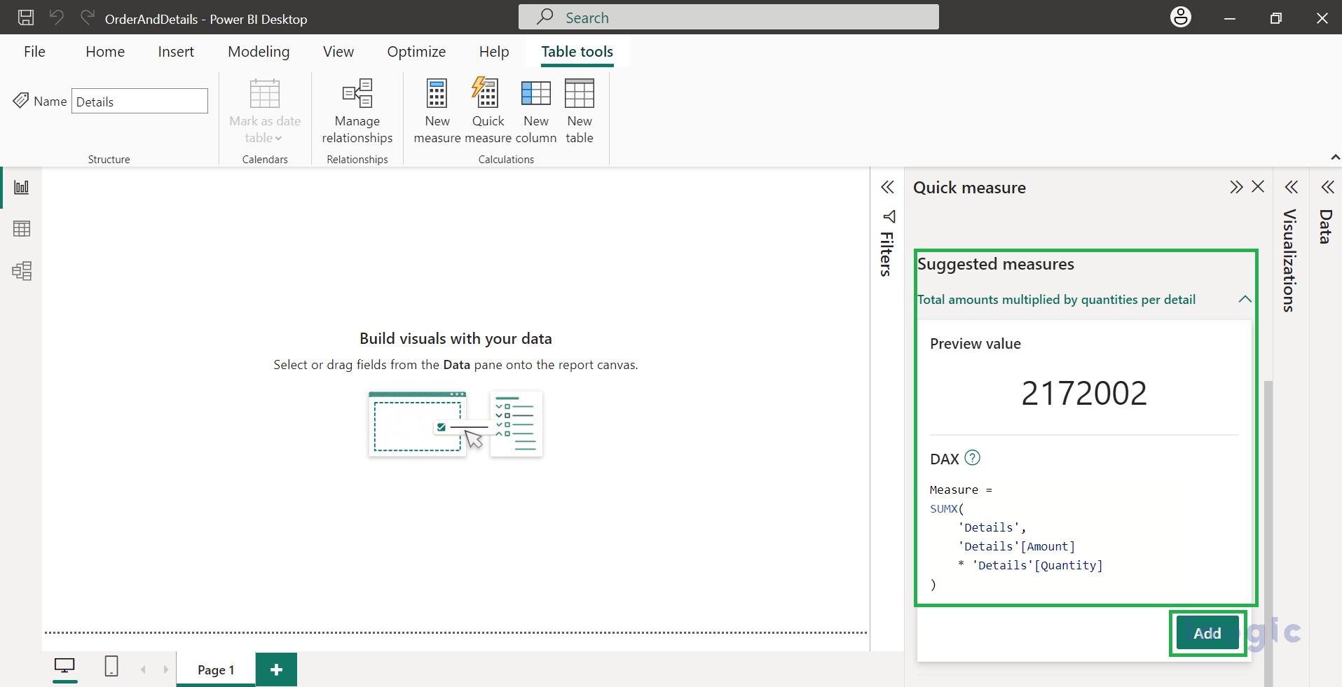
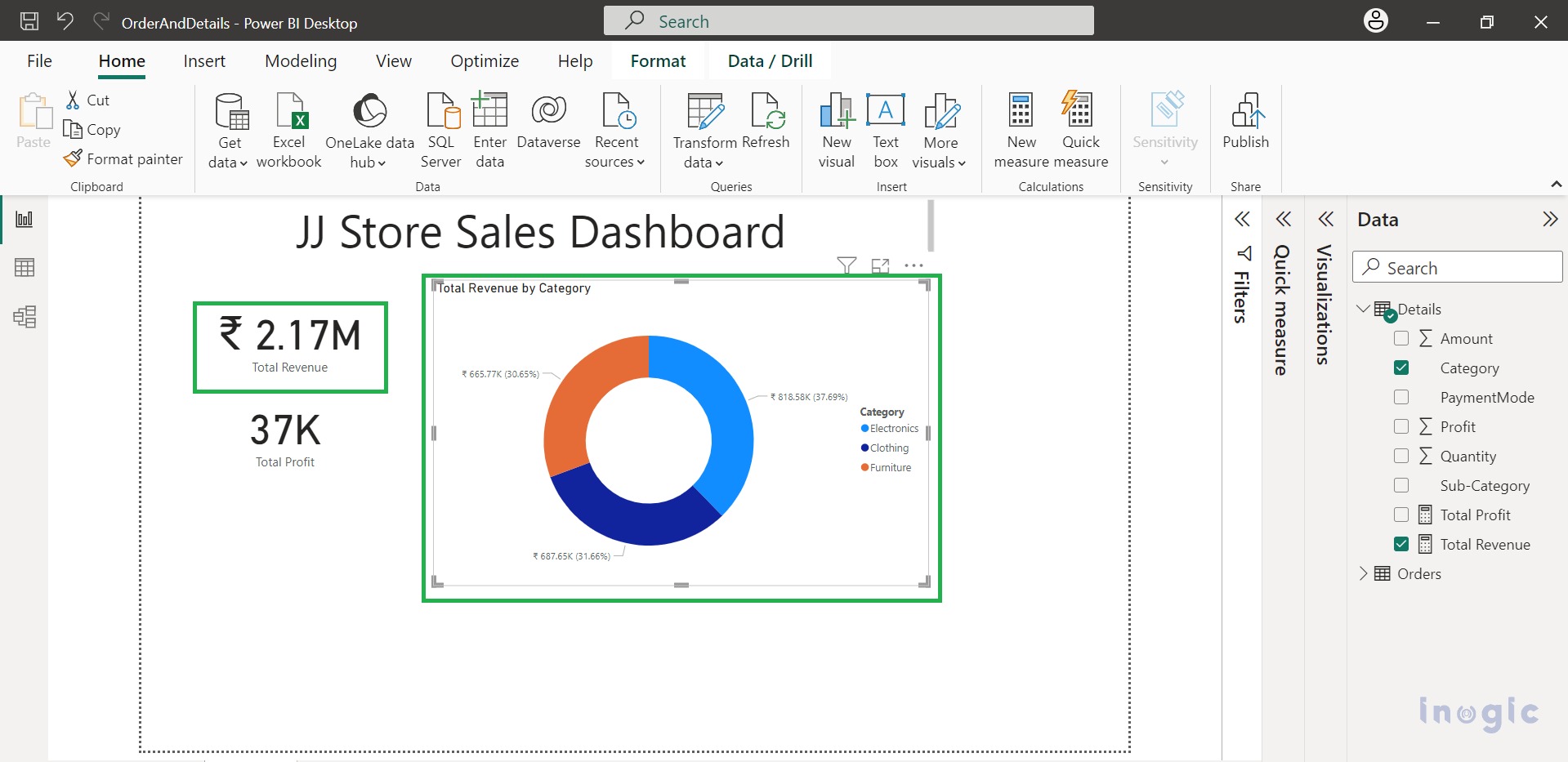
However, to make it more visual, choose the donut chart and visualize the Total Revenue generated by each category.
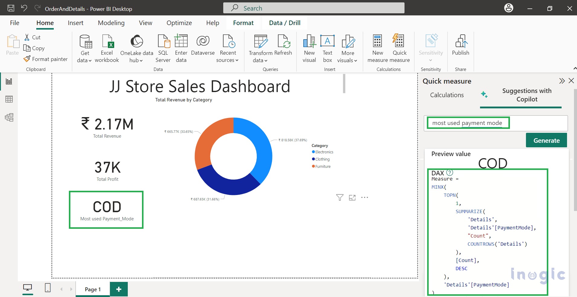
2. Most/ least common value: Here we want to know the most preferred payment mode chosen by the customer.
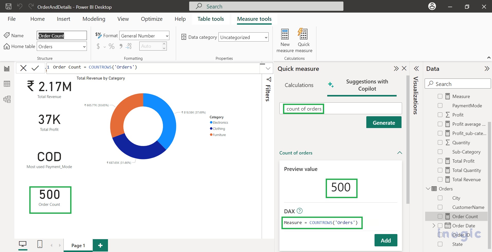
3. Count of rows: To find how many orders have been placed.
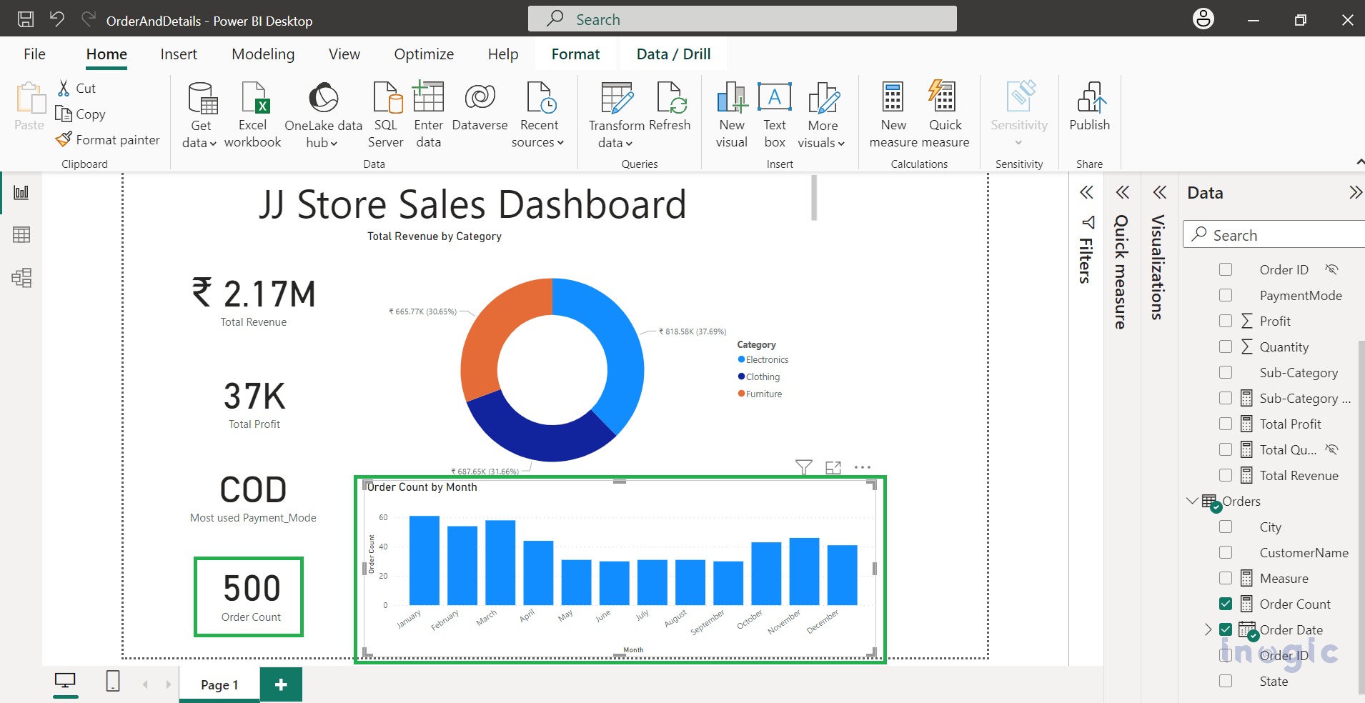
Here, we visualize the Count of Orders placed by month using a stacked column chart.
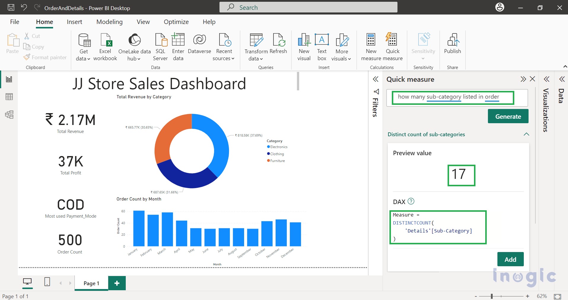
4. Distinct Values: Furthermore, we can find distinct values for selected columns. As per the need for analysis, you can describe exactly what you need, and Copilot will generate DAX for you. DAX generated by Copilot can be customized later.
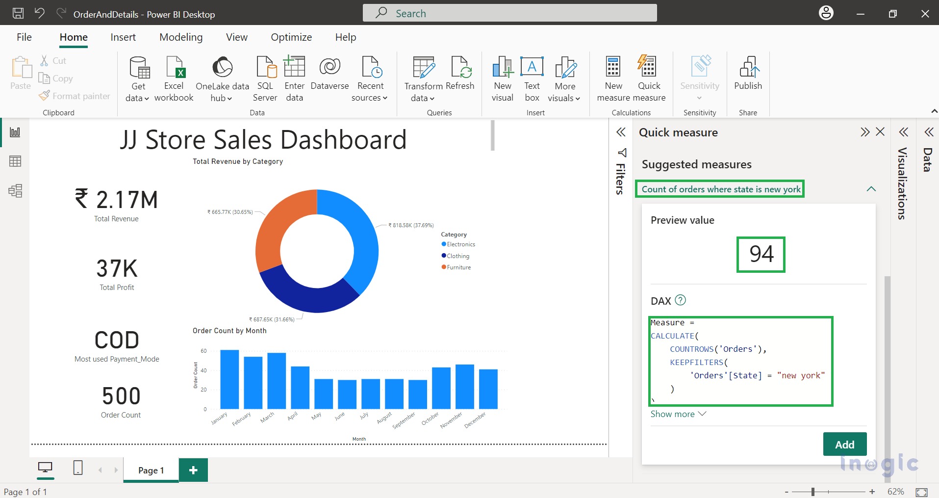
5. Filtered Values: Based on the condition, data gets filtered. Suppose the owner wants to find orders placed in New York.
Conclusion
Copilot helps you build faster and easier dashboard reports and insights. With Copilot measure suggestions, you can create interactive dashboards and analysis reports.
