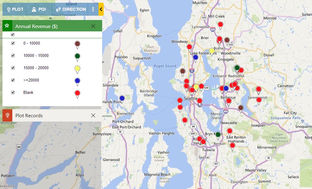
With Maplytics May Release, we have incorporated many new features that were demanded by our beloved customers and partners. One of such great features is “Defining colors for category attributes”.
In previous versions, whenever users plotted records with Category option on the map, records were populated with the color defined automatically. Users were not able to set a fixed color for a particular category. As a result, each time they plotted the records, the pushpin’s color was changed and they faced issue to find out exactly which color represents which category.
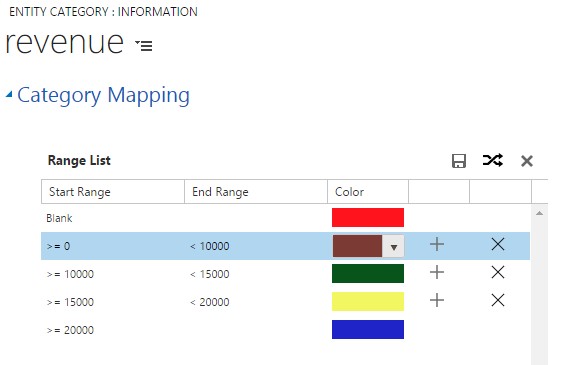
With the new release of Maplytics, the users have the ability to set a fixed color for different attributes of a particular category. For example, if you wish to show all the accounts with annual revenue $0 to < $10000 in Brown color, $10000 to <$15000 in Green color, $15000 to $20000 in yellow color, while the ones having annual revenue >$20000 in Blue color, it’s possible with the new Maplytics version.
Steps to Set Category Colors for Attributes:
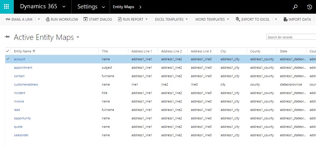
1. Go to Settings >> Maplytics >> Entity Maps and select the desired entity record for which you wish to define the color.
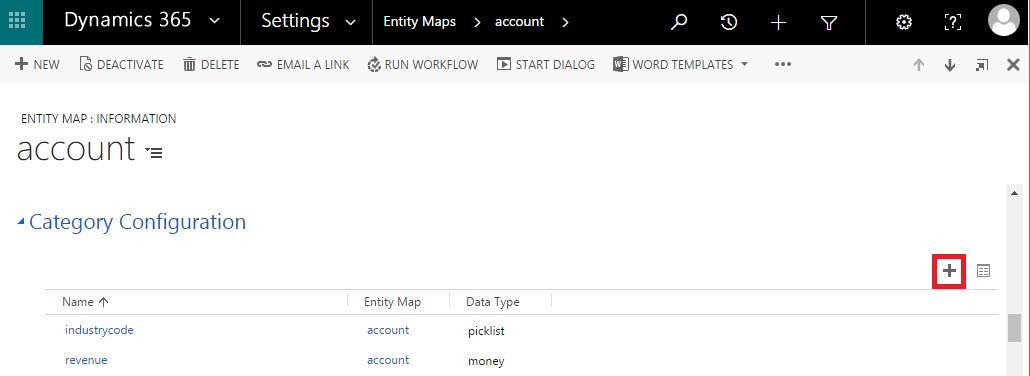
2. Go to the Category Configuration sub-grid at the bottom of the form as shown below:
3. Click on the plus (+) icon to create a new Entity Category record and enter the logical name of the attribute for which you wish to define the colors like revenue for account entity.
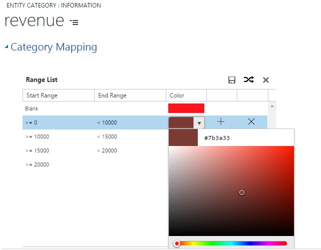
- Once you enter the Category and save the record, you can see the list of the options with auto-populated colors in the Category Mapping tab as shown below (Please refer the Note below):
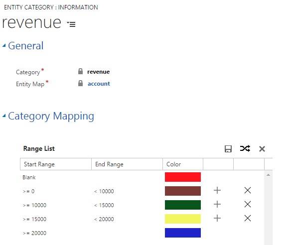
6. For attributes of Money data type, by default we show two options i.e. 0-99999 and >=99999 but users can add more options or intervals by clicking on the plus (+) icon beside the pushpin. They can also remove an option by clicking on the cross (X) icon beside the plus icon.
For example, you wish to have an interval of 0-10000, 10000-15000, 15000-20000, >20000 etc. then you can follow the below steps.
- Edit the End Range of the first row and set the value as 10000 then click on the plus icon to add a new row.
- You can see the new row is auto populated with the Start Range and End Range as 10000-15000.
- You can follow the above step to add as many intervals, as you require and set the color of the as per your choice.
- Once all the intervals are specified, click on the Save icon on the header of the grid.
- If you wish to auto set the colors of all the options then you can click on the AutoSet icon.
- In case you are unsatisfied with the edited colors then you can reset the colors by clicking on the
7. Currently, users can select among 33 colors to be set as the pushpin color and a color once set cannot be used again for another option. For example, Red color cannot be used for Hot and Cold rating of leads at the same time.
8. After defining the colors of the pushpin, we need to check the effect. Open the Detail Map from the account entity and choose the annual revenue as the category.
9. We can see that the records are colored according to the defined colors, while the ones which do not have the annual revenue are colored in Red and those records are categorized as Blank.
Note:
1. This feature currently supports only OptionSet (Picklist), Money and Boolean(Two Options) type of attributes.
2. The below table lists the type of attribute and their default options
