Imagine having a way to instantly turn raw data into clear, insightful visuals without the hassle of manually gathering and updating information. As a Data Analyst, you know how challenging and time-consuming it can be to pull data from multiple CRM records, create reports, and keep charts updated whenever data changes.
But now, Microsoft Dynamics 365 has completely transformed this process with the new “Visualize” feature. With just a click, Copilot automatically generates a dynamic chart based on the selected columns and views of your entities or tables. No more manual adjustments—these charts update instantly to reflect your data, providing you with a clear and organized view.
What’s even better is the AI-generated explanation that comes with each chart. It helps you understand why a specific chart type was chosen and gives you insights into changes and performance, making your data analysis more meaningful.
You can easily customize your visuals too—switch between Pie Charts, Column Charts, Donut Charts, and more. You can even select specific columns or record statuses for a more focused view. This seamless integration with Microsoft 365 CRM simplifies the way you analyze and present customer data, saving you time and delivering accurate, actionable insights.
Say goodbye to tedious data analysis and hello to smarter, faster reporting with the Visualize feature in Dynamics 365!
Let’s see how to set the configuration
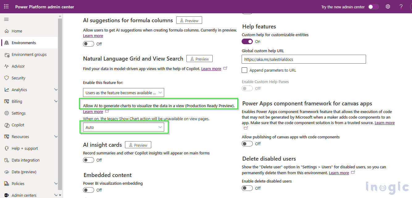
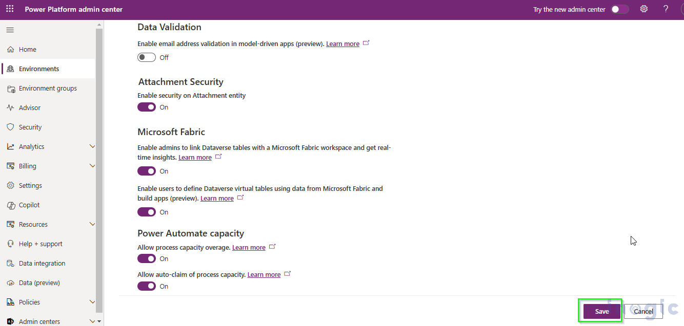
By default, the “Allow AI to generate charts to visualize the data in a view” feature is set on “Auto Mode”, so you can see the Visualize button on the entity grid in CRM.
To enable the setting, turn on the “Allow AI to generate charts to visualize the data in a view” setting.
Follow the below steps to enable “Allow AI to generate charts to visualize the data in a view” setting:
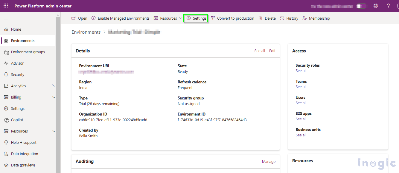
- Go to Power Platform Admin Center
- Click on the Settings Button.
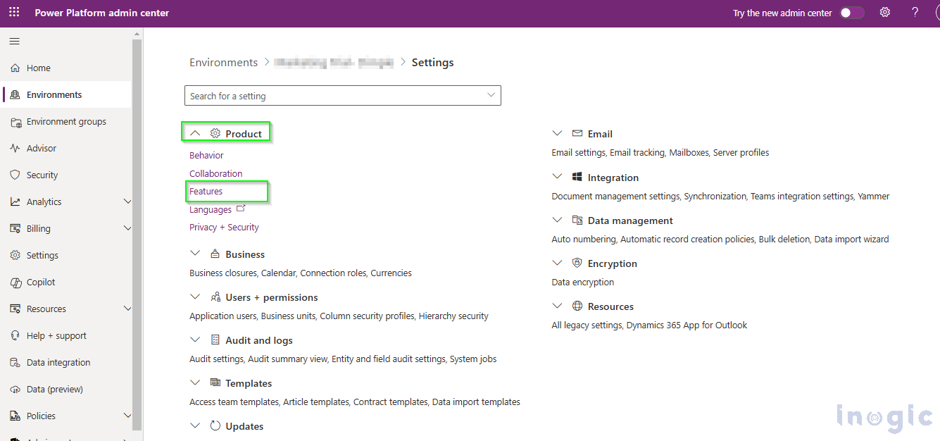
- Expand the Product dropdown as shown in the below image.
- Select the Features option.
- Navigate to Allow AI to generate charts to visualize the data in a view feature.
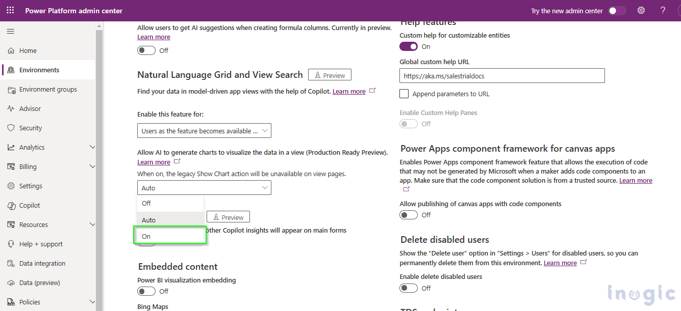
- Select the option as Auto or on to enable the setting.
- Click on the Save button.
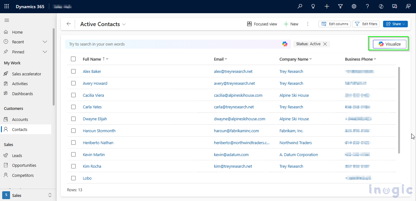
Now you will be able to see the Visualize Button on the Entity record grid, as shown in the below image:
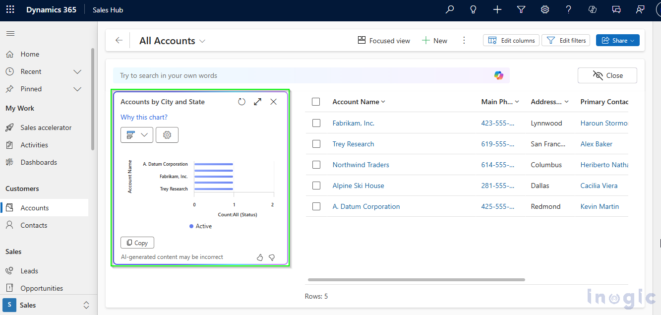
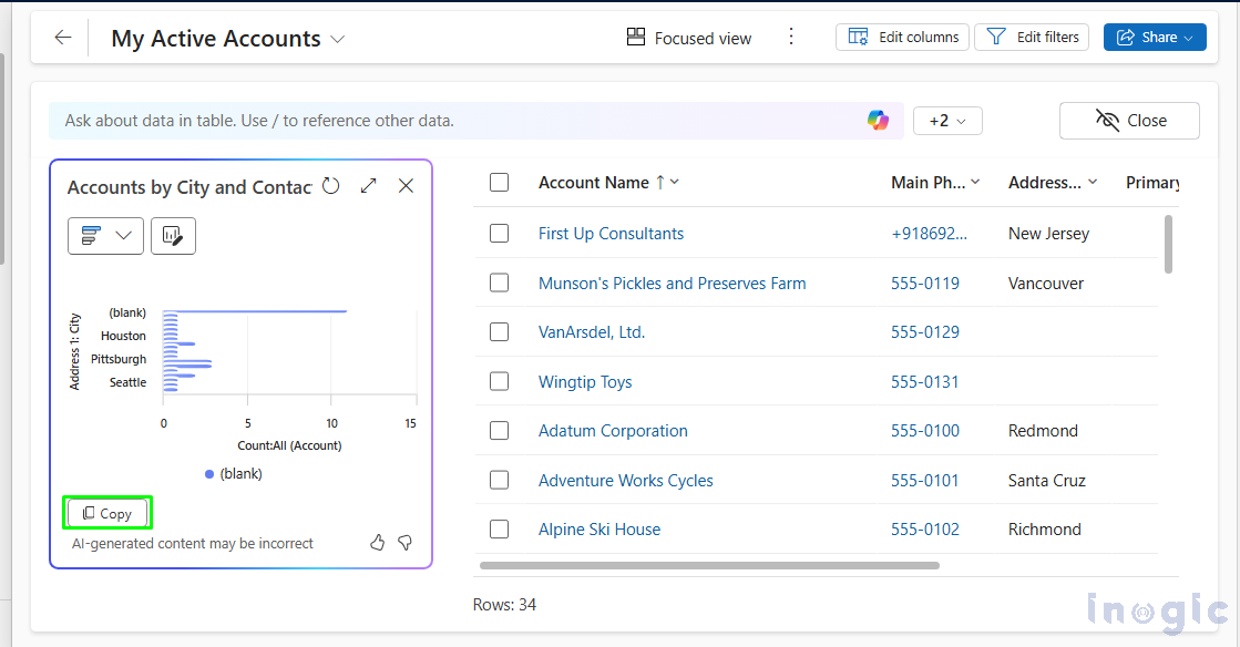
After clicking on the Visualize Button, the Chart will open.
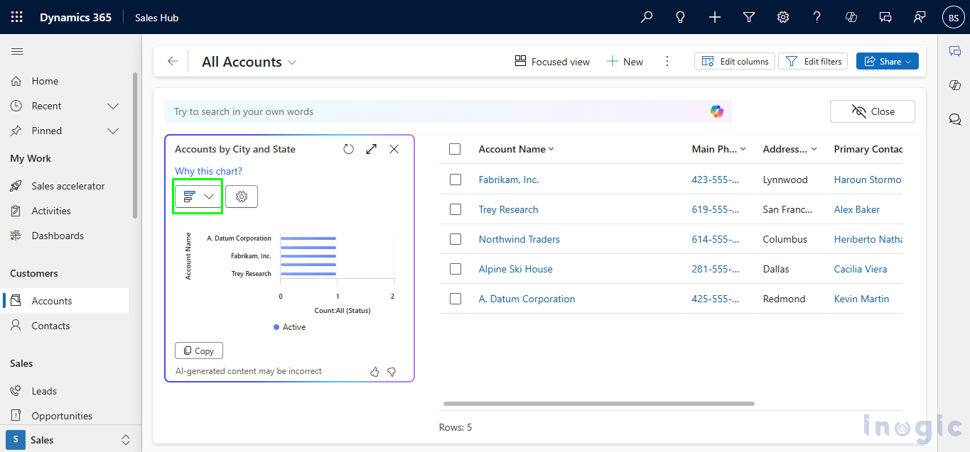
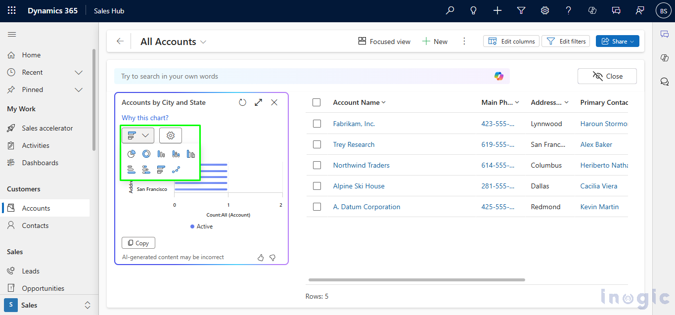
When you click on the Charts icon, you’ll see a range of options to choose from, allowing you to select different types of charts.
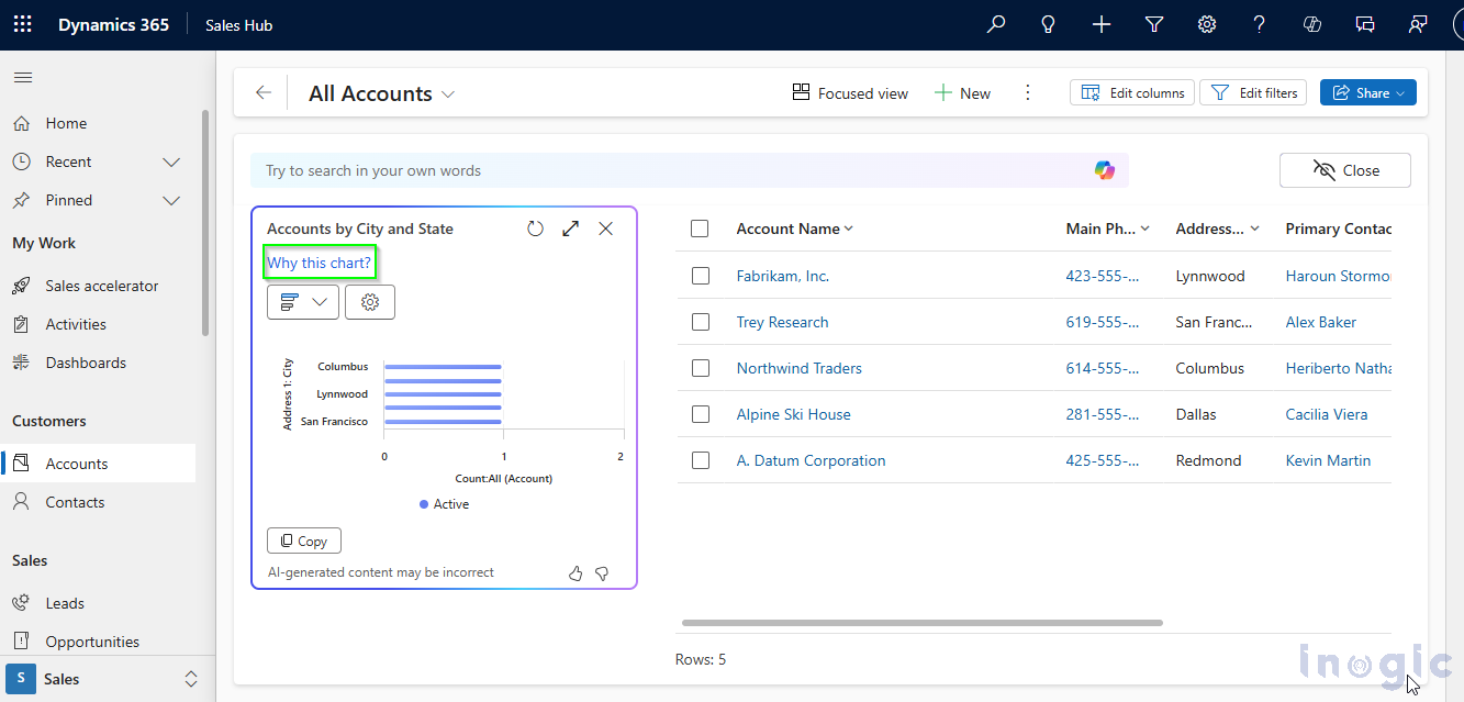
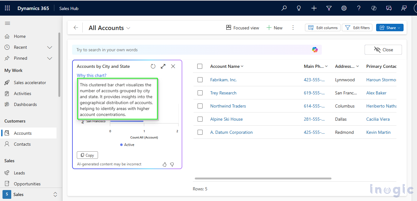
When you click on the “Why this chart?” hyperlink, you’ll get a quick and simple explanation of why that specific chart was chosen. The explanation is based on the columns and views you selected for your entity records, making it easy to understand how your data is being visualized.
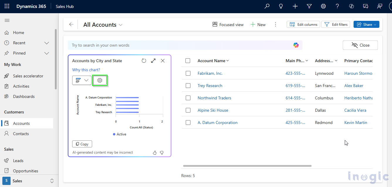
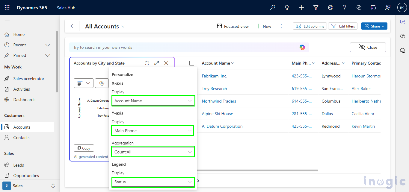
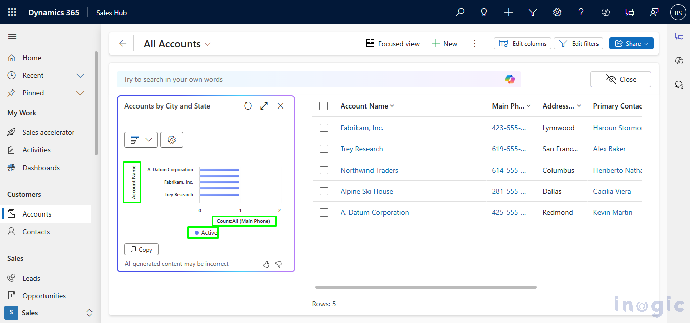
When you click on the Settings icon, you can choose the Display Columns—the specific columns you want to fetch data from. Once you make your selection, the chart is automatically created based on the columns you picked. It’s a quick and easy way to see the exact data you need!
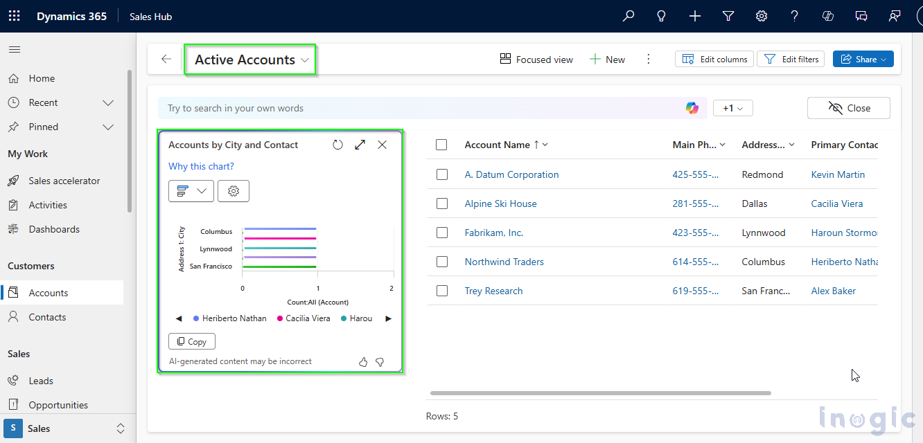
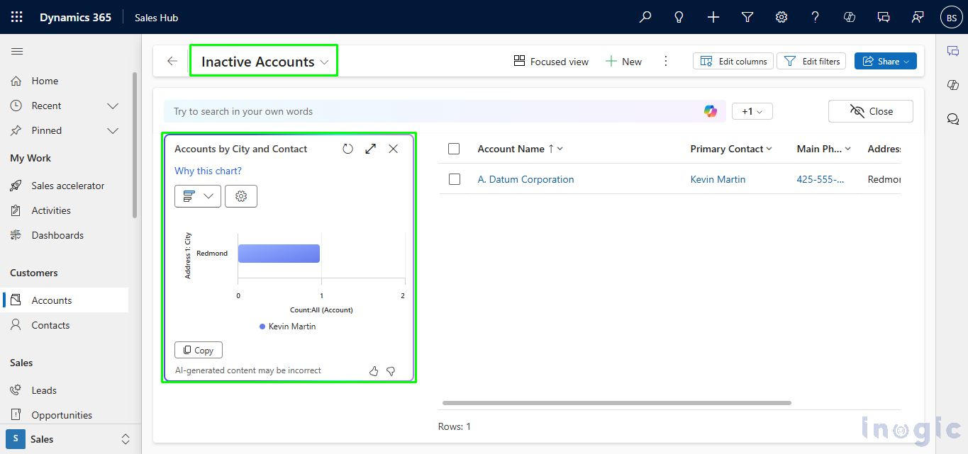
The chart will automatically update based on the view you select. For example, if you choose the “Active Accounts” or “Inactive Accounts” view, the chart will instantly reflect the relevant data.
Active Accounts View
Inactive Accounts view
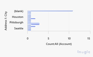
You can also copy your data by using the Copy button. It will copy the chart in image format.
Copied chart:
Conclusion
With the new “Visualize” feature in Microsoft Dynamics 365, your role as a Data Analyst just got a whole lot easier. It saves you time by automatically creating charts based on the views and columns you choose, with a helpful AI explanation to break down the insights. You can even pick the chart type that suits your analysis best, making it simple to share insights with stakeholders. This seamless CRM integration means smoother, more effective data analysis—helping you make smarter business decisions effortlessly.
