Microsoft has introduced an exciting new feature for Power Pages, making it simpler than ever to showcase product information on websites. With the Card Gallery component, users can effortlessly display product details in a visually appealing format, eliminating the need for complex HTML, CSS, or JavaScript coding.
Solving Real-Life Challenges with Ease
We will consider a scenario where a sales company needs to display its range of products on its website, complete with essential details. Traditionally, achieving this level of presentation would entail extensive HTML, CSS, and JavaScript coding within Power Pages. However, Microsoft’s groundbreaking Card Gallery feature eliminates this need.
To learn more about the Add a Card gallery please refer to the below link,
Let’s check how to implement and use the Card Gallery in Power Pages,
Step 1:
Upon accessing the Power Pages website at https://make.powerpages.microsoft.com/, users will find a selection of components to add. Please select the “Card gallery” option to insert the component into the desired section of the webpage.
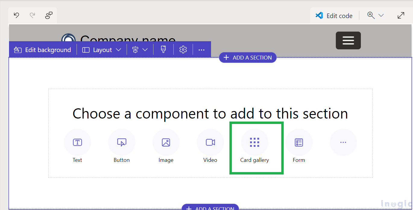
After clicking on the option, a component will be added to the section, appearing as shown in the picture below.
Step 2:
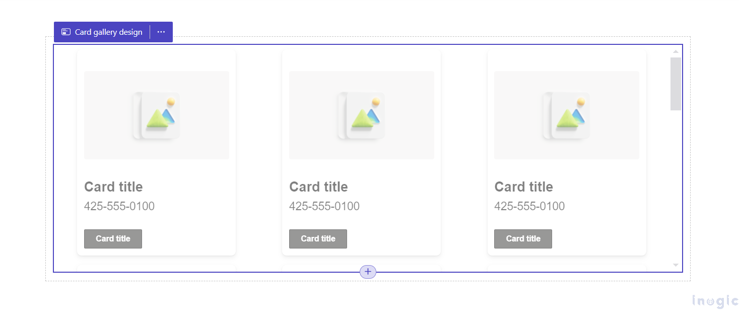
After successfully integrating the Card Gallery component, the next step involves applying stylistic enhancements and configuring the data to be displayed.
To commence this process, users must click on the “Card gallery design” button at the section’s top-left corner.
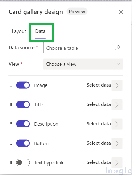
Upon activation, a popup window emerges, presenting two distinct tabs: “Layout” and “Data” as shown below pictures,
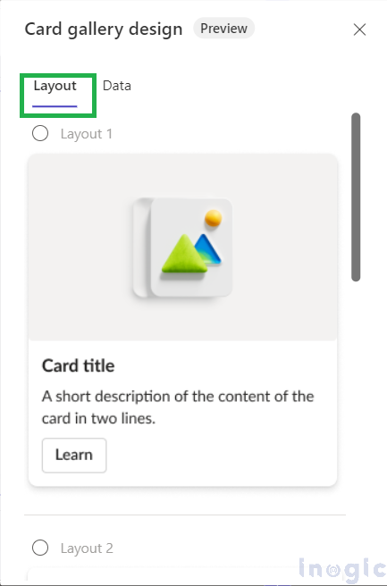
In the “Layout” tab, users can tailor the visual presentation by selecting specific layouts for products.
Meanwhile, the “Data” tab serves as the control center for configuring the content showcased within the Card Gallery. Here, users can define the data source and select the fields to be displayed on the cards. By leveraging this tab, users can ensure that only relevant and essential information is presented, enhancing the overall user experience.
Step 3:
In the Layout tab, users are presented with four distinct options for configuring the card format (for now it is in preview with 4 Layouts):
- Layout 1
- Layout 2
- Layout 3
- Layout 4
This selection empowers users to choose a layout that best complements their website’s design and enhances the visual appeal of the Card Gallery.
Meanwhile, in the Data tab, two essential configurations must be made. First, users need to choose the Data Source, identifying the entity from which the data will be drawn to populate the cards. This step ensures the displayed information is accurate and relevant to the user’s needs.
Secondly, users should designate the View, determining which fields will be showcased on the cards. This selection is crucial for tailoring the content displayed to meet specific objectives. Within this tab, users have the flexibility to choose from five options for showcasing data:
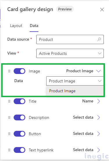
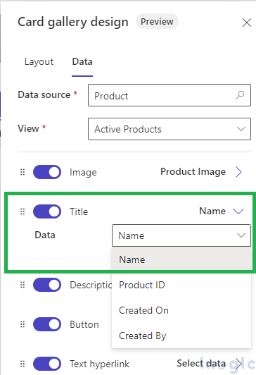
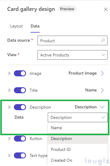
In the scenario outlined below, we have selected the Product entity as the Data Source, utilizing the Active Product view which encompasses all necessary fields to be displayed on the card. There are five customization options available for the card. Each option allows the user to select specific field types, detailed as follows:
- Image:
For the Image, users have an option to choose an Image type field. This selected field will be shown as an option, such as “Product Image.”
- Title:
The Title section offers Text, Date, and Lookup type fields for users to choose from (the multi-line text field will not be available for selection).
- Description:
For the Description, all Text type fields will be visible to choose on the option (lookup type field will be not available for selection).
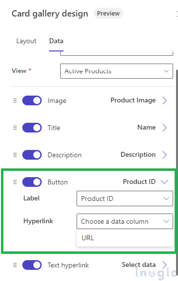
- Button:
Users need to select two fields for the Button option :
-
- Label (single lined text field available for selection)
- Hyperlink (URL type field available for selection).
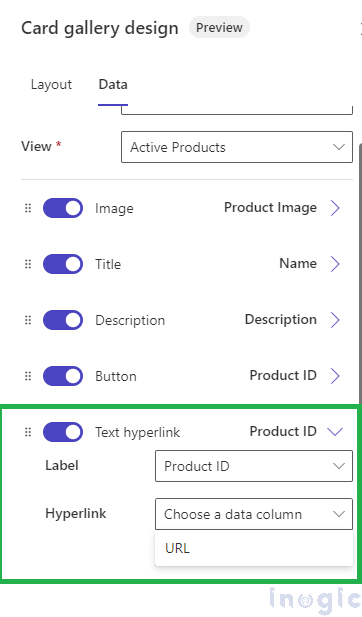
- Text hyperlink
Similar to the Button option, the Text Hyperlink option requires users to select two fields:
- Label (a single line of text field available for selection)
- Hyperlink (URL type field available for selection).
Step 4: Styling the Card Gallery
After completing all configurations, users can now style the card gallery by clicking on the Styling button on the component.
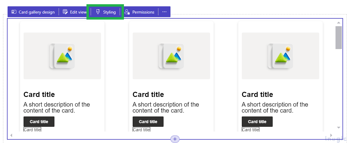
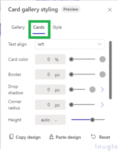
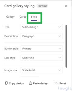
Upon clicking the Styling button, a window will pop up, featuring three tabs: Gallery, Cards, and Style.
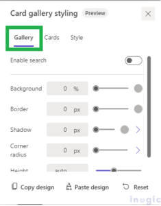
- Gallery Tab: In this tab, users can apply CSS to the gallery, such as setting the background color, border, and other styles.
- Cards Tab: This tab allows users to apply CSS to style individual cards within the gallery.
- Style Tab: Users can apply CSS to the card’s content, including images, buttons, and text displayed on the card.
Additionally, within the Gallery tab, there is a toggle labeled Enable Search. When this option is turned on, a search bar will appear in the gallery, allowing users to search for specific products by name or description.
Furthermore, there are two buttons available in the Styling window:
- Copy Design
- Paste Design
These buttons provide convenience for users managing multiple card galleries on the website. Users can design one card gallery, copy the design, and easily paste it onto another card gallery, eliminating the need to apply the design manually to each gallery.
Below is a screenshot of the website following the completion of all steps:
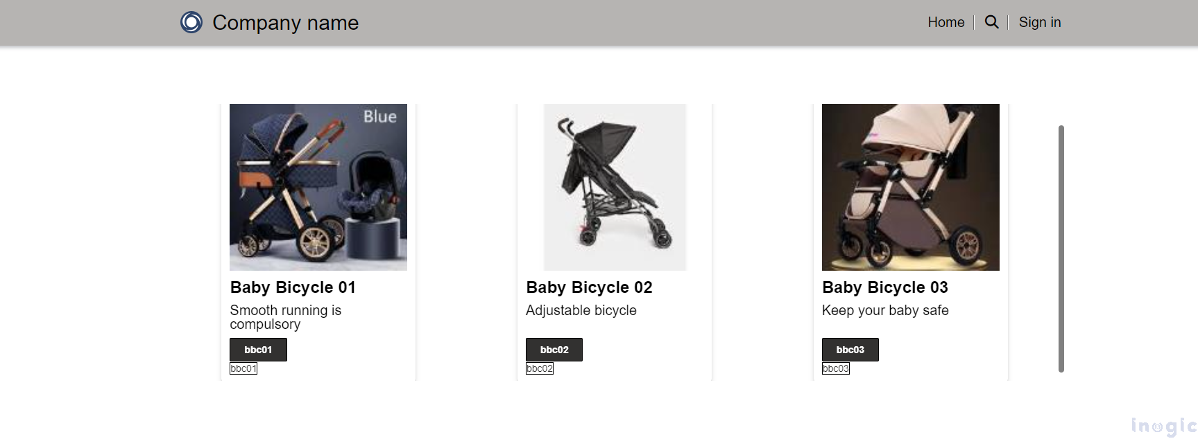
The layout of the card gallery in the screenshot shown above is described as follows:
- Image: The image is displayed at the top.
- Name: Below the image, the name is shown.
- Description: The description appears below the name.
- Button and Hyperlink: At the bottom, a button and hyperlink are displayed.
Conclusion:
The Card Gallery control in Power Pages transforms how businesses showcase products on their websites. It simplifies the process, eliminating the need for complex coding and allowing for quick, visually appealing displays. This feature enhances the user experience and reduces development time, making it an essential tool for any business looking to present its products professionally and efficiently.
Outsource Development Made Easy for Dynamics 365 CRM and Power Platform!
From customizing Microsoft Dynamics 365 to developing Copilot-enabled Power Platform Apps, our outsourced development services ensure top-notch solutions tailored to your needs. Let our experts handle the technicalities while you focus on your core business. Email us at crm@inogic.com to get started today.