Introduction:
With Co-pilot, theme generation for app development will be simplified, accelerated, and made more intuitive. Thanks to various AI-powered features, your theme ideas can come to life in ways you never would have imagined. Co-pilot with Al may produce theme colors, components, schemas, or whole pages. You could improve the following UI visual elements, for instance:
- To establish product branding, alter the navigation color scheme and product logos.
- Modify accent colors, such as selection or hover colors
- Make entity-specific coloring available.
- Tooltip for the logo
- Color of the navigation bar
- Shelf color of the navigation bar
- The color of the Unified Interface’s main command bar
- Color of the header
- Color of global links
By altering the system’s default colors and visual components, one can give an app a unique appearance and feel—a theme. By including your company logo and using entity-specific coloring, you can establish your unique product branding. Developers do not need to write code to create a theme; instead, they can use UI customization tools. Themes that are used in your company can be added, modified, or removed. Dynamics 365 for Outlook Web forms allow theme customization. Although you can designate more than one theme, only one of them can be selected and made public as the default theme.
With Co-pilot for Theme, you can start working on your brand’s theme right from the design studio. You can make additional customizations to the theme in the Styling workspace once it has been generated using Co-pilot.
Use case: Al theme is useful in many scenarios such as
- For writing research papers and creating presentations, students can create themes using an Al-generated co-pilot. To help with class tasks, the AI generates a theme to create presentations, summaries, and outlines. Creating various types of themes for presentations from scratch by hand takes more time than this.
- To expedite client deliveries, consultants can utilize Al generated theme using Co-pilot. It quickly creates a theme by entering some keywords in the search bar using co-pilot elegantly present findings. The quick turnaround time leaves clients impressed.
- By adding their company plans, investor notes, and product descriptions, entrepreneurs can create various themes using Co-pilot. The AI saves hours of design labor by producing polished themes that meet VC presentation standards.
Following are the steps used to configure the Co-pilot theme.
Step I: Go to the Pages Workspace:
With the Pages workspace, users can create and edit webpages in context and add content using low-code and no-code widgets, including lists, forms, images, videos, text, and Power BI reports.
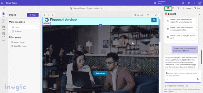
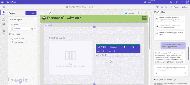
Step II: Click on the Co-pilot icon
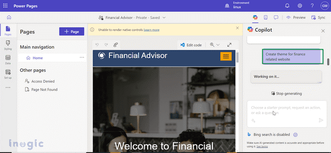
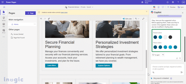
Give an explanation of the subject you wish AI to produce. Think of the phrase “Create a theme for finance-related website.”
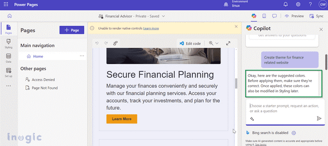
Co-pilot will replay on the theme user has asked for.
It will present various themes related to subject that user has entered in search box.
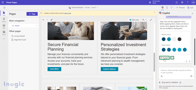
These are the settings that the user can select to personalize the theme.:
- Try again: Create a new theme using the description that has already been provided.
- Workspace for styling: The AI theme is manually modifiable in the styling workspace, just like any other theme.
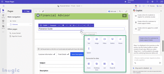
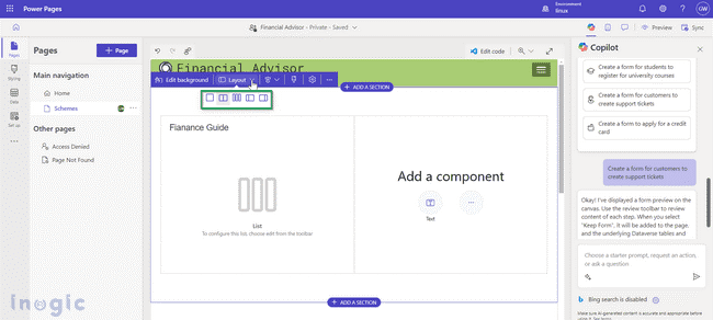
User can add call to action buttons here along with list, forms, multistep forms etc.
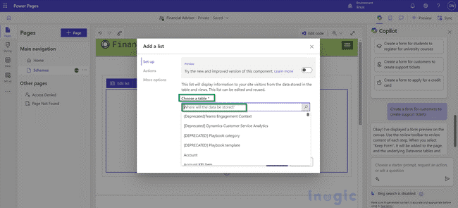
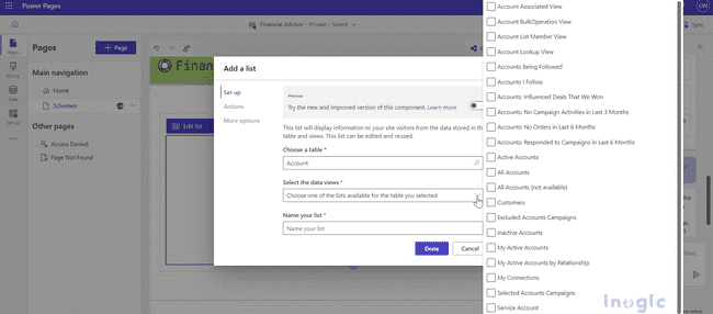
User will get option where to store data
User will get the privilege to store data in particular view form of selected entity
Various options are available to change the layout of the segment.
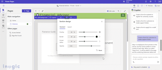
If section is added, design can be changed by clicking on design icon.
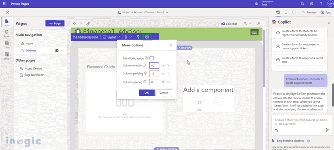
By clicking on the gear icon user can change column margins and spacing for selected sections.
For a particular column user can again edit the data, can add text, image, etc using co-pilot.
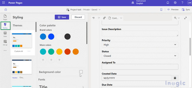
Styling workspace: User can apply global site styles from the styling workspace. The app window’s right preview allows users to examine and apply adjustments to corporate branding. Styling provides 13 pre-made themes. You can alter the font styles, section margins, color scheme, background color, and button styles for every theme.
- Open design studio.
- Form selected in the previous step gets added here. User can make changes by styling button on the left pane of the page.
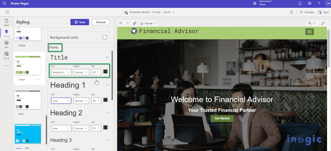
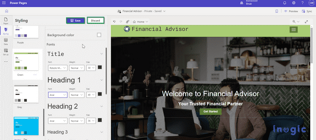
In the Styling workspace, take note of the theme list. The Styling option allows user to further alter particular components, such as the site’s fonts and color schemes. Users have access to over 30 Google Fonts in Power Pages in addition to standard fonts.
To view the style reflected on the canvas workspace to the right, select one of the predefined themes.
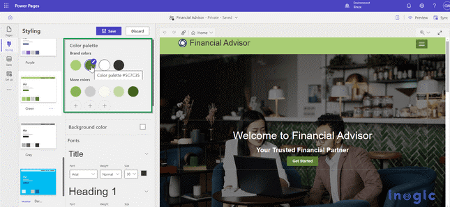
Each theme has its own color palette. Users can use the styling menu to make adjustments to each theme. Options for text include size, color, weight, and font.
Once changes are made click on save changes or discard changes.
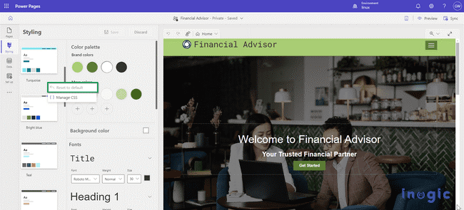
Resetting the theme: User can customize specific element such as background color, and font style from styling menu by clicking on ellipsis (…).
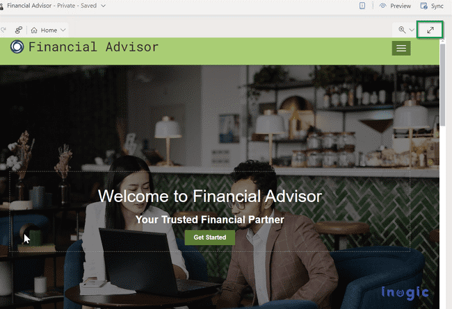
Viewing Your Page: Click the full-page icon to see the entire page in the design studio.
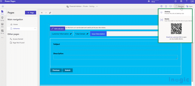
User can view the site and how it looks in production by selecting the preview button. By selecting the device
Theme mapping: There is a corresponding color for each element on the page in the palette. The user can choose from three slots containing nine colors that make up the predefined theme. Unless the theme is reset, the mapping becomes incorrect if you modify items.
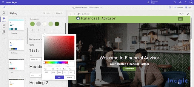
Click the plus sign (+) in the color palette to add a new color or modify an existing one. You can use the color picker, RGB values, or hexadecimal values to select your color.
A newly added color to the palette can be used to customize the color of context menu items.
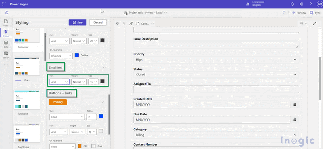
Each theme can be adjusted or modified by making changes in text options such as font, font size even buttons and links changes can be done.
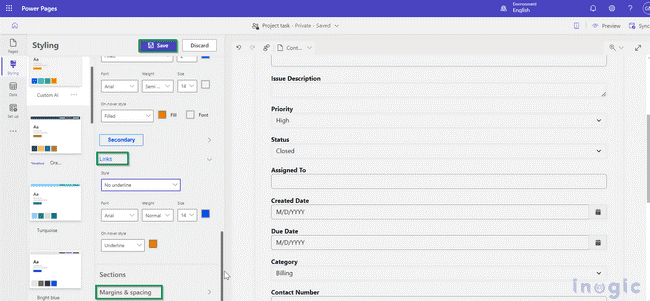
User can modify margins, spaces, etc. by simply clicking on margins and spaces. Once formatting is done user can save or edit data by clicking on save or discard button.
For each theme user can customize color palette, font style, button style, and margins spaces.
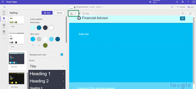
Undo or Redo: To undo theme adjustments for any scenario involving modifying the currently selected theme, choose the Undo and Redo icons in the Styling workspace.
Any style adjustment for the chosen theme can be undone or redone, including the option to return to the default theme from the More menu (…).
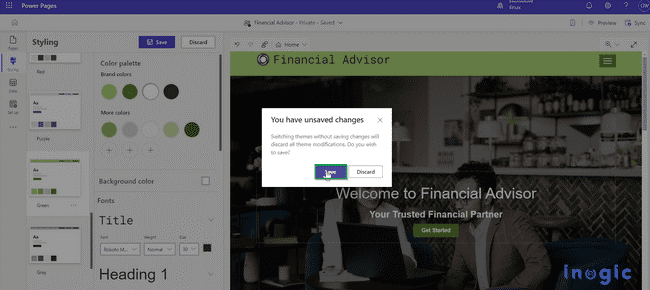
You’re presented with an option to save or reject any unsaved modifications when you change themes. Selecting one of the operations clears the undo/redo stack. The options undo and redo support changes that are made in styling workspace.
Conclusion:
From wherever you are, AI Copilot acts as your website-building assistant, whether you are just getting started or are in the thick of constructing a theme for your website. It provides recommendations for pieces inside containers as well as layouts, wireframes, and other design elements. It’s like always having an artistic partner by your side, ready to spark the next big idea in your design.
Empower Your Dynamics 365 CRM with Our Next-Gen AI Expertise!
Step into the future of app development with our Copilot-enabled Power Platform solutions, Azure OpenAI Sales Companions, and Copilot Studio Developments. Contact crm@inogic.com to unlock business success with AI integration.
