Microsoft Power BI is an interactive tool to visualize the data. Using Power BI, users can interact with the data in order to develop business reports and make business-level decisions. Power BI visuals are tools, and they are picture illustrations of data. Microsoft introduced the on-object feature, i.e., an easy way to construct and setup visuals.
On-object is an easy approach to constructing and setting up the visual. The on-object feature provides the following formatting options on visuals:
- Rename titles.
- Add data labels.
- Change colour of selected element/title.
- Change text format of titles.
- Easy to add data in the fields on Visual itself, etc.
Initially, Power BI desktop had a Formatting panel for each visual, and users had to navigate to that panel to find the required properties of the visual for formatting, as shown in the below screenshot.
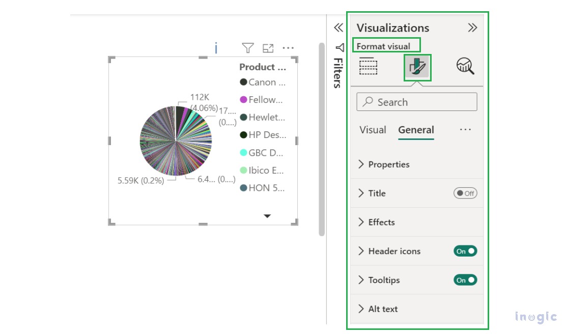
Whereas On-Object feature allows user to simply find the formatting options beside the visual itself.
NOTES:
- This feature currently supports Table, Pie, Donut, Tree map, Card, Bar, Column, Line, Area, Combo and Scatter visuals.
- This feature is not supported in Power BI service or mobile layout.
Let’s consider a scenario where production supervisor wants to create a production report for manufacturing company. We can construct the visual using On-object feature for production report in Power BI Desktop by following below steps.
Step 1: Navigate to Power BI Desktop app.
Step 2: Navigate to below path to activate On-object feature.
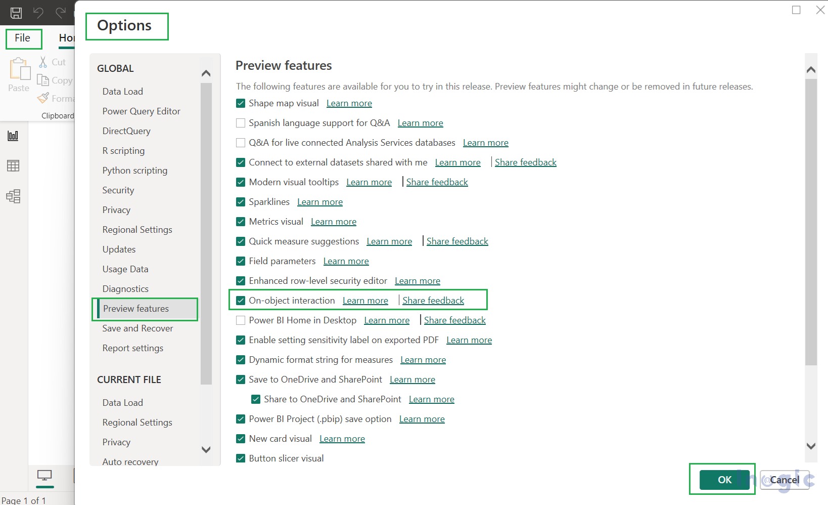
In File -> click on Options and settings -> then click on Options -> then click on Preview Features -> then click on Features -> and put a tick mark in checkbox of “On-object interaction” -> then click OK to turn it ON. Then restart Power BI Desktop app to see the newly added On-object feature.
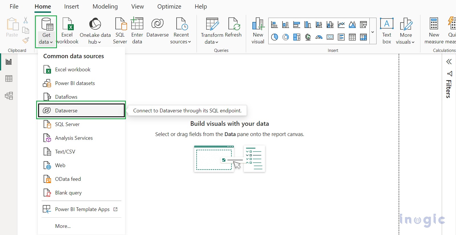
Step 3: Navigate to In Home -> click on Get Data -> then click on Dataverse.
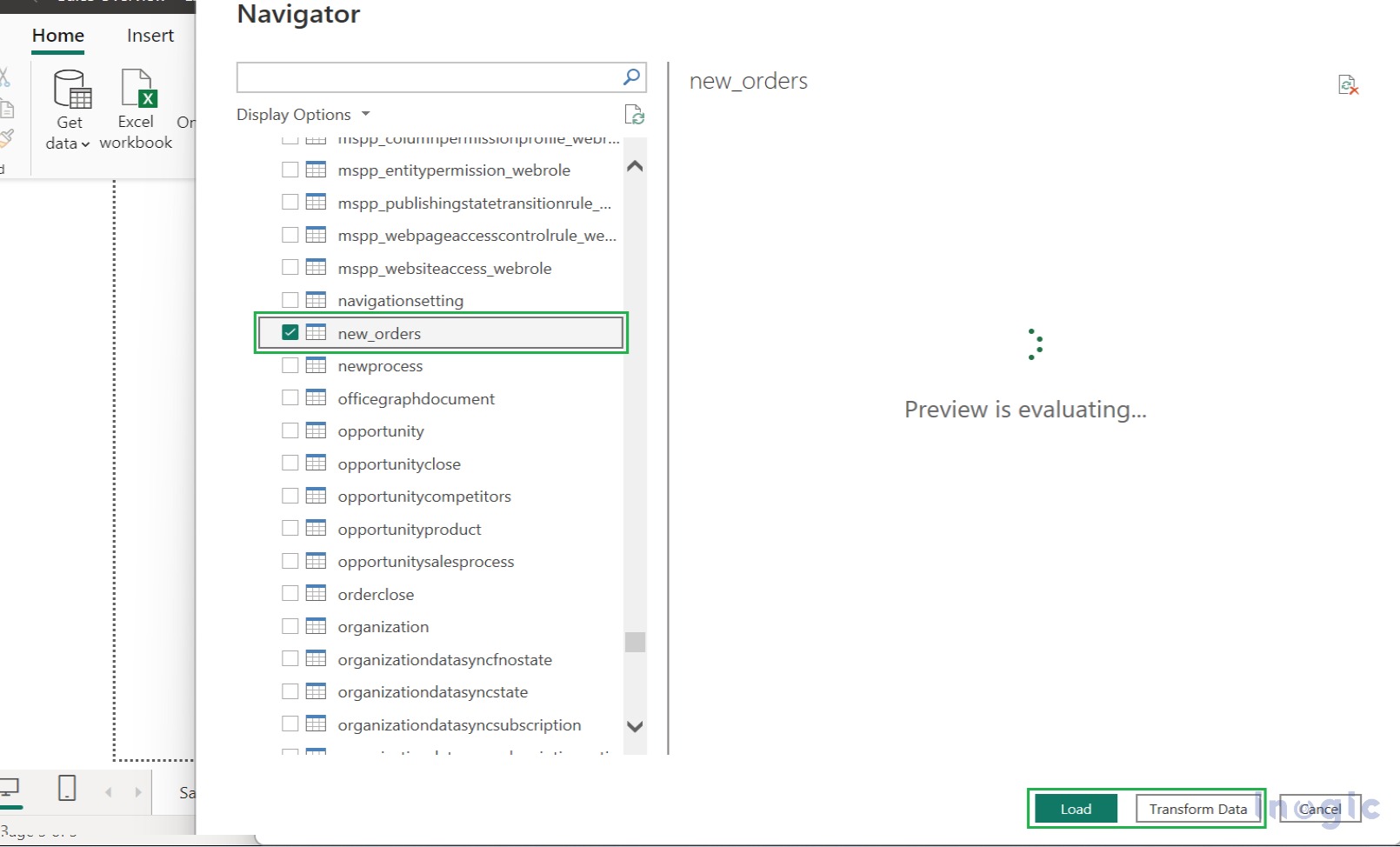
Step 4: Log in with your user credentials to establish connection with Dataverse. Then select appropriate Environment and select the Table as per your requirement, and then either load the data directly or transform data.
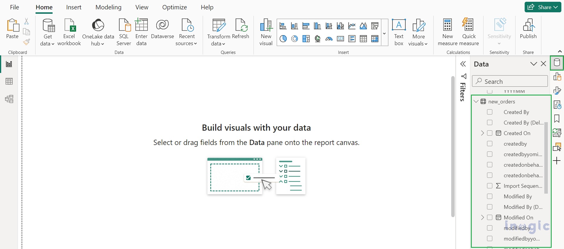
In production report, all the Table columns are visible in Data pane, as shown in below screenshot.
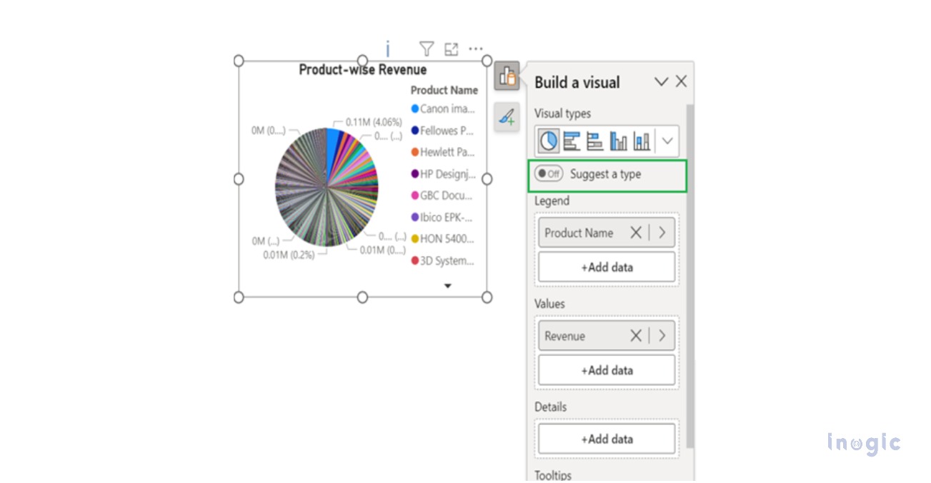
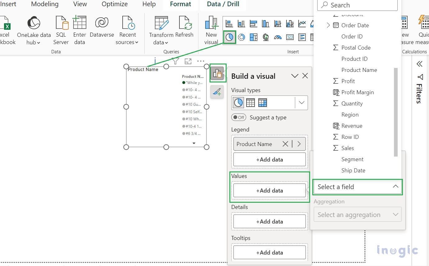
Step 5: Add a Pie chart visual in Production report. In Visual, navigate to Add data and build a visual button, and from Build a visual popup menu, easily add data by selecting Product Name field in Legend and Revenue field in Values without drag and drop fields from the data as shown in below screenshot.
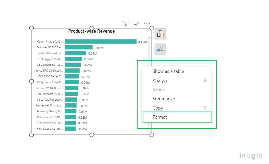
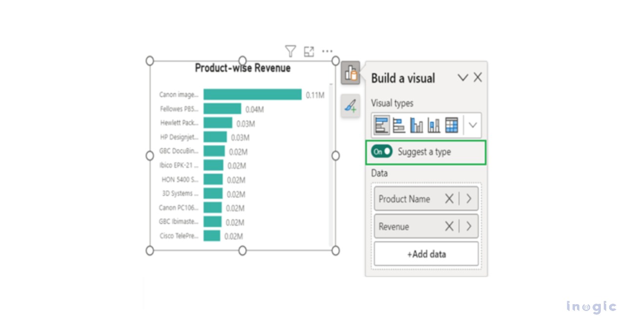
When we select toggle Suggest a type to on, then Pie Chart Visual is changed to Clustered Bar Chart Visual, as shown in the below screenshot.
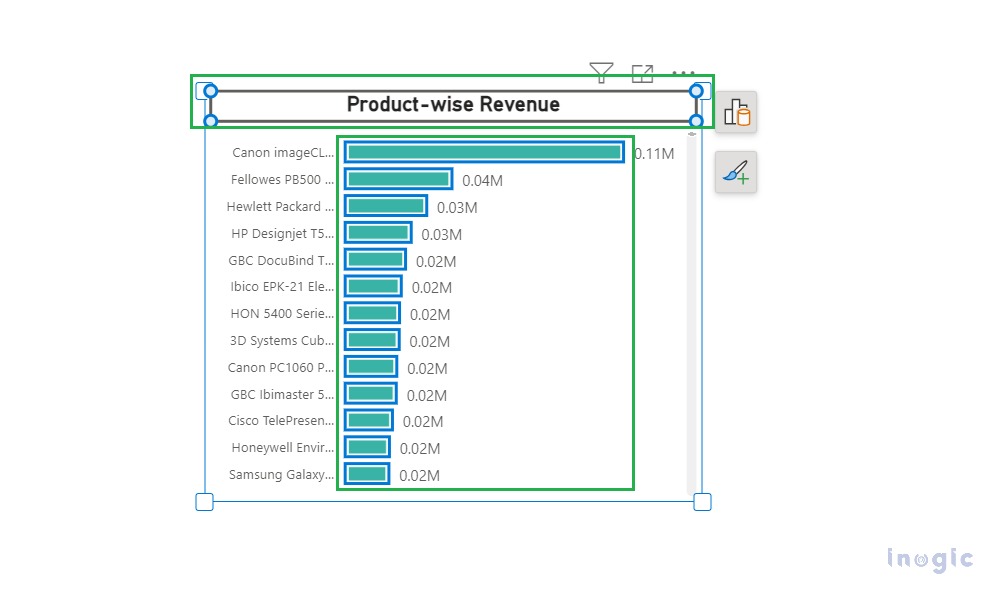
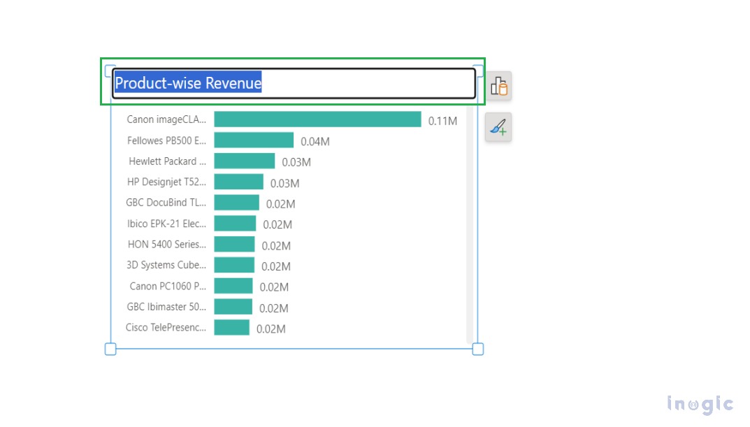
In the formatting of the clustered bar chart visual, the borders of the visual turn blue, and on hover, the region is displayed to format the Bars element, and on click, select the Bars element or Product-wise Revenue title.
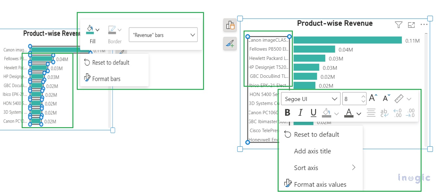
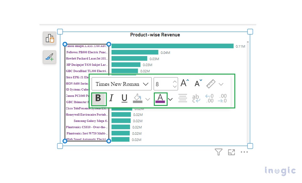
In formatting, right click on selected Bar element or Axis value element to get a pop-up mini-toolbar and shortcut menu for formatting the selected Bar or Axis value element.
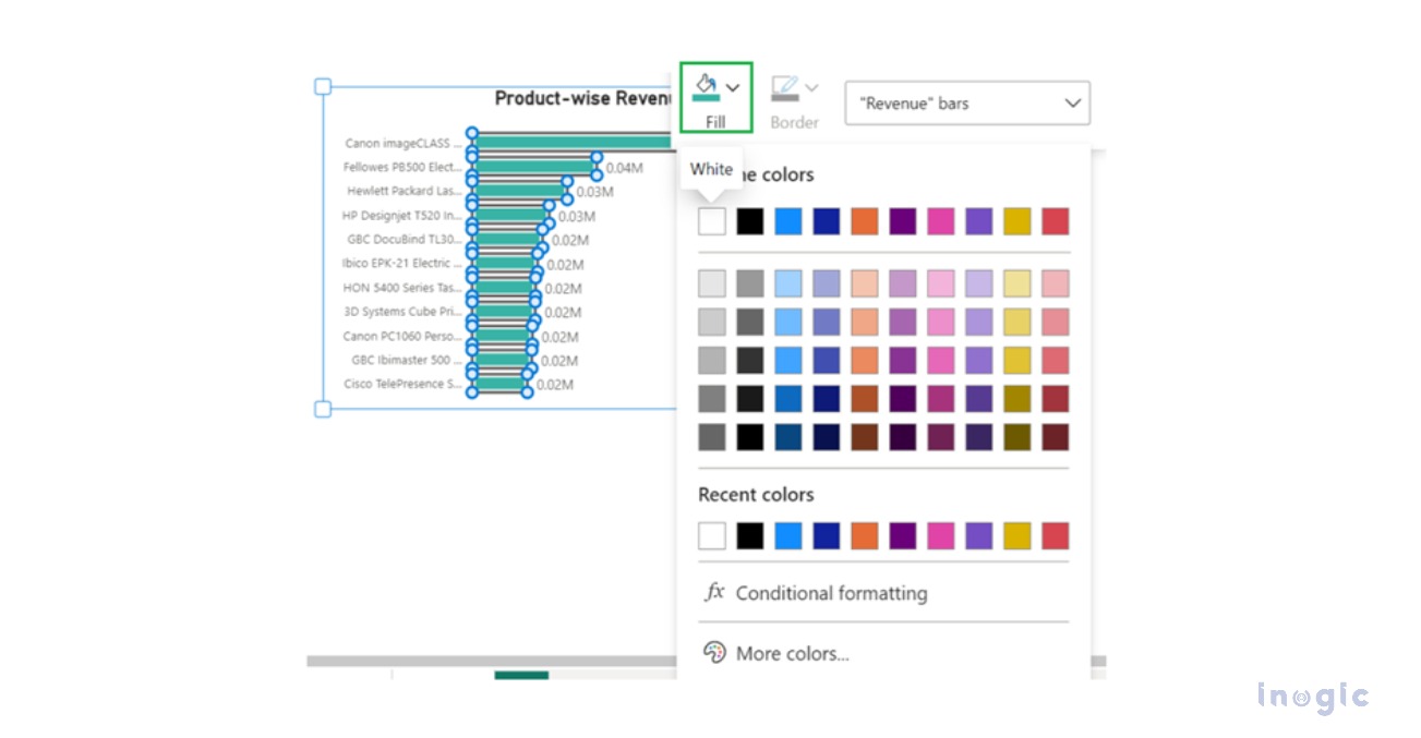
We can change the colour of Bar elements as shown in screenshot below.
Also, we can change the text format or change text colour of Axis value element, as shown in the below screenshot.
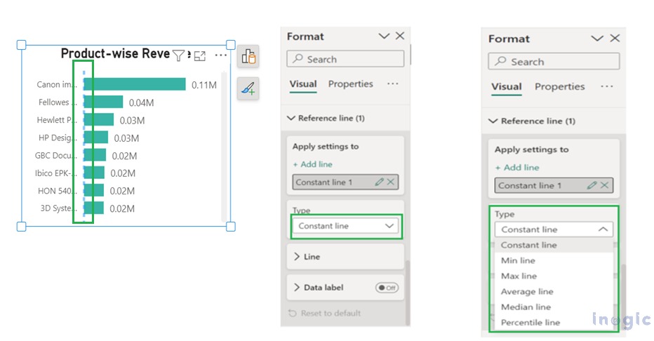
In the formatting of the clustered bar chart visual, navigate to the Reference line and select Constant Line from the Type dropdown for the Analytics feature. Analytics feature is moved to the format setting of visual from the visualization pane.
Conclusion
While creating reports using the On-object feature, we can easily construct and format the visuals. So, working with visuals becomes more convenient and simpler.
