Pipeline view is a control introduced by Dynamics 365 for visualizing records of the entities, displaying them on a graph, and focusing on the current pipeline phase of records of the selected entity. The data which you can visualize on two different dashboards called “Deal tracker” and “Sales funnel” is shown by a bubble chart/graph and a horizontal funnel bar graph. This blog is a brief overview of the pipeline view, its components, and its working as well as usage for entities of Dynamics 365.
Use Case:
Suppose we want to check which opportunities have a higher chance of getting closed successfully (closed as in won) from the selected view or some selected opportunities records, we currently have in the view and how many opportunities have been closed already along with the status of the closed ones. We can use the default grid where we can see every single record and their stats, however, we cannot directly compare them with each other. We want some visualization panel where higher authorities of the organization can easily compare opportunities between each other on different parameters such as Estimated Revenue, Actual Closed Dates, etc.
Please follow the below steps to configure Pipeline on Opportunity entity:
Step 1:
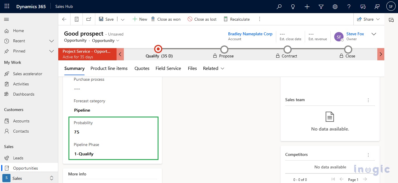
Add an existing field named ‘Probability’ on the opportunity form. The data filled in the probability field will be the number that represents the probability of the opportunity record closed as won, e.g., the higher the chance an opportunity has to close as won the probability number will be closer to 100 and the opportunity which gets closed as won, their probability value will set to 100.
Step 2:
Add an existing field named ‘Pipeline Phase’, the values entered in the pipeline phase field will be set as a legend name for the Sales Funnel dashboard.
How to access Pipeline view:
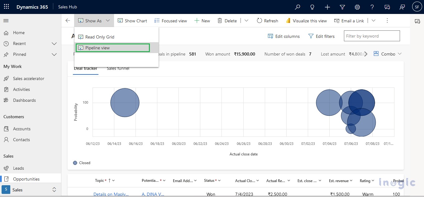
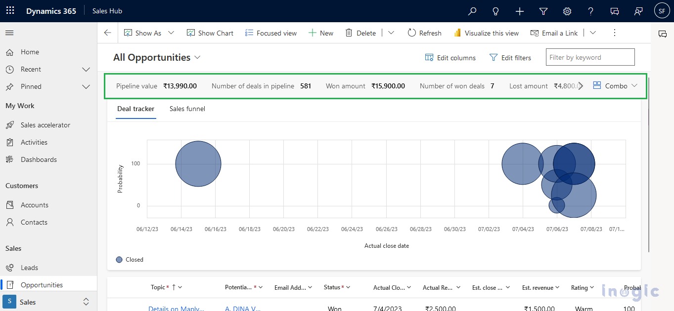
To access the Pipeline view, you need to redirect the Opportunity entity home grid. Once you redirect, It will be visible as an option on the ‘Show As’ button present on the ribbon bar. On clicking the Pipeline view option, the opportunities records will visualize in a graph as well as a grid. The below screenshot shows the pipeline view for the opportunity entity.
Here you will get two different dashboards as follows:
1. Deal Tracker:
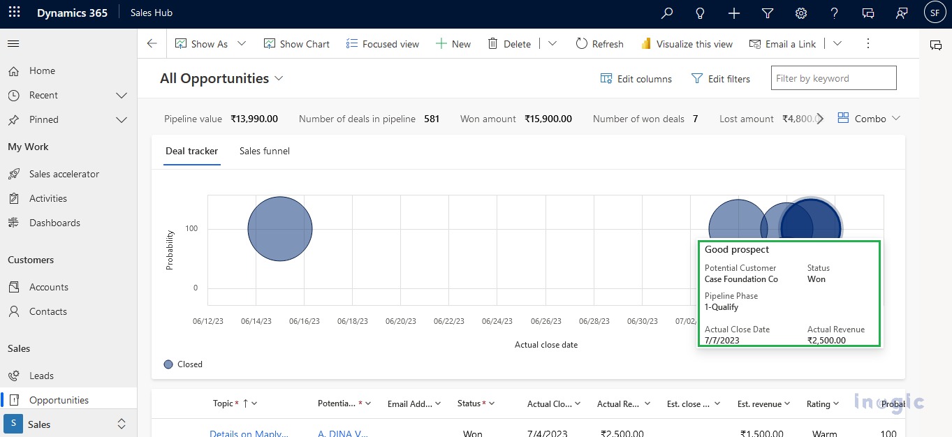
In this dashboard, you will get an idea about how many Opportunities will chance to close as won and how many opportunities which gets closed as won in graphical format. As per the above screenshot, the ‘Y-axis’ denotes the Probability value of opportunities (0-100) and the ‘X-axis’ denotes the Actual close date which shows when the opportunities records will get close as won. Bubble indicates that individual opportunity record which indicates that possibility of opportunity makes it as close as won.
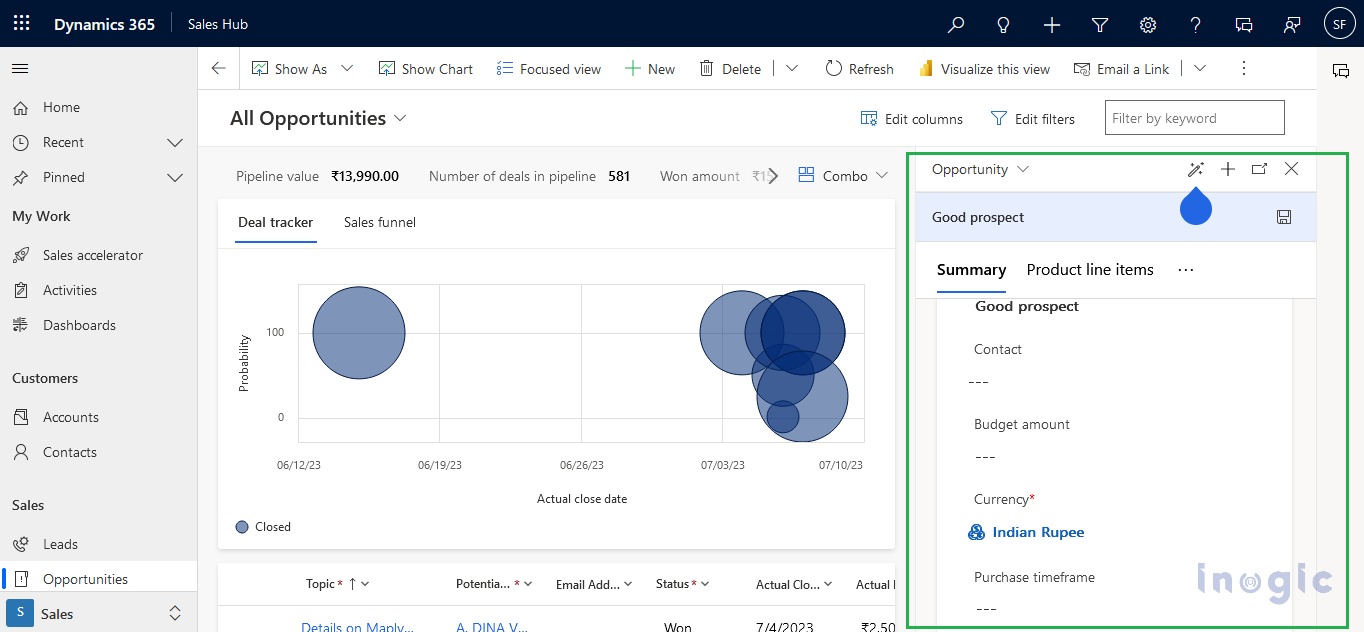
By clicking the record on the bubble chart, a section will open on the right side of the screen as shown below. In the form, a dropdown will be present on the left side of that section’s title which will have the different forms of that entity.
2. Sales funnel:
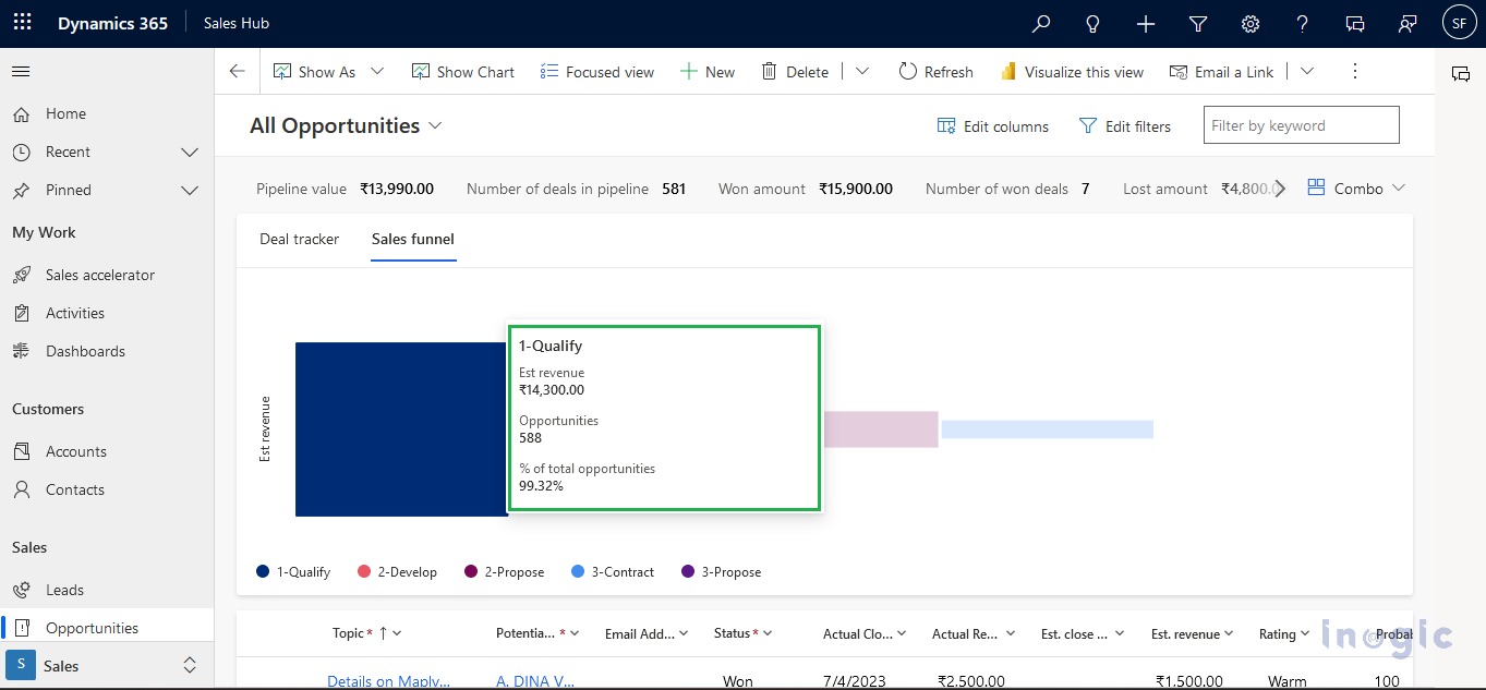
The sales funnel displays the total number of records of the selected metric based on the estimated revenue and the pipeline phases in the form of a horizontally stacked bar graph. The legend options phases of the pipeline and the default options on the axis are estimated revenue of the records of the selected metric. The user can interact with the bars by double-clicking on any of them, and the bar graph and bubble chart will display their data. On double-clicking again, the previous funnel chart will be back. On hovering over any option, a tooltip opens displaying the relative data, the total number of records comes under the metric, and it is in percentage in the last option. On hover of any of the legends, the bar related to it gets highlighted and the rest will be dulled.
There are 7 options available in the header along with a command bar button named combo. They are Pipeline value, Number of deals in the pipeline, Won amount, Number of won deals, Lost amount, and Number of lost deals as shown in the screenshot below. The records will have filtered and shown based on the selected view. The user can also create their metric as per their requirements. The available options are average, sum, min, max, and count options available
Reset Button and Combo Command Bar Button:
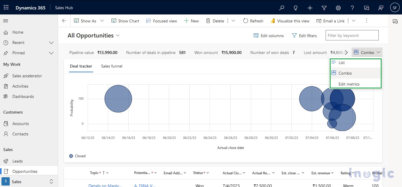
In the screenshot below, there is a button named ‘Reset’. A command bar button with the name ‘Combo’ is also present next to the reset button. When the combo button is clicked, three options are shown named list, combo, and edit metrics respectively as shown in the below screenshot.
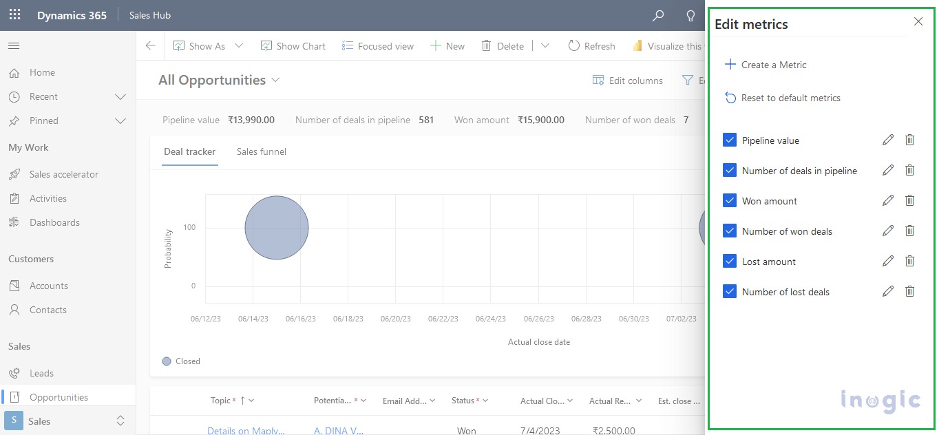
The first two options are related to displaying the data and the last option named ‘Edit Metrics’ is used as mentioned in its name, I.e., Editing the existing metrics and it also is used to create new metrics. When clicked, a side panel opens on the right side of the screen. This panel has a button ‘Create a Metric’ for creating a new metric, a Reset button with the name ‘Reset to default metrics’, following a list of all the existing metrics in the pipeline view. Refer to the following screenshot for the visuals. The button below the ‘Create a Metric’ button is ’Reset to default metrics’ which will reset all changes made. Below these buttons will be a list containing all the metrics created with the options to make changes to them.
Creating Metrics:
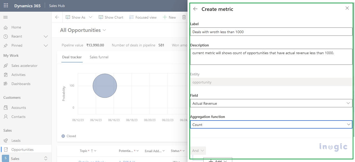
For creating the metrics, click the combo button which opens the list on the combo button then click the third option with the name of edit metrics, a sidebar will open listing all the metrics available. The metrics will be in a list with each having a checkbox on the left side of the row and 2 buttons on the right side. The Metrics will only be visible in the ribbon bar if it is checked, unchecked metrics will not be visible. The user can select the field they want and can perform the five mentioned actions on the selected field for all the records of the view. When the Create a Metric button is clicked, the form shown in the following screenshots opens on the right side of the screen.
To create the metric, we must fill the proper data in all the required data in the form. After that, click the apply button on the bottom right to create the metric. If at some point user does not want to create one, they can close the form by clicking on the cancel button next to the apply button.
Conclusion
To sum it all up, the pipeline view visualizes the data and displays it in graphical formats based on the current pipeline phase of the records. This helps the user to find the records they want more quickly than the standard read-only grid.
