Microsoft Power Pages offer a low-code, no-code SaaS (Software as a Service) platform fortified with enterprise-level security. It simplifies the process of creating, hosting, and managing modern external-facing business websites.
By default, when creating a Power Pages site, the primary navigation is positioned at the top of the header. However, there might be at times when custom navigation designs are needed for the Power Pages Portal.
We will consider a scenario, where we choose to customize the site map in Power Pages. Our goal is to alter how the navigation bar looks and move it from the top to the left side of our portal pages.
Let’s do a walkthrough with the steps we need to perform and achieve these requirements.
The first step is to create a Web Template, wherein we will input CSS for the navbar and incorporate a few lines of JavaScript code.
Follow below action list to do these changes:
- Navigate to the Web Template in Portal Management.
- Create a new Web Template. Here, you’ll design your Site Map.
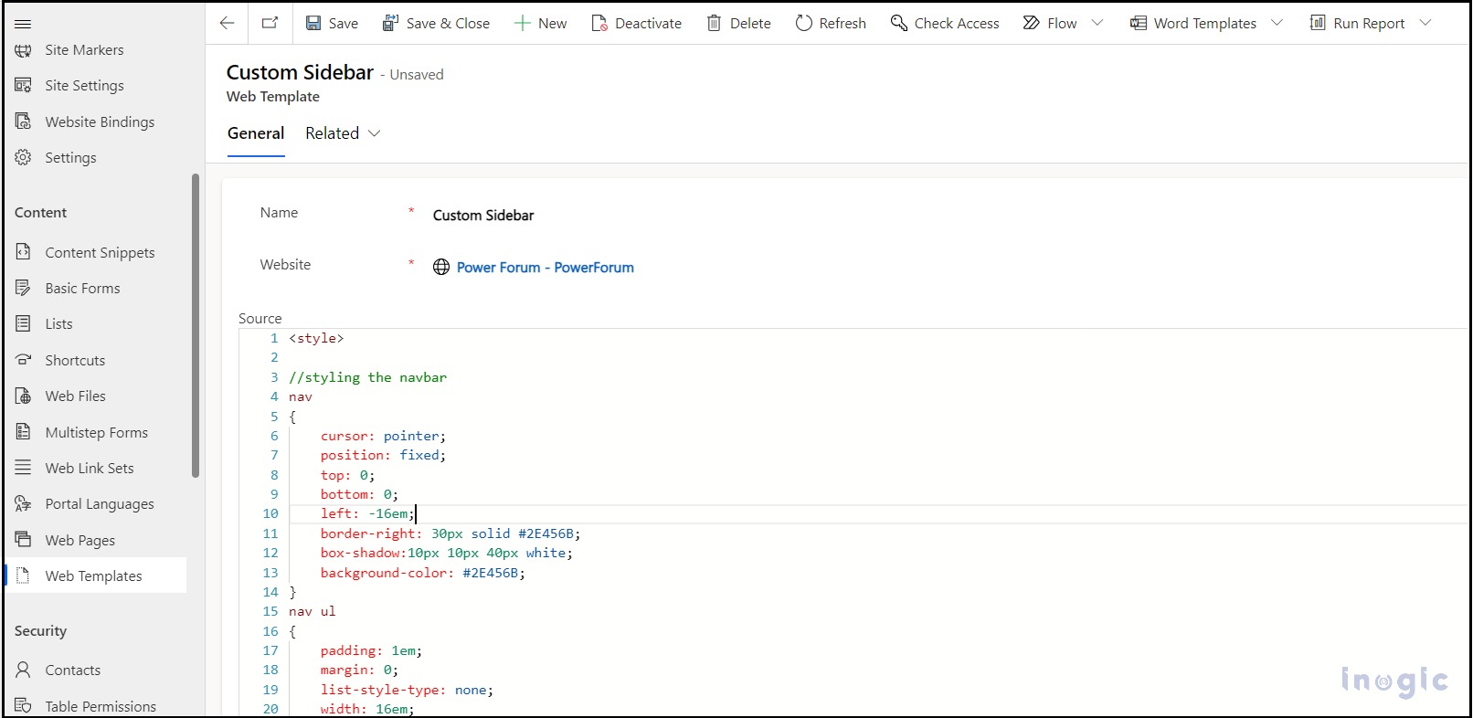
- For our Site Map, we’ve used the following CSS (always ensure CSS codes are encapsulated within a style tag):
/* Styling the Nav Bar */
nav

{

cursor: pointer;

position: fixed;

top: 0;

bottom: 0;

left: -16em;

box-shadow:10px 10px 40px white;

border-right: 30px solid #2E456B;

background-color: #2E456B;

}

nav ul

{

width: 16em;

list-style-type: none;

padding: 1em;

margin: 0;

}

/* Adding Animations to nav and all its child elements */

nav, nav *

{

transition: all 600ms ease-in-out;

}

/* On hover expanding the Site Bar */

nav:hover

{

left: 0;

}

nav ul li a{

font-size: 15px !important;

}

nav ul li{

width:100% !important;

}

.navbar-nav{

overflow: auto !important;

height: 100vh;

}

/* Hiding the Vertical Divider */

.divider-vertical{

display:none !important;

}

.dropdown-menu{

position:relative !important;

}

/* Right arrow Style for Users to identify the SiteMap */

#rightArrow{

position: absolute;

color: white;

top: 50%;

left: 110%;

z-index: 2;

border: 50% solid white;

width: 20px;

height: 28px;

border-top: 20px solid transparent;

border-bottom: 20px solid transparent;

border-left: 20px solid #2E456B;;

}
Refer the screenshot below:
Next, to help users identify the site map, we will introduce a right arrow with the help of the below actions:
- Incorporate jQuery and add the source in the Web template.
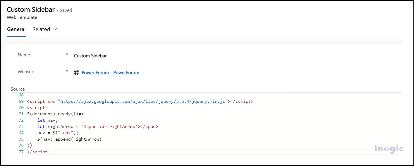
- Use the following logic for displaying the right arrow on the pages:
<script src="https://ajax.googleapis.com/ajax/libs/jquery/3.6.4/jquery.min.js"></script>

<script>

$(document).ready(()=>{

let nav;

let rightArrow = "<span id='rightArrow'></span>"

nav = $(".nav");

$(nav).append(rightArrow)

})
</script>
As shown in the screenshot below:
Lastly, implement this Web Template into our Power Pages Site’s header with the below set of actions:
1. Navigate to the website section.
2. Select the desired website and locate the header.
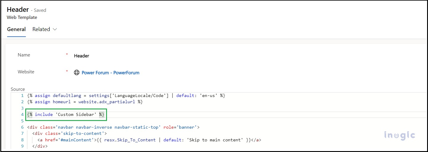
3. Click on the header, we can use the Created Custom Sitemap Web Template for all the website-associated web pages,
As shown in the screenshot below:
Save and Sync the Website,
Conclusion
Customizing navigation in Microsoft Power Pages is both flexible and user-friendly. By following the above listed steps, users can enhance site navigation and ensure a more tailored and intuitive user experience.


