Recently while configuring Model Driven Apps, we came across a setting for an advanced modern look and feel available. This setting incorporates fluent design into apps.
In this blog, we will have a walkthrough of this new feature introduced in the 2022 Microsoft release wave 2 using which you can enhance the user experience while using Model Driven Apps.
Enabling the feature
App Makers need to turn on this setting explicitly by navigating as below:
Go to Maker Portal > Select the appropriate environment > Apps > Select the existing model-driven app [e.g., Sales Hub] > Click on the Edit button as below:
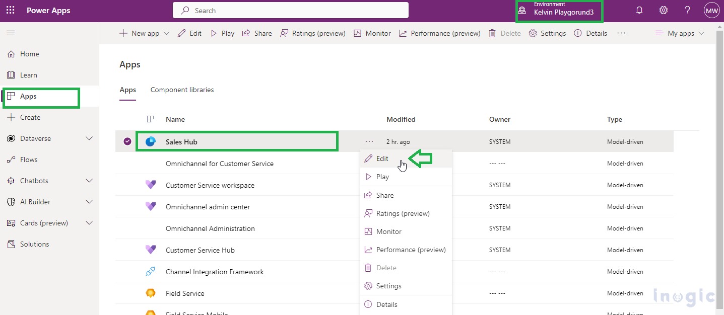
After clicking on Edit button “Sales Hub” page opens up for editing, click on “Settings” as below:
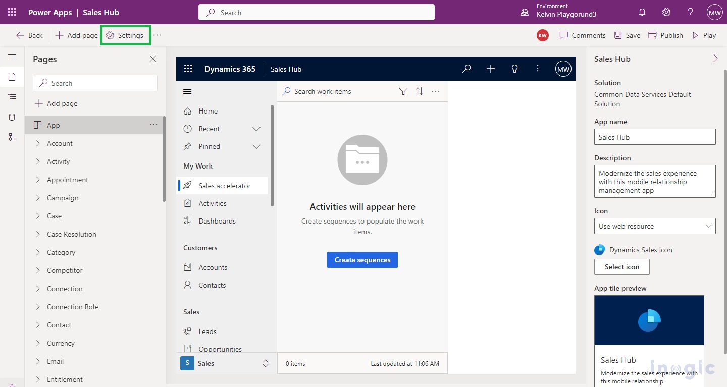
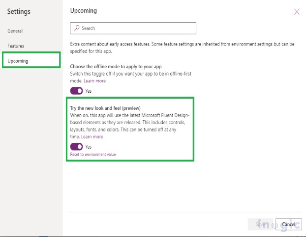
After clicking on “Settings” > click on “Upcoming” > and turn on the upcoming feature named “Try the new look and feel (preview)” as shown below:
NOTE: This is a PREVIEW feature hence, it is disabled by default, you have to explicitly enable it.
What can we expect after enabling the feature?
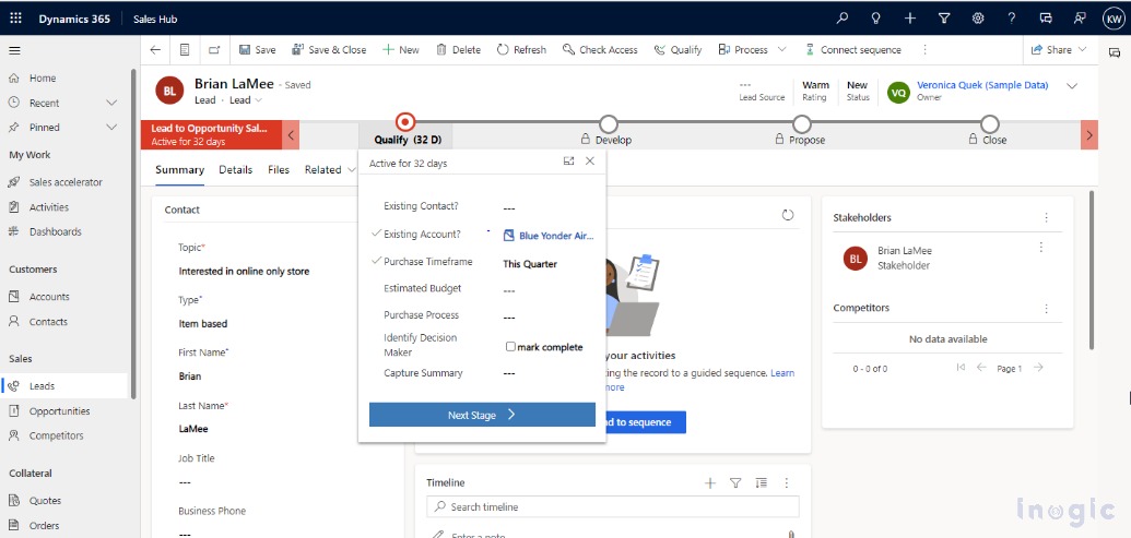
- When this feature is enabled, instantly you will observe that the fluent-based UI controls get applied to the forms, business process flows, and field controls such as text input, lookups, etc.
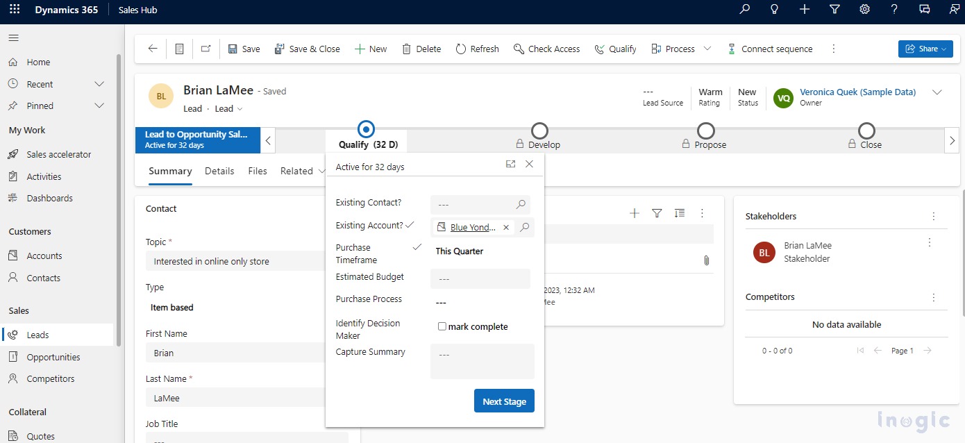
- The command bar can be distinguished as a separate section at the top of the page with a floating and elevation look and feel.
- Users can experience the modern styling and enhanced look and feel of forms where they can experience the little elevated or floating appearance of sections from the background. Due to the shadow effect users can distinctly differentiate the sections from the background.
- Also, a new Power Apps grid gets introduced while using the views.
- Input and error message styling has also been refreshed based on the fluent design.
Let us observe each enhancement in this blog as below:
Modern Floating Command Bar
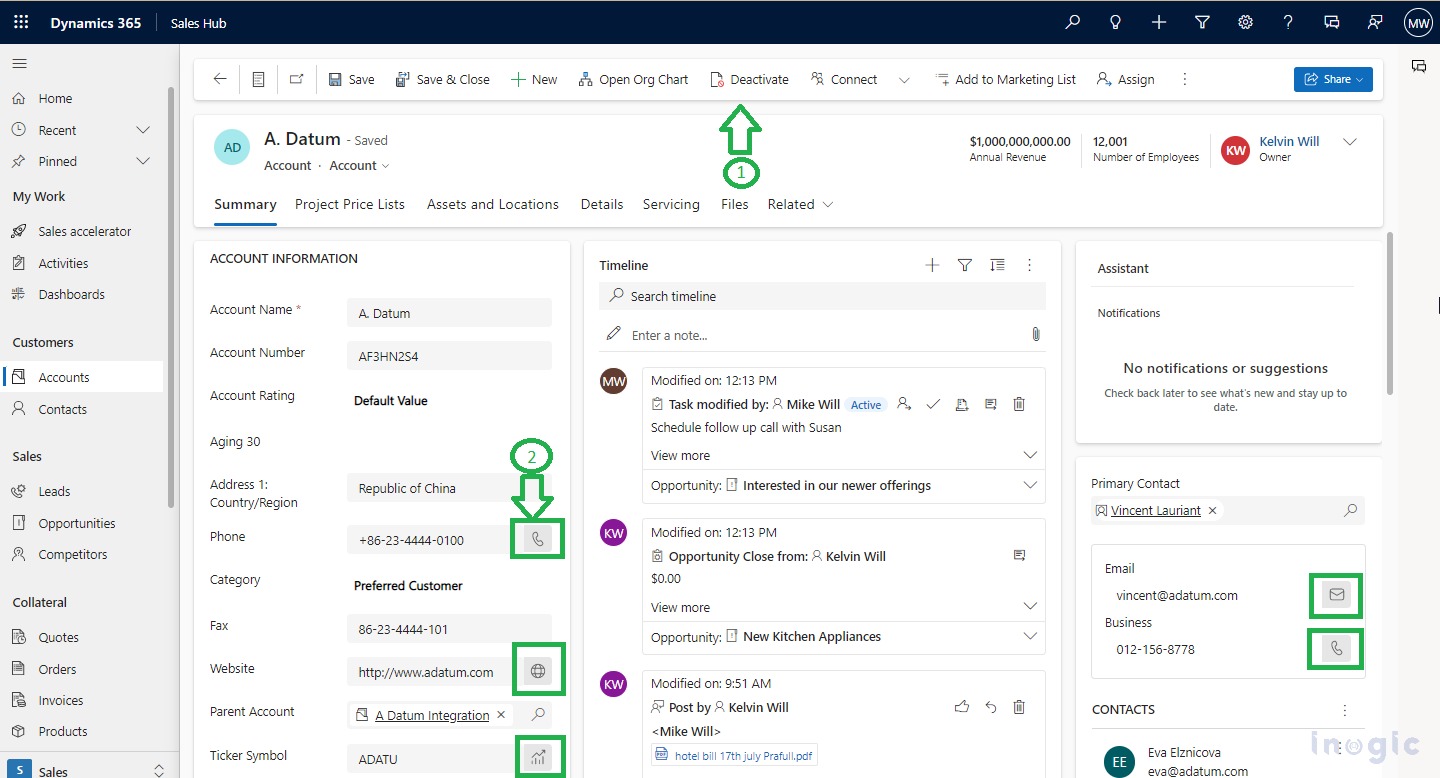
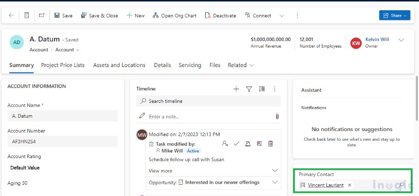
- Command bar can be viewed as a separate section at the top of the page, also the “Share” button is separately placed with an enhanced design, marked as #1 below:
Modern Field Controls
- Field controls will be modernized using fluent design, Icons have been highlighted with grey background shown on the right side of the field labels. For demonstrations, you can refer the #2 marked above.
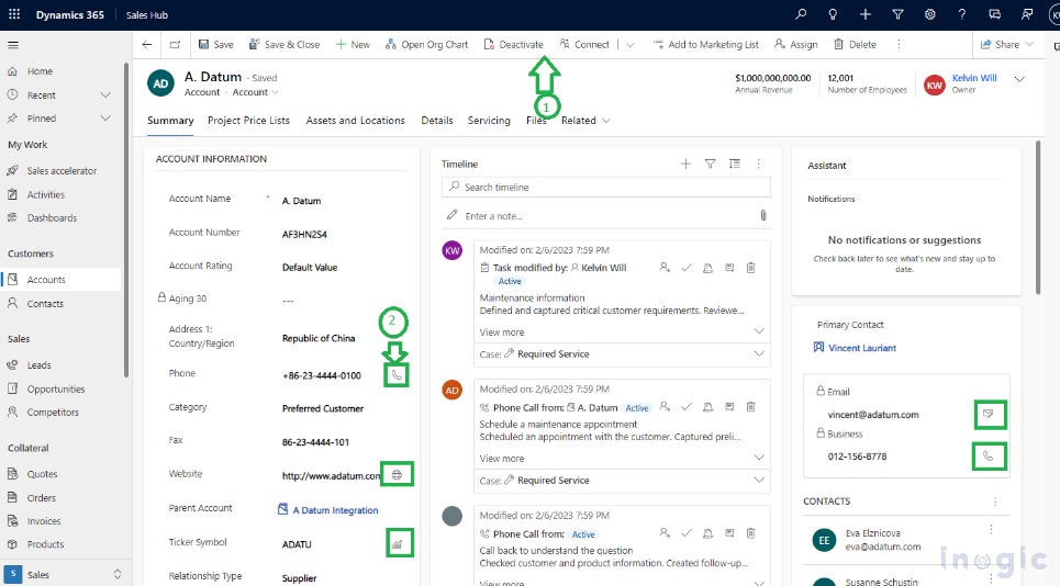
- Previously (without turning on this feature) form layout experience was as shown below:
- Field sections, which are containers for the fields on a form, have a more streamlined design. For e.g.
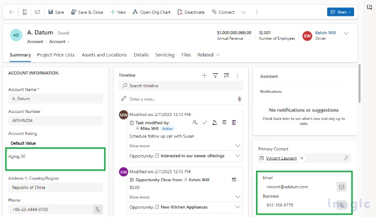
1. The explicit lock icon isn’t shown for read-only fields. You can refer to below read-only field placed on the form and on the quick view form:
2. The lookup fields are more streamlined as shown below:
Power Apps grid control introduced in View:
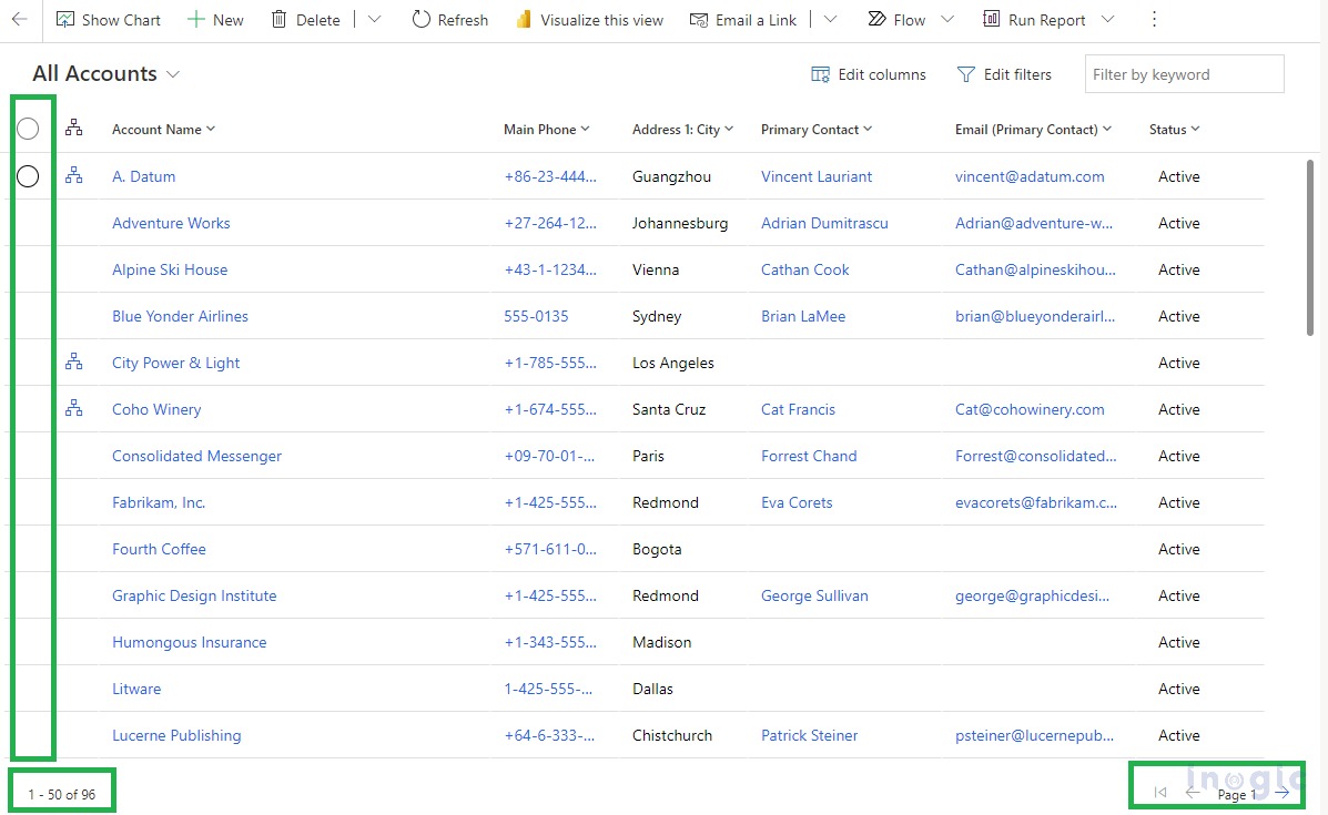
- With enhanced view control, now users can experience an elevated UI experience.
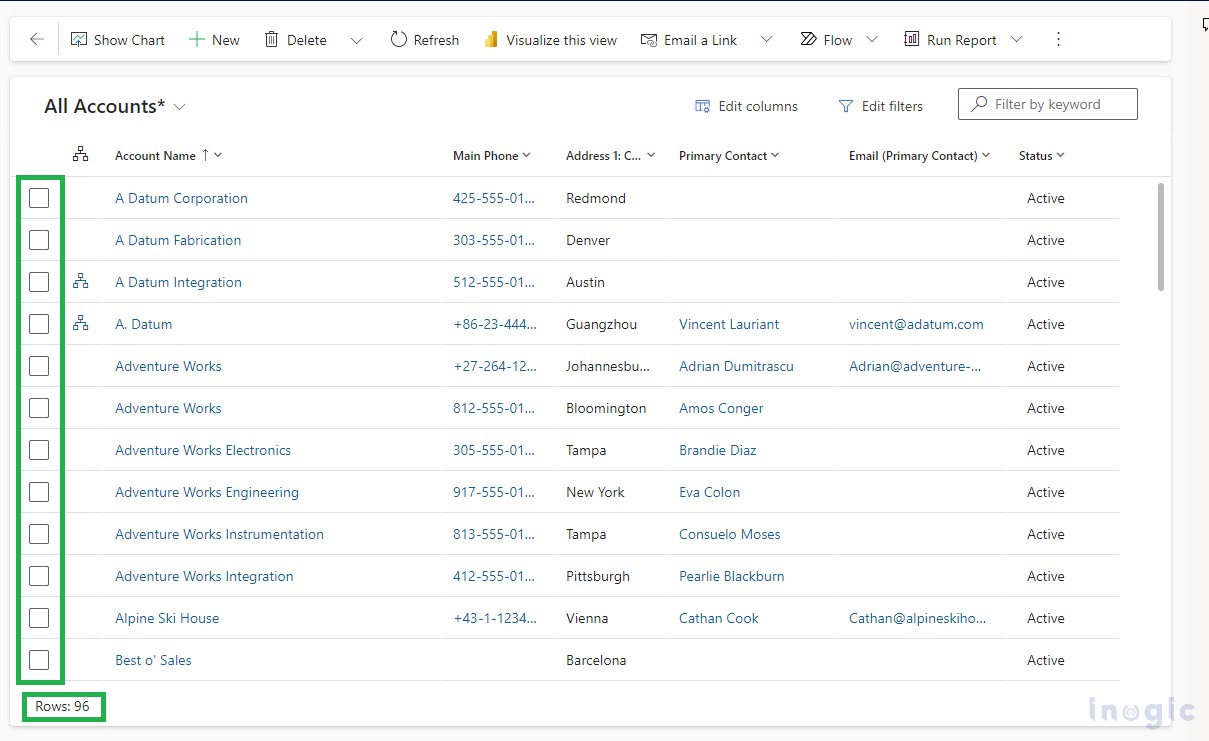
- The biggest change is Power Apps grid control incorporated which enables the infinite scrolling and no more pagination concept in modern views as shown below:
By turning on this feature:
Error messages with new fluent design:
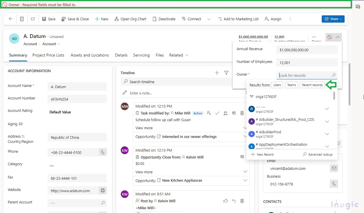
- Input and error message styling has also been refreshed based on the fluent design and shown on top of the command bar as shown below:
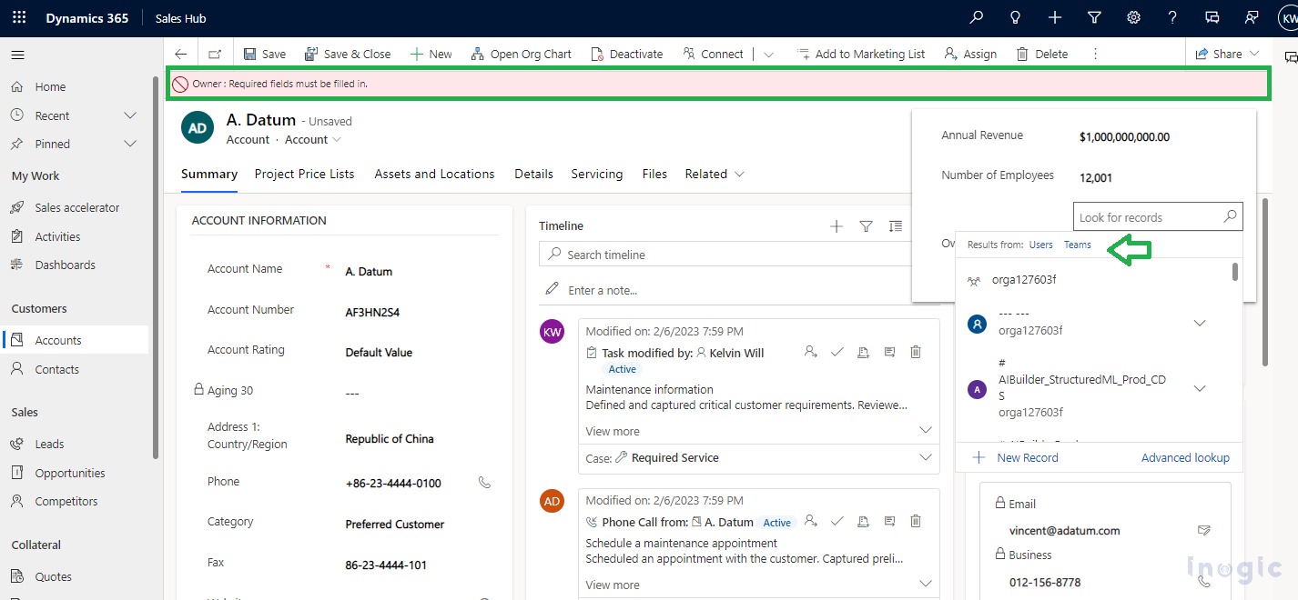
- Prior, it was shown with a different style and that too below the command bar as shown below:
NOTE: Also, while setting the Owner lookup value the elevated experience appeared while choosing a value from “Users”, “Teams” or “Recent records” which was not present before as shown with the arrowhead above. When clicking on “Recent records” the recently selected value in owner can be seen.
Few observations:
Business Process flow new look and feel:
- New Business Process Flow (BPF) look and feel can be seen in blue color with UI changes as below:
- Prior Business Process Flow (BPF) look and feel can be seen below:
Business recommended Icon changes:
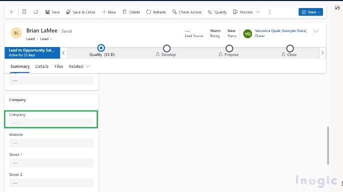
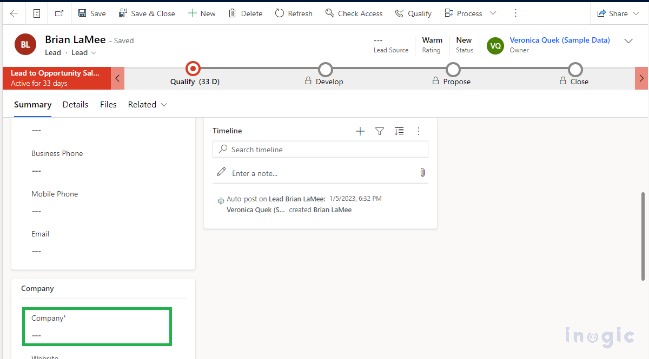
- Business recommended fields are no longer seen with the blue star icon for consistent form experience as below:
- Prior Business recommended fields are seen with a blue star icon as below:
Status indication bar with fluent design:
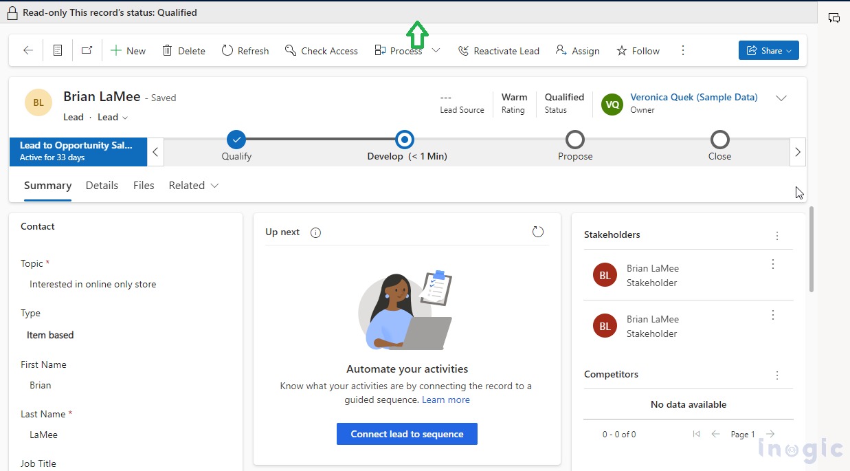
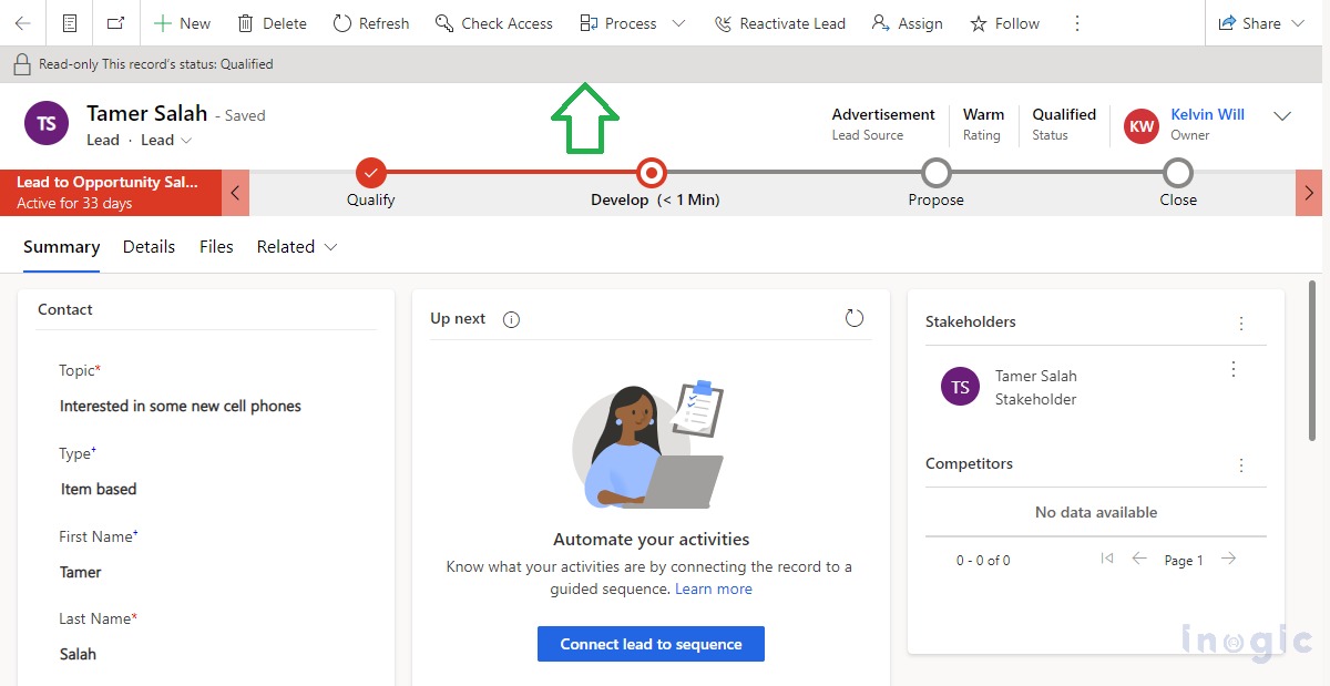
- The status indication message styling has also been refreshed based on the fluent design and shown on top of the command bar as shown below:
- Prior it was shown with a different style and that too below the command bar as seen below:
Saving progress with background shadow effect on the form:
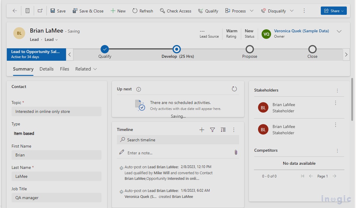
While saving the form now the experience is as below, the whole form is shadowed during the saving as below which was not there before:
You can explore more details for Modern/refreshed look and feel changes incorporated in the model-driven apps in this doc.
NOTES:
- This setting is app specific so identify for which app you want to enable this feature. As demonstrated above the refreshed UI look is applied only to the “Sales App”. You can apply it to any existing or custom app as well.
- You can turn off this setting at any time as being PREVIEW feature not recommended to try on the Production environment directly.
Conclusion
This modern new look setting provides refreshed and enhanced form and view styling. The floating/elevated shadowing using fluent designs makes the form more distinct to the user while entering the data efficiently.
Let us help you with application building!
Want to visualize and build up a Model Driven App atop your steady, working framework?
We’ll help you to add components to your Apps, breezily. Contact us at crm@inogic.com and our Microsoft Dynamics 365 and Power Platform Inogic- Professional Services Division will help you at every step of the process!”
