Reusable components or code blocks have always been the best practice to be followed to avoid re-designing or coding the same components again and again. It also ensures a single centralized location to manage updates or changes. Any change made to this component or code block will auto reflect in all programs that this has been referred from.
It also helps to create complex components that can then be reused by power users without the need to understand the logic/code behind it.
Component reusability now comes to Canvas Apps in the form of Component Libraries. As of the date of writing this article it is in Preview. In this article we will walk through creating a component and utilizing them across canvas apps (i.e multiple different canvas apps) and shipping them along.
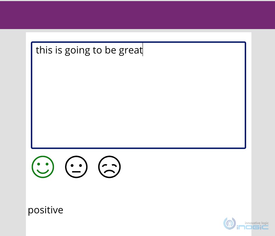
For this article we will make use of the AI builder capabilities and create a component that includes a textbox and it will do a sentiment analysis of the text entered in there and indicate the sentiment by enabling one of the three emote icons. Since it is a component, we have also added an output property where it will return the sentiment, in case the maker wants to store this sentiment in the database.
Note: To make use of AIBuilder components/api you need to ensure you have enabled AI Builder subscription. There is a trial available that you can enable for evaluation purposes.
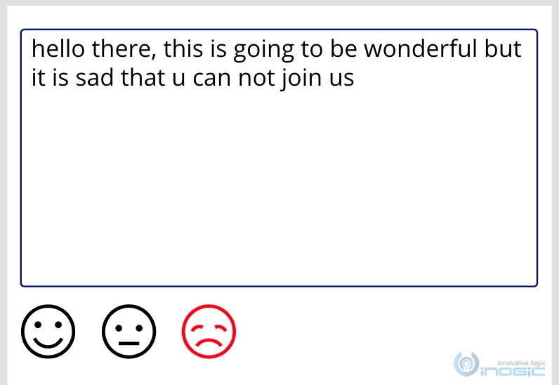
Let’s begin the design
1. Navigate to the maker portal at https://make.powerapps.com
2. Here you see the option to create Apps as well as Component Libraries,
for this exercise first we will choose Component Library
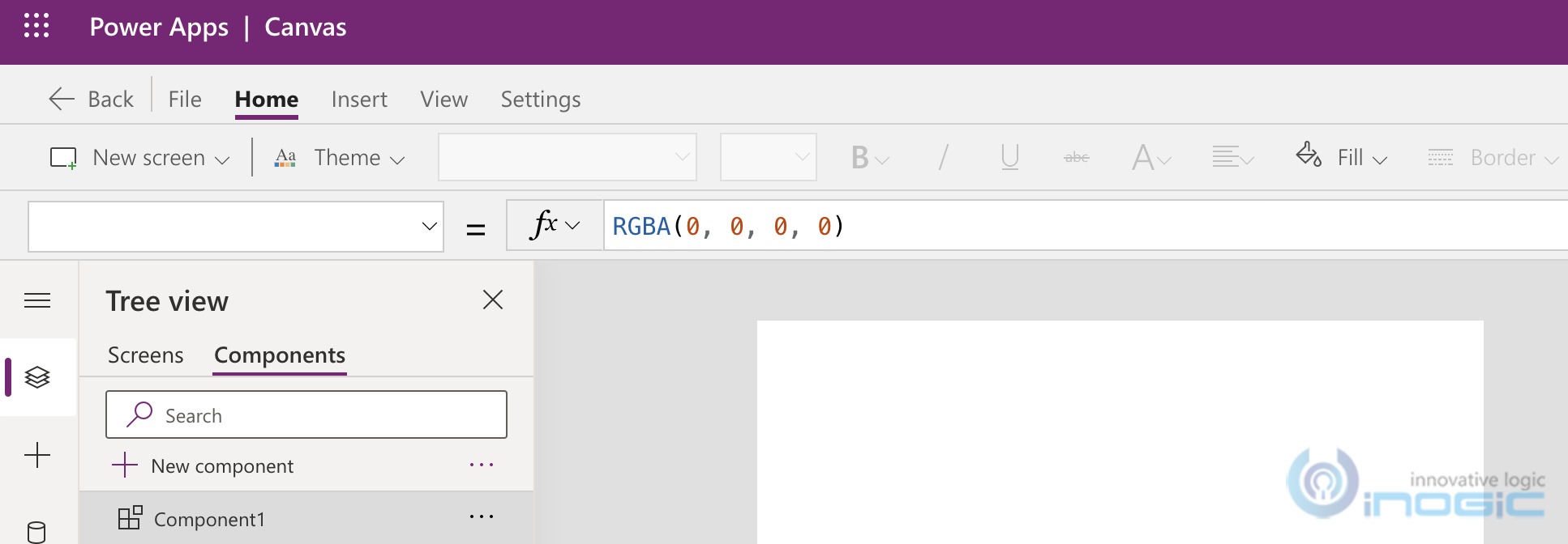
3. This will open the same familiar screen that we work on while designing our canvas apps.
4. We will focus on the Components tab. Rename Component1 to a name that you want the users to refer your control as. I have renamed it as Sentiment
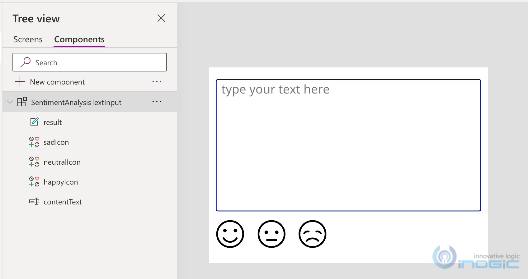
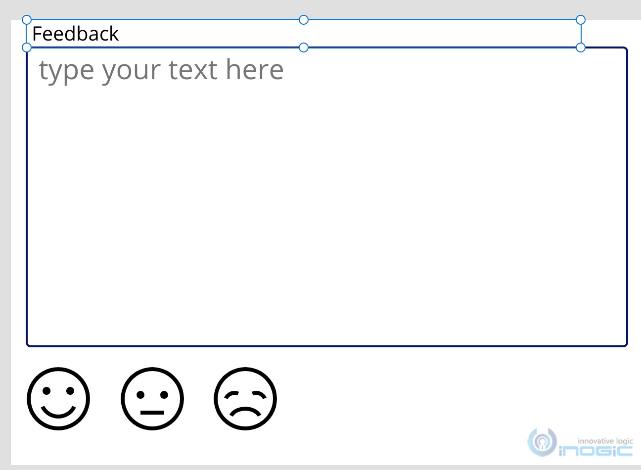
5. Designed the canvas to include a multi-line textbox to enable user input.
6. Add icons -> chose the emoticons for Happy Neutral and Sad and added them on the canvas
7. A label that cannot be seen has also been added to the canvas.
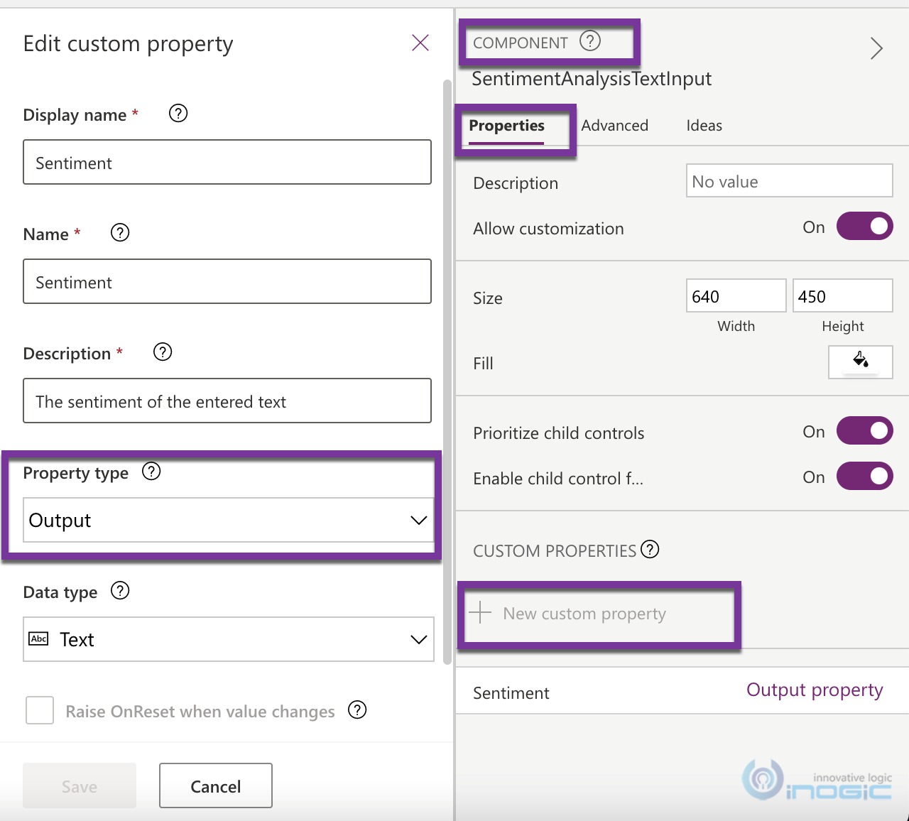
8. We will now add a property to our component that the maker can refer to the read the sentiment value of the entered text. Note since we are creating a component library, the maker that incorporates this component in their canvas app cannot directly access any of the controls placed on the canvas in the above steps. The only way for the makers to interact with our control/component is through input/output properties. For this example, we will create an output property.
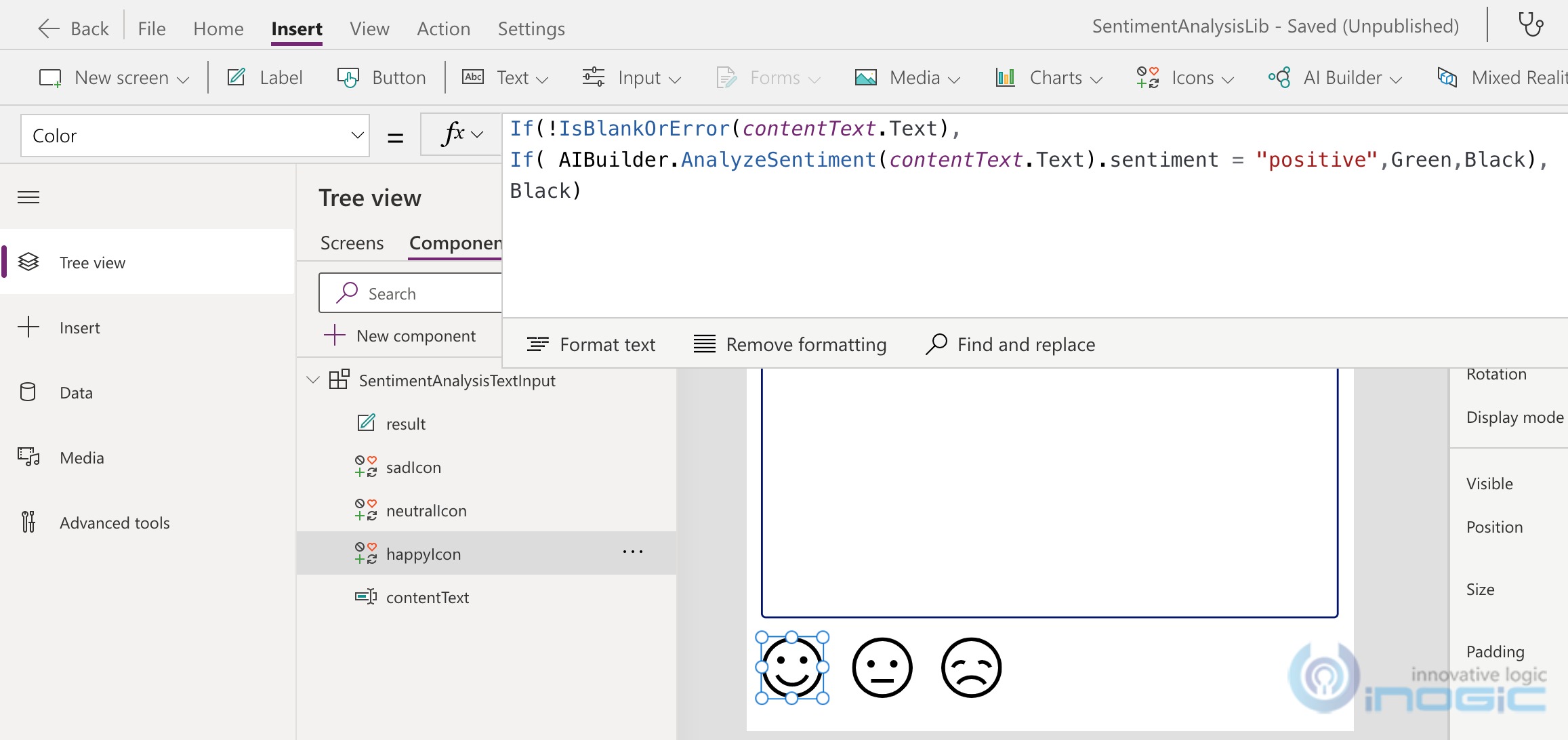
9. Now let us make all the controls functional. Depending on the text entered in the textbox, we need to highlight one of the 3 emoticons depending on the sentiment of the entered text. For this we will write the following expression on the color property of the icons
10. For the Happy icon we have
If(!IsBlankOrError(contentText.Text),

If( AIBuilder.AnalyzeSentiment(contentText.Text).sentiment = "positive",Color.Green,Color.Black),Color.Black)
The expression first checks to ensure the textbox isn’t empty before it can send the text for sentimentanalysis
If(!IsBlankOrError(contentText.Text),
If it is not empty then do the sentiment analysis on the text using the AIBuilder feature
If( AIBuilder.AnalyzeSentiment(contentText.Text).sentiment
Depending on the result, if it is positive, we set the color to Green or else keep it at Black
If( AIBuilder.AnalyzeSentiment(contentText.Text).sentiment = "positive",Color.Green,Color.Black)
11. Similarly, for the neutral and sad icons we have the following expressions set for the color property
Neutral
If(!IsBlankOrError(contentText.Text),

If( AIBuilder.AnalyzeSentiment(contentText.Text).sentiment = "neutral",Color.Blue,Color.Black),Color.Black)
Sad
If(!IsBlankOrError(contentText.Text),

If( AIBuilder.AnalyzeSentiment(contentText.Text).sentiment = "negative",Color.Red,Color.Black),Color.Black)
12. We have added a label to the canvas that will store the sentiment result. The expression for that one is
13. Now let us set the value of the output property to the value of this textbox
14. Choose the Root control – SentimentAnalysisTextInput and then in the properties dropdown you will find the Sentiment property we created earlier
Result is our label that we set in step 12 above.
15. Our component is ready. We now need to test it. Note while you are on the component, the Run icon in the command bar is disabled
16. Save the app before you proceed further.
17. To test the component, you need to switch to the Screens tab and create a test screen and include your component there to test.
18. You will find your component in the Custom command bar button
19. Choose that and it will auto add the component to the screen.
20. Now run the screen and type the text and see the appropriate icons get highlighted based on the sentiment returned
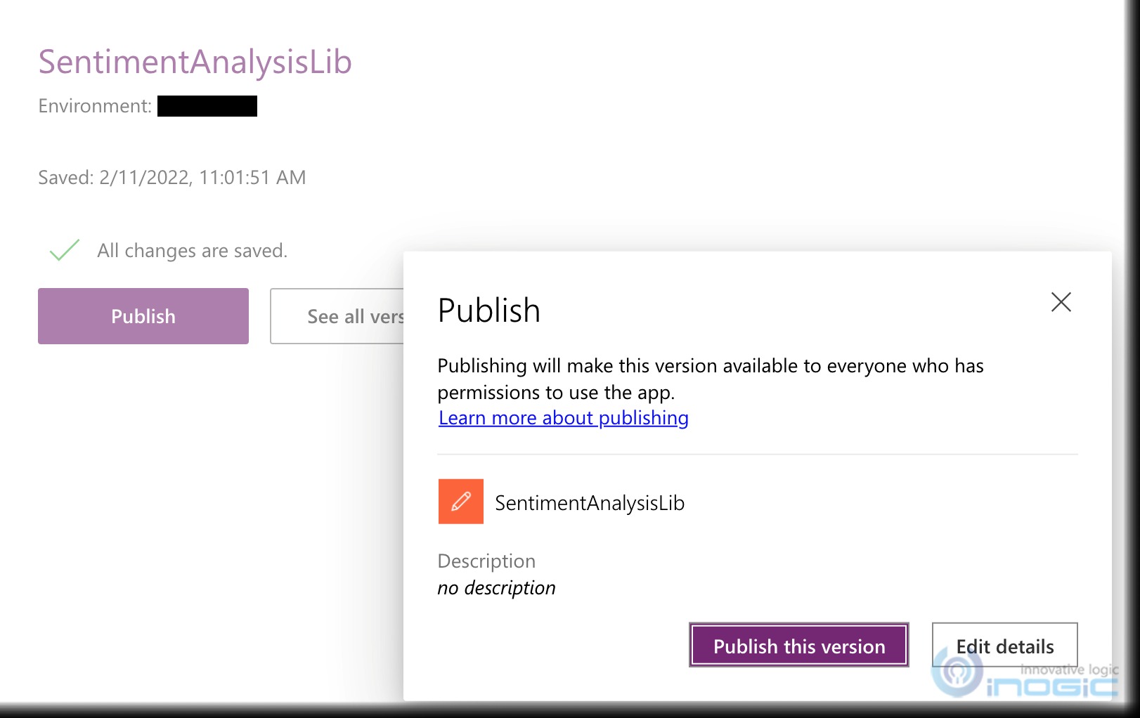
21. Publish the app component library
22. Now that our component is working, let’s use this in a new Canvas App that we will go ahead and design.
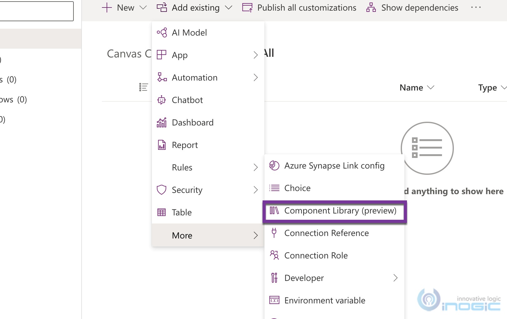
23. Create a solution and add the component to the solution
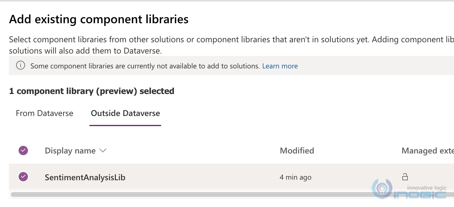
24. Since we did not create component within a solution, you will find it in the outside Dataverse tab
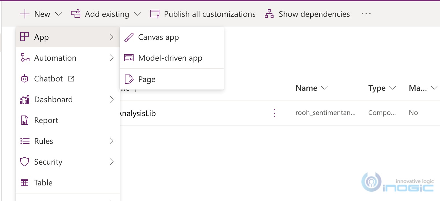
25. Add a new Canvas app to this solution
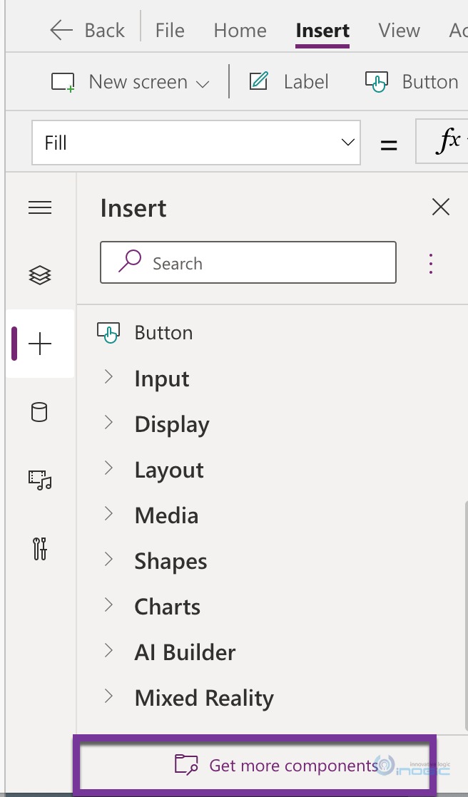
26. At present if you choose Custom components à Import Components option from the command bar, you will not see the component library listed
27. Instead choose Get More Components from the Insert side bar
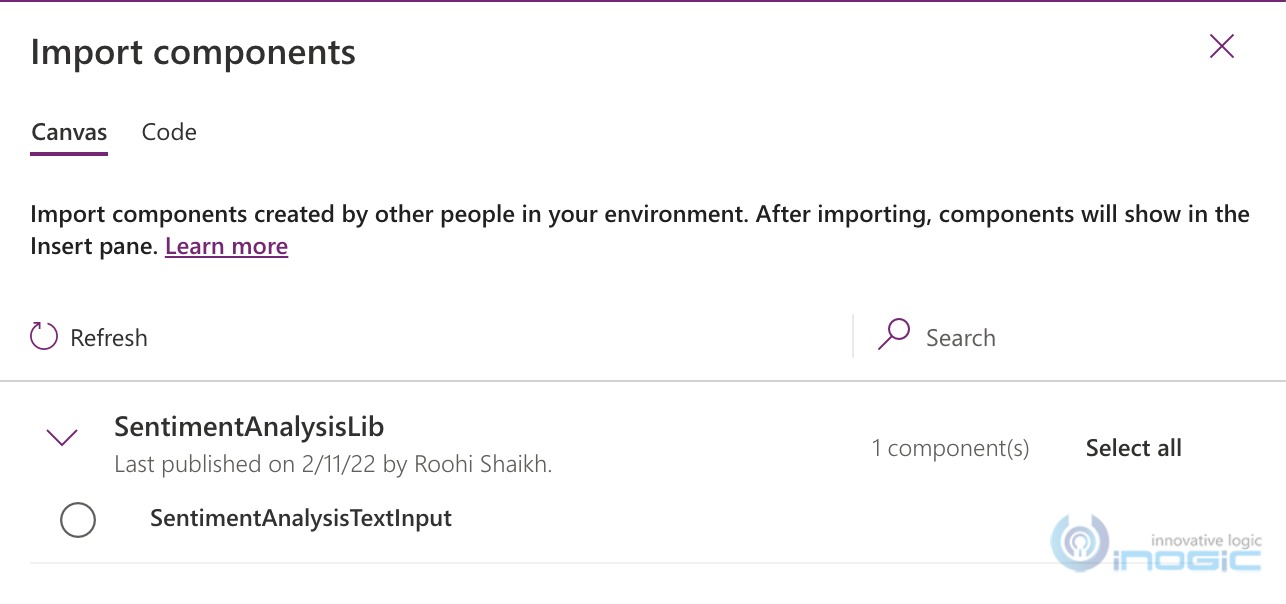
28. This will bring up the following window with your component library listed
29. Choose and click ok.
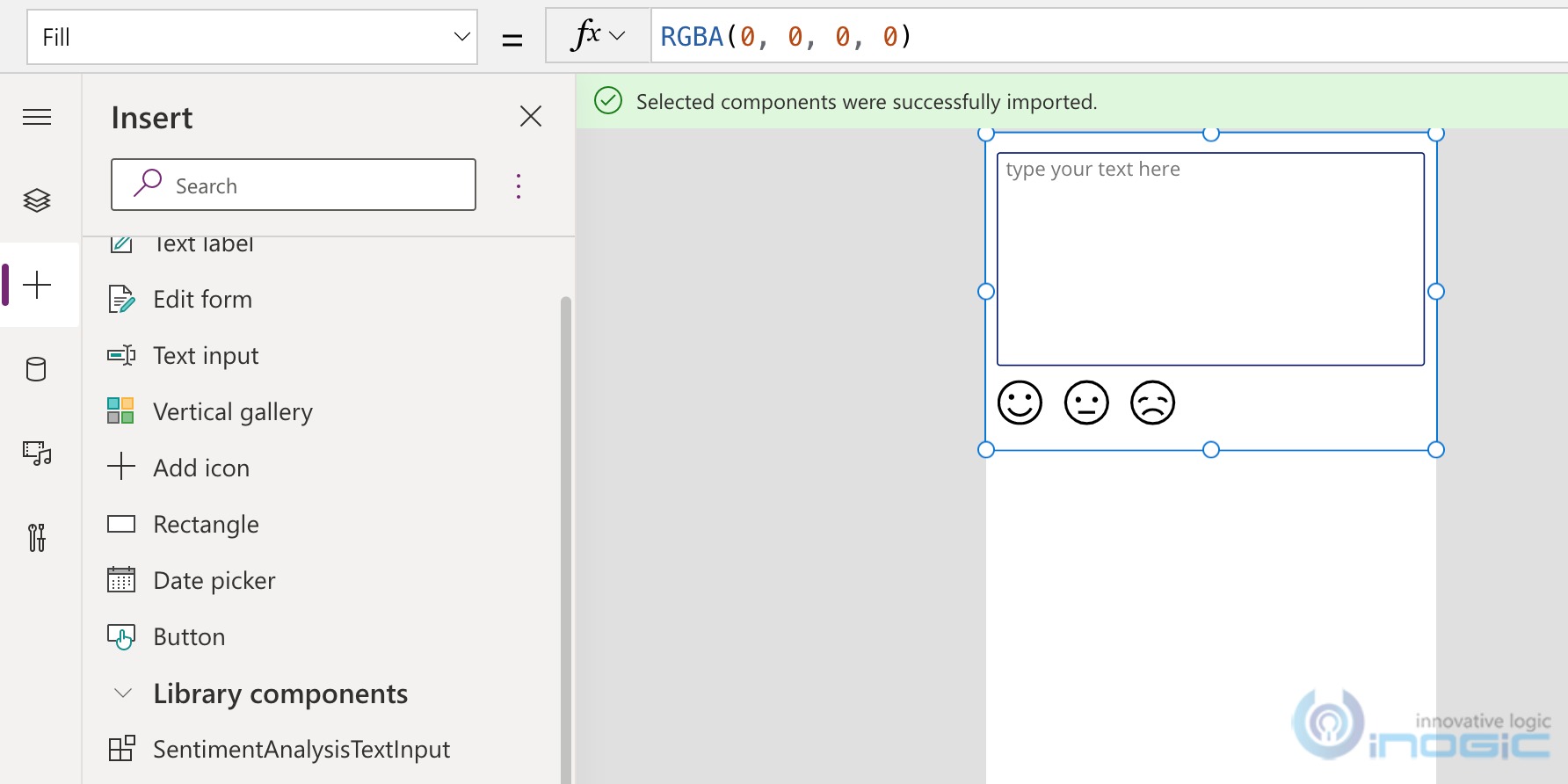
30. Back in your Canvas App Insert side bar, you now find a section for Library Components, you will find your control there. Drag and drop the control from there
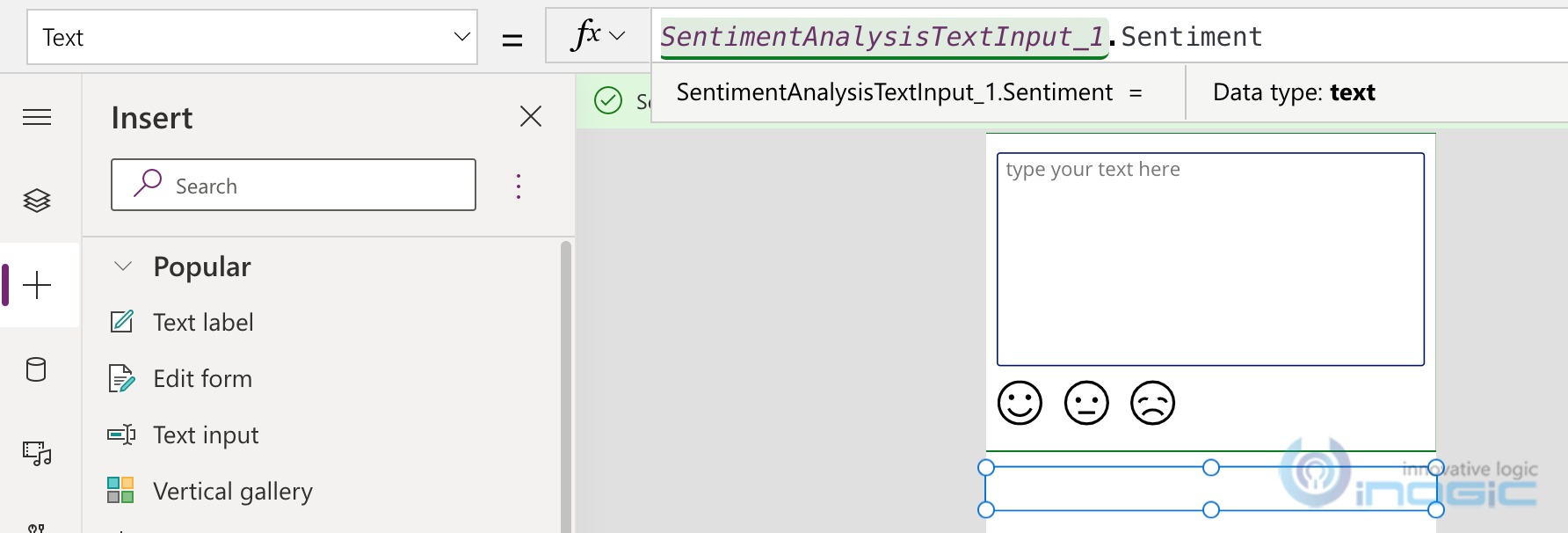
31. Now let us add another label to display the content of the output property we had created for the component.
32. Play your app and see the results.
33. Save and publish this app.
34. As component libraries are solution aware, i.e we can include it in a solution, we can easily ship our canvas app as well as the component library through solutions between environments.
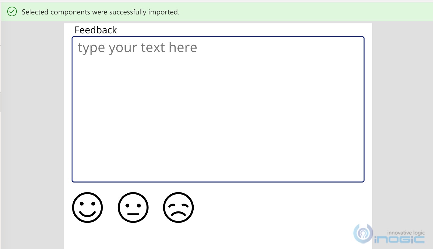
35. Now if you were to make any updates to your components in future, like say I added a label to the component and published it
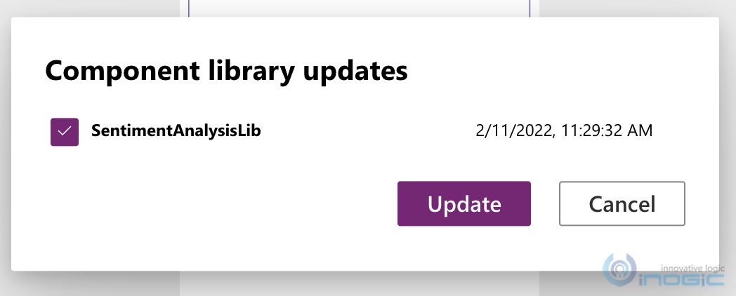
36. The app makers that have used this component will be notified of the updates
37. Click review and update to update the component to the latest version
38. And you see the label added in the design now
Conclusion:
Reusability and hiding the complexity is the key to successful adoption of low code tech by power users and citizen developers.
Save 1-2 hours or $800 monthly on scheduling and managing business travel with a geo-mapping App!
Maplytics – Integrate Map with Dynamics 365 CRM and visualize data on the map, manage sales territories, auto-schedule appointments, get optimized travel routes, track field reps in real-time, and more


