Power Apps Control Framework is what we are using these days for creating re-usable and configurable custom UI or components in Dynamics 365 Modal driven apps.
When it comes to designing a component, the Fluent UI is another Microsoft’s tool that empowers developers to use built-in controls like Button, Date Picker, Label, Slider, Textbox, etc.
If you have observed, you can find these Fluent UI controls automatically adjust to Dynamics 365 app’s default theme.
What is Dynamics 365 app’s default theme? Follow the below steps and let us first check what the default theme is.
Navigate to Advanced Settings -> Settings -> Customizations -> Themes
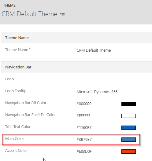
From the list of themes, open the “CRM Default Theme” which is the default theme of the application. Dynamics 365 app uses these colors in different areas of the application.
However, from this list of colors, you will see the main color throughout your application is the above highlighted “Main color”. Now, let us check where you generally see this color.
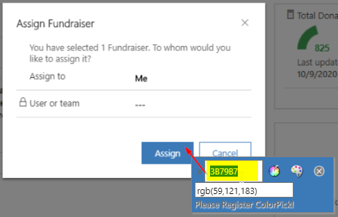
Open any entity record, click on “Assign” button, and just observe the color of “Assign” button. It is the same as that of the main color i.e. #3B79B7.
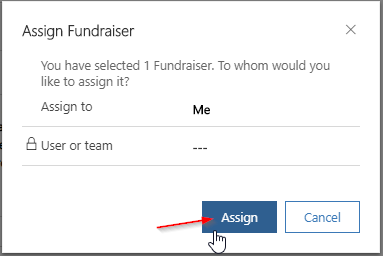
Now, hover on the button and just observe if there is any color difference. Yes, there is a difference in color. Button hover color is a bit darker. This darker color is not present in the default theme record. This is an automatically generated color based on the main color.
As mentioned above, the Fluent UI controls by default uses the same default theme scheme for the controls. Therefore, we always prefer and recommend you to use Fluent UI controls while working with Dynamics 365.
Customer may want their business application (Dynamics 365) match with their branding and color scheme. That is why the Themes capability is added to Dynamics 365.
Let us change the main color in theme and see how the button looks like. (Note: If you want to make any changes in the Theme, copy existing theme and make changes in the new theme.)
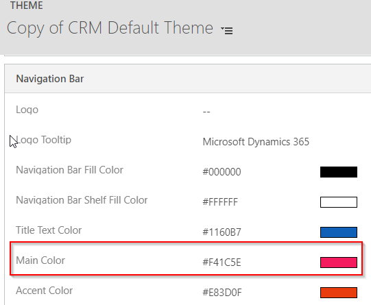
Change the main color in copy of the CRM Default Theme to #F41C5E
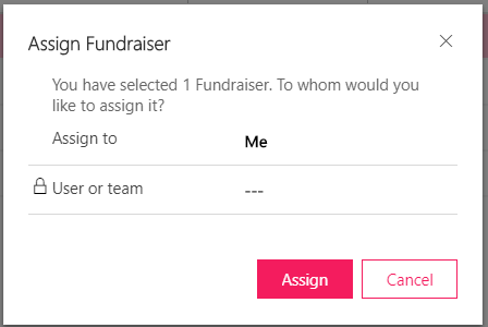
After publishing the theme, button starts to appear as below,
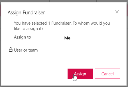
On hover, the color is a bit darker,
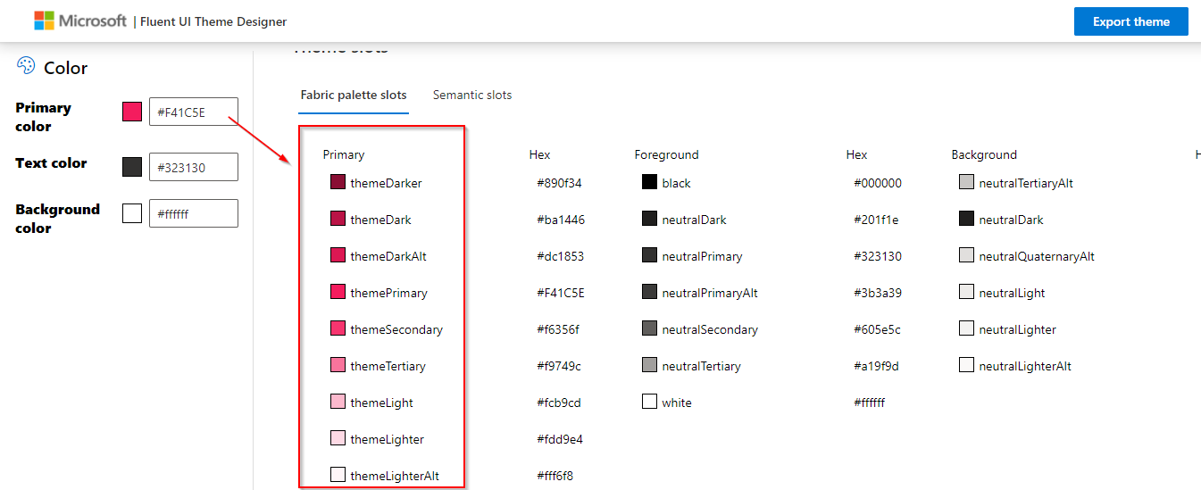
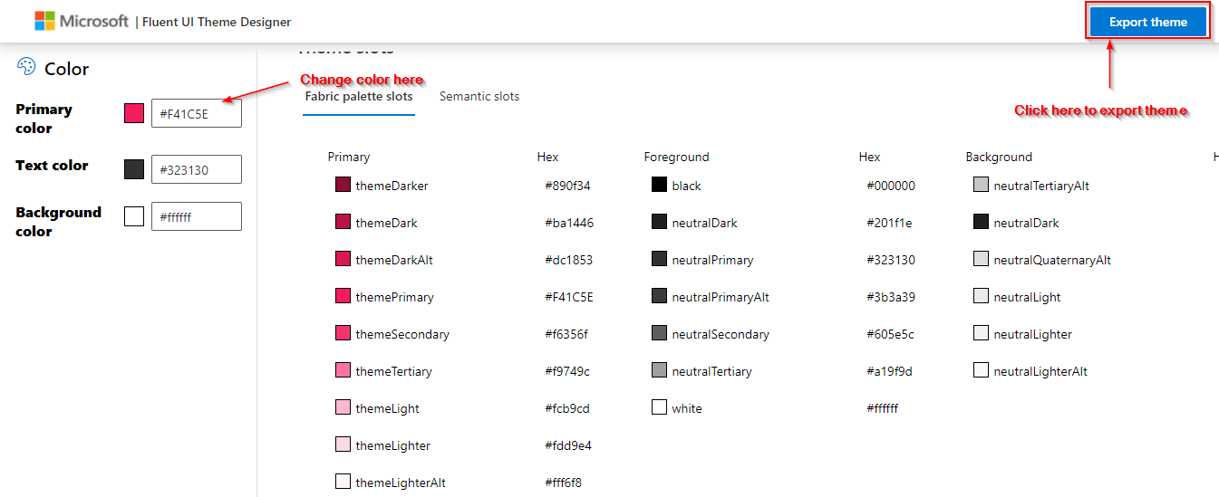
Initially, I wondered where this darker color is coming as it is not defined anywhere in the Theme record. Later I found out the logic behind it. Based on the main color, Fluent UI Theme generates different shades of the color. Try Fluent UI Theme Designer and change the default primary color; you will see the different color slots.
How can we include this behaviour to our Fluent UI control that is being used in PCF or webresource?
Because change in the theme main color will not reflect in our custom developed PCF controls or webresource. It will still appear in the default theme color.
In this blog, I will illustrate how we can apply Dynamics 365 app theme’s main color scheme to Fluent UI controls in Power Apps Control Framework.
I am dividing this article into two parts. In this first part, I will show you how to match Dynamics 365 app theme in PCF control when the main color is known, and in the second part I will explain what if the main color is not known and needs a dynamic theme for custom UI.
Match Dynamics 365 App theme in PCF control when the main/Primary color is known
You are developing a control specifically for one particular customer and you just need to customize for this single customer branding and color. In this case, we already know what color we want to use for controls and it is not necessary to be dynamic because it is going to be develop for the single customer.
Let us see how we can achieve this,
Create PCF control and add Fluent UI controls
First, create PCF control or webresource and add Fluent UI Controls. You can find various resources over the internet to get started with PowerApps Component Framework and Fluent UI. If you have any existing PCF with Fluent UI project open and get started with that.
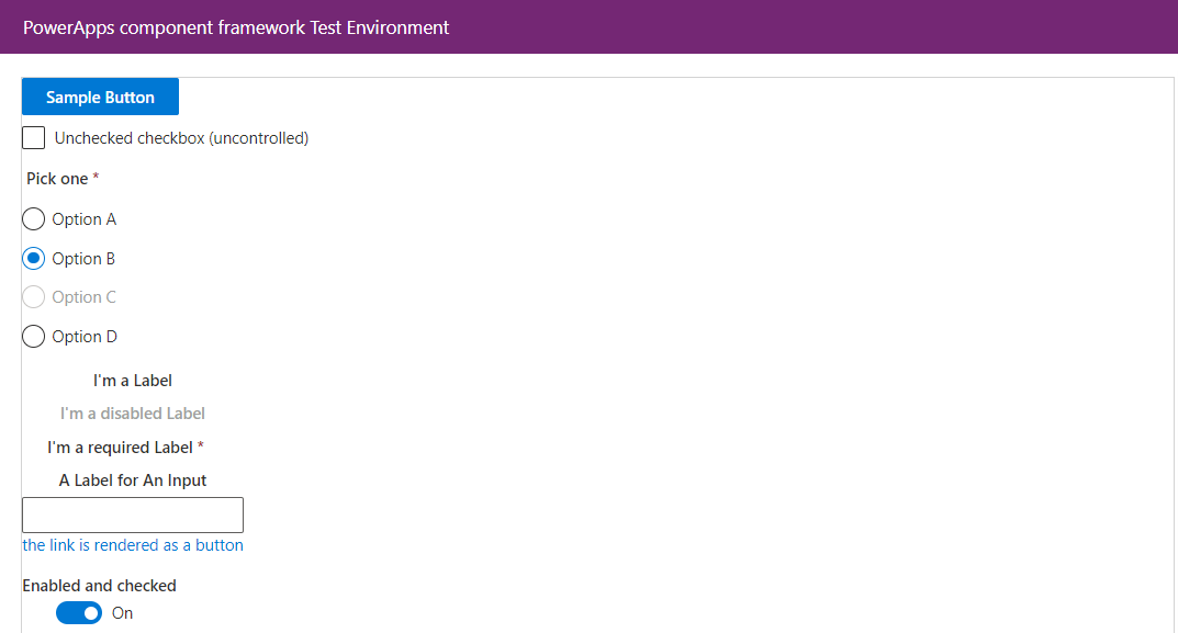
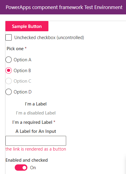
To demonstrate, I have added Fluent UI controls as shown below,
Design Theme using Fluent UI Theme Designer
Use Fluent UI Theme Designer to generate theme. Change the Primary Color and click on Export Theme button.
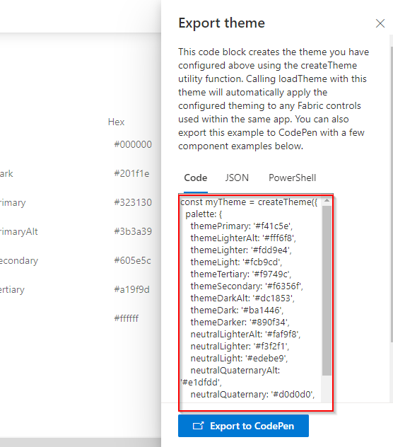
This will open a panel that will provide us auto-generated code. This code we will use in our Fluent UI Project. To get a better understanding you can try and run this in Code Pen using “Export to CodePen”.
Update project to load this new theme
Add the import statement as shown below in your root component of the project. Root component is the container for all the controls used in the project.
import { loadTheme, createTheme } from ‘@uifabric/styling’;
Then add generated code by Fluent UI Theme designer.
const myTheme = createTheme({
palette: {
themePrimary: ‘#f41c5e’,
themeLighterAlt: ‘#fff6f8’,
themeLighter: ‘#fdd9e4’,
themeLight: ‘#fcb9cd’,
themeTertiary: ‘#f9749c’,
themeSecondary: ‘#f6356f’,
themeDarkAlt: ‘#dc1853’,
themeDark: ‘#ba1446’,
themeDarker: ‘#890f34’,
neutralLighterAlt: ‘#faf9f8’,
neutralLighter: ‘#f3f2f1’,
neutralLight: ‘#edebe9’,
neutralQuaternaryAlt: ‘#e1dfdd’,
neutralQuaternary: ‘#d0d0d0’,
neutralTertiaryAlt: ‘#c8c6c4’,
neutralTertiary: ‘#a19f9d’,
neutralSecondary: ‘#605e5c’,
neutralPrimaryAlt: ‘#3b3a39’,
neutralPrimary: ‘#323130’,
neutralDark: ‘#201f1e’,
black: ‘#000000’,
white: ‘#ffffff’,
}
});
To apply this theme call loadTheme() by passing above theme object immediately at app startup before any app code executes.
loadTheme(myTheme);
Run and test changes:
This will automatically apply theme to all the Fluent UI controls in the app.
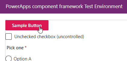
If you hover on the control, you will see darker shade of the color, which match with Dynamics 365 app theme.
Override applied theme styling:
Sometimes you may want few components of the app off theme or with different styles. This you can do by simply applying style to individual control using styles property or using className. Refer following link to learn different ways of applying style to component:
https://github.com/microsoft/fluentui/wiki/Component-Styling
Conclusion:
We see how we can change default theme of Fluent UI Components and match with custom Dynamics 365 App theme when we know the theme is going to be static.
I hope this will help you.
In the next part of this blog, I will show how to match Dynamics 365 App theme in PCF where the theme color is not going to be static and need to be changed dynamically based on the main color defined in the Dynamics 365 Theme record.

