Introduction
In our previous blog, we have seen how to create a PCF dataset grid control to replace the Dynamics 365 CRM OOB grid. In this blog, we will see how to create a configurable PCF Control where few parameters would be taken from the user which will be used in our control.
Recently, we had a requirement where we wanted to show records in the form of cards. But then the following question raised – Which fields should be shown on the cards?
As seen in our previous blog we get all the column values present in a view but what if there are 10-15 columns in a view. If we show all the 10-15 field values then the card size may get very big and we would not be able to show many records. Similarly, there were many such scenarios where the use of existing column value would hamper the consistency or standard look and feel of the cards.
So, we decided to create a configurable control where the values that the user wants will be chosen by the user.
For such scenarios, the first thing that pops up in mind is to create an entity for configuration and retrieve the provided field values using retrieveMultiple(). But there is a better way to get additional column values in PCF, which is by using property-set to get columns that are not present on view columns.
Prerequisites:
- Microsoft PowerApps CLI should be installed.
- React JS basic knowledge.
- Should be familiar to create Basic dataset control.
Overview:
What is Property-set and Property?
Property-set: When you want additional column data and want user to choose those values we can use property-set
Syntax –
<property-set name=”userChoiceData1″ display-name-key=”User choice data 1″ description-key=”userChoiceData1″ of-type=”SingleLine.Text” usage=”bound” required=”true” />
Property: When you want some static value from the user we can use the property. Given below is an example of how to use the property.
Syntax-
<property name=”userChoiceStaticValue” display-name-key=”User Choice Static Value” description-key=”userChoiceStaticValue” of-type=”SingleLine.Text” usage=”input” required=”true” />
Attributes Descriptions for property-set and property tag:
of-type – Defines which datatype you want the user to be able to select from. If you want more than one data-type you can use type-group. Given below is an example on how to make and use type-group.
For Example: Type group tag is used in ControlManifest.Input.xml file. Here, we have made a type group to support Currency and Boolean datatype field for configuration.
<type-group name=”SupportedFields”>
<type>Currency</type>
<type>Boolean</type>
</type-group>
usage: Will be bound for property-set and input for property tag.
required: Whether it is compulsory for the user to select option?
To know more about the attributes please follow the following link.
Where to configure Property-set and Property?
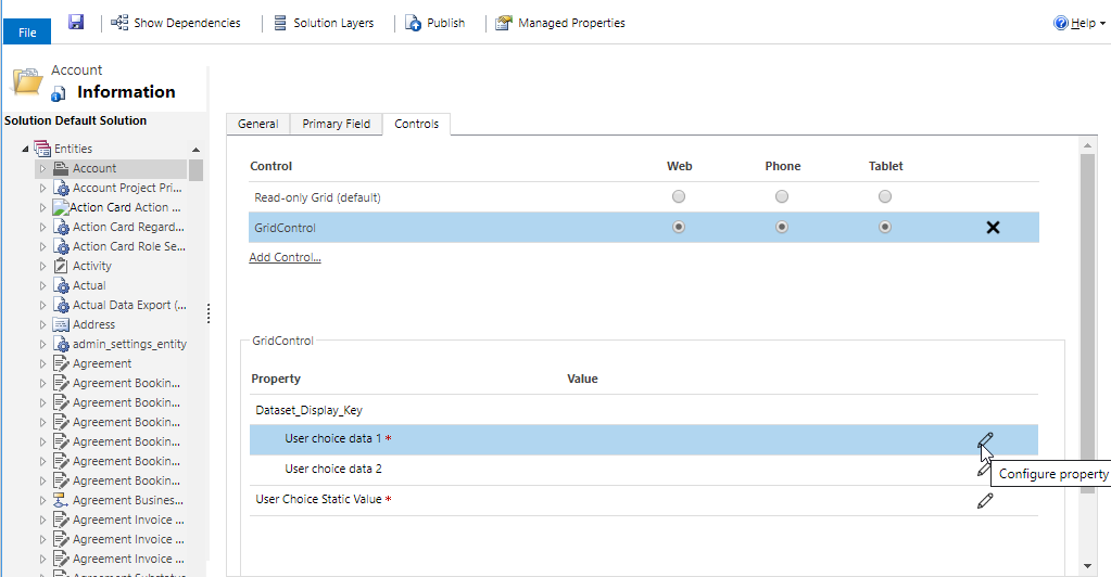
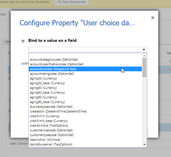
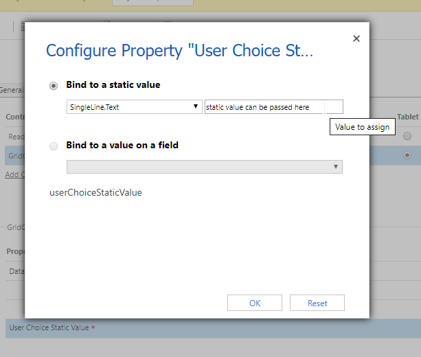
When the user tries to configure our Custom grid on Entity, the user will get the choice to select entity fields as shown in the below screenshot:
For Property-set:
For Property:
After configuration:
Code Implementation:
You can refer to our previous blog for index.ts and react component code. Only changes are in ControlManifest.Input.xml file.
Given below is the ControlManifest.Input.xml file in which we add the property-set and property tag and also create a type-group.
In type-group you can see there different tags called type whose values are data-type of fields.
In conclusion, a type-group is a collection of various data types that can be used in a property-set and property tag attribute for providing the option for the user to select different data-type fields for configuration.
ControlManifest.Input.xml –
<?xml version=”1.0″ encoding=”utf-8″ ?>
<manifest>
<control namespace=”Inogic” constructor=”GridControl” version=”0.0.1″ display-name-key=”GridControl” description-key=”GridControl description” control-type=”standard”>
<type-group name=”SupportedFields”>
<type>Currency</type>
<type>DateAndTime.DateAndTime</type>
<type>DateAndTime.DateOnly</type>
<type>FP</type>
<type>Multiple</type>
<type>OptionSet</type>
<type>Decimal</type>
<type>SingleLine.Email</type>
<type>SingleLine.Phone</type>
<type>SingleLine.Text</type>
<type>SingleLine.TextArea</type>
<type>SingleLine.Ticker</type>
<type>SingleLine.URL</type>
<type>TwoOptions</type>
<type>Whole.None</type>
</type-group>
<!– dataset node represents a set of entity records on CDS; allow more than one datasets –>
<data-set name=”sampleDataSet” display-name-key=”Dataset_Display_Key”>
<!– (property-set) Get user choice columns added in view columns –>
<property-set name=”userChoiceData1″ display-name-key=”User choice data 1″ description-key=”userChoiceData1″ of-type-group=”SupportedFields” usage=”bound” required=”true” />
<property-set name=”userChoiceData2″ display-name-key=”User choice data 2″ description-key=”userChoiceData2″ of-type-group=”SupportedFields” usage=”bound” required=”false” />
</data-set>
<!– (property) Get static/hardcoded value by user –>
<property name=”userChoiceStaticValue” display-name-key=”User Choice Static Value” description-key=”userChoiceStaticValue” of-type=”SingleLine.Text” usage=”input” required=”true” />
<resources>
<code path=”index.ts” order=”1″/>
</resources>
</control>
</manifest>
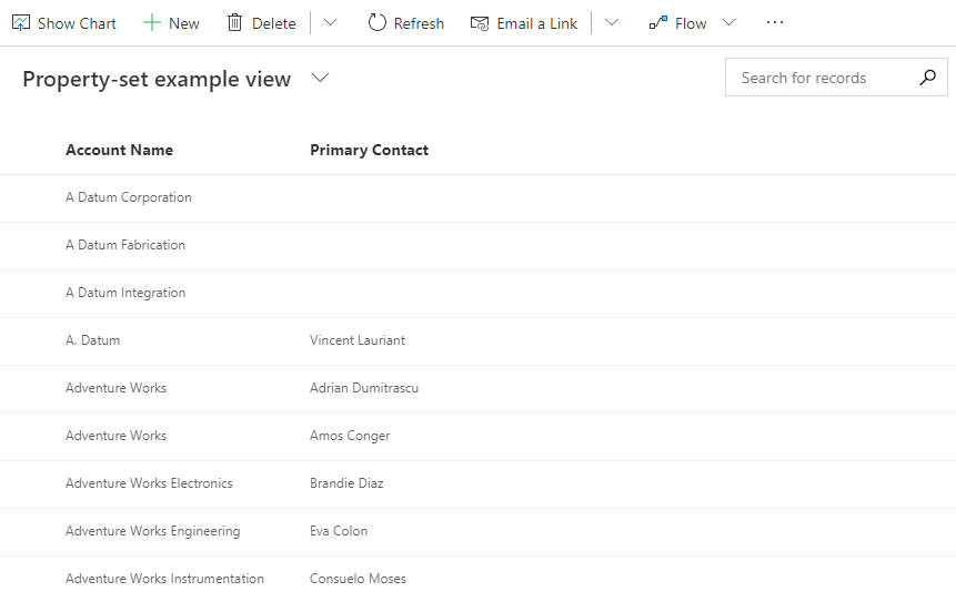
Before configuring property set there were only two columns on view.
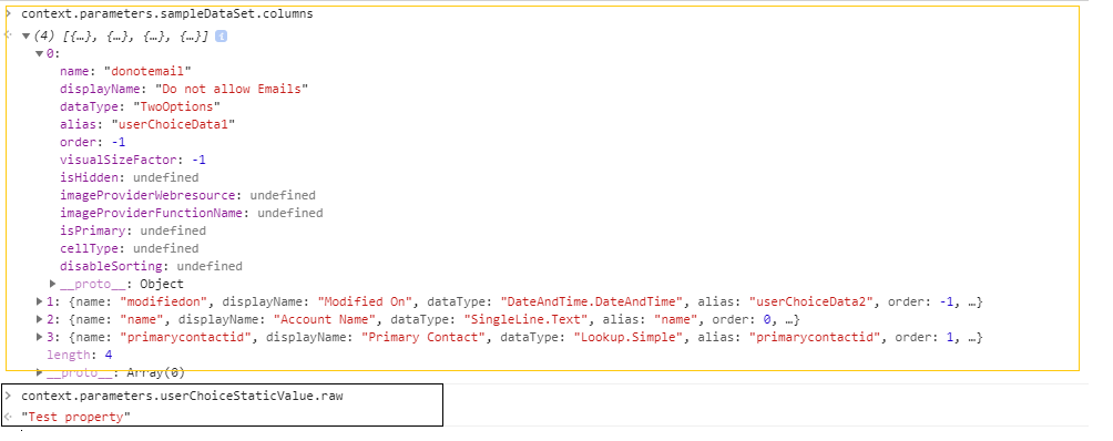
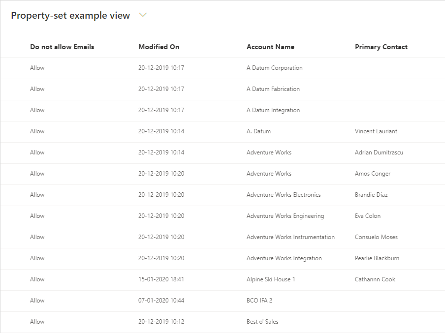
After user-configured dataset control, you can see in the below screenshot, an additional two columns are being loaded in context.parameters.sampleDataset.columns i.e. ‘DoNotEmail’ and ‘Modified On’.
To know which column is mapped to which property-set we can use alias value i.e. if you want to check which field is selected to User Choice data 1 the alias name of the column would be the property-set name.
To get the property value you would have to write context.parameters.userChoiceStaticValue.raw to get the user-entered value.
Note: In context.parameters.userChoiceStaticValue.raw, userChoiceStaticValue is property tag name defined in ControlManifest.Input.xml file.
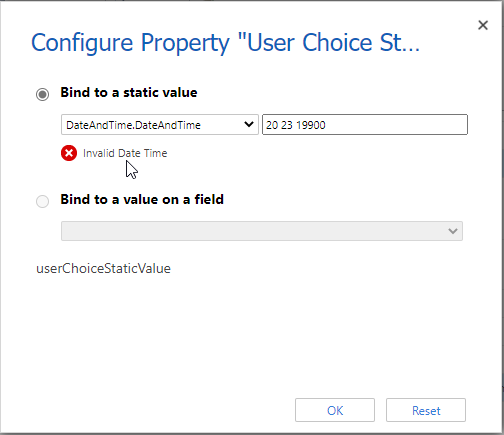
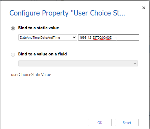
There is default validation by Dynamics 365 CRM on property configuration based on datetype.
For Example, in the below screenshot I want user to enter DatetAndTime value. So I specified property type as DateAndTime. More similar validation can be done such as if you want numeric input from user, you can specify type as Whole number.
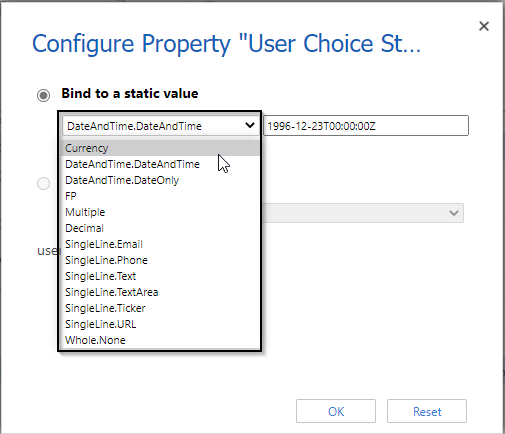
Given below are the supported data-type for property type. For property-set please refer the following link.
Final Component:
After deploying your control and configuring it on the entity you will see the OOB Grid has been replaced with our own configurable React Fluent UI Detail List Grid.
Conclusion
Thus, as illustrated above you can now make a user-configurable Dataset Control with ease.
Generate Your Own New Leads Within Microsoft Dynamics 365 CRM
Contact us for a demo to know more about how Maplytics can help you to generate new leads from within Microsoft Dynamics 365 CRM.
Maplytics is a 5-star rated, preferred business app on the Microsoft AppSource that is Certified for Microsoft Dynamics 365 (CfMD) and comes with powerful features like Appointment Planning, Sales Routing, Territory Management, Heat Maps, Geo-analytical Dashboards and more that empower organizations to add more value to their CRM data, improve sales & service processes, and achieve high ROI.
Get your free trial from our Website or Microsoft AppSource!
‘If data is the new oil, location intelligence is ??”
