Introduction:
Enhanced Reference Panels is now available in UCI/UII Client.
Reference panel have been around for a couple of versions now. However, it has gone mostly unnoticed and under-utilized. Reference panels are a good way to organize sub-grid information without utilizing too much of the screen space. It is compact and allows quick access to information.
Reference Panel is a type of a section and can be found under Section tab in the form designer. You can insert sub-grids and quick view forms only under this section, for more details you can refer our previous blog.
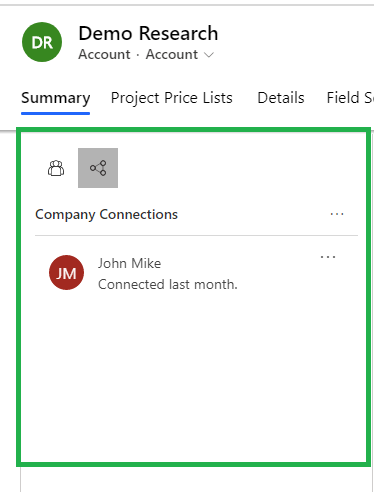
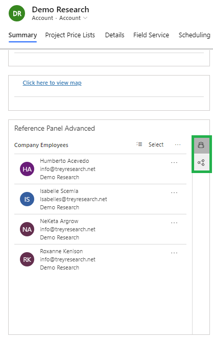
When rendered in the current version, this is how it shows up:

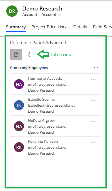
With the latest release, some of the enhancements include:
1) Display – You can switch between the panels using panel selector that docks either at the left or at the top depending on screen resolution.
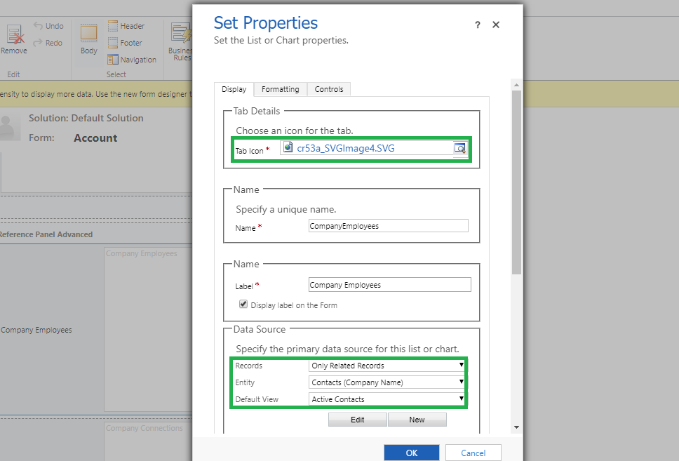
2) You are now allowed to specify the image file for the icons that are displayed in the tab as shown below:
Note: Providing a .svg file provides for better presentation. Hence, it is advised to switch to svg images for all icons in Dynamics 365 CRM.
3) Once the grid is added to the panel, along with the native behavior of grid with options to add new record, you now have the ability to get a quick view of any of the records in the grid by simply clicking on the record as shown below:
Given below is the screenshot of quick view form:
You can open multiple records and they are displayed as tabs that you can switch between, as shown in below screenshot:
The data shown in these tabs is based on the default quick view form designed for the entity.
Conclusion:
Next time you work on a form design, make use of the reference panels to make it a clean and compact interface!


