Introduction
Similar to the components that we can create for model driven PowerApps using the PowerApps Component Framework, it is also possible to create components within Canvas Apps as well. A component once created with Canvas App can be reused across apps and screens following the ‘Build once and reuse multiple times’ approach. In this article we will walk you through the steps to create a Number Control that provides the following options:
- Ability to set the Min value acceptable in the control.
- Set the max valid value for the control.
- Increment/Decrement buttons to update the value.
App Settings
Note: The ability to create components in Canvas App is not enabled by default.
In order to enable the option to create components in Canvas App, follow the steps given below:
- Navigate to File -> App Settings –> Advanced Settings -> Scroll down to Components option and enable Components option.
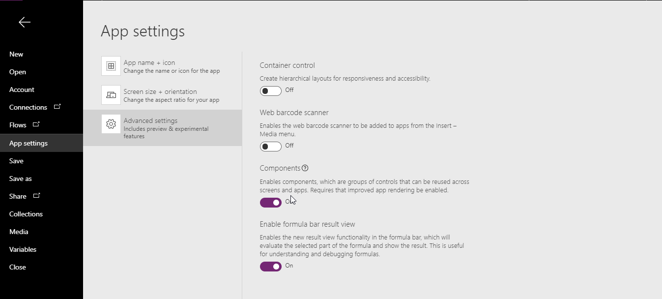
With this option enabled you will now see the new ‘Components Tab’ in the tree view. We will now use the Components tab to add a new component. Once the component is created, you can quickly add them to your screen and test it from there.
From the Components tab/ribbon button choose ‘New Component’ and name it appropriately.

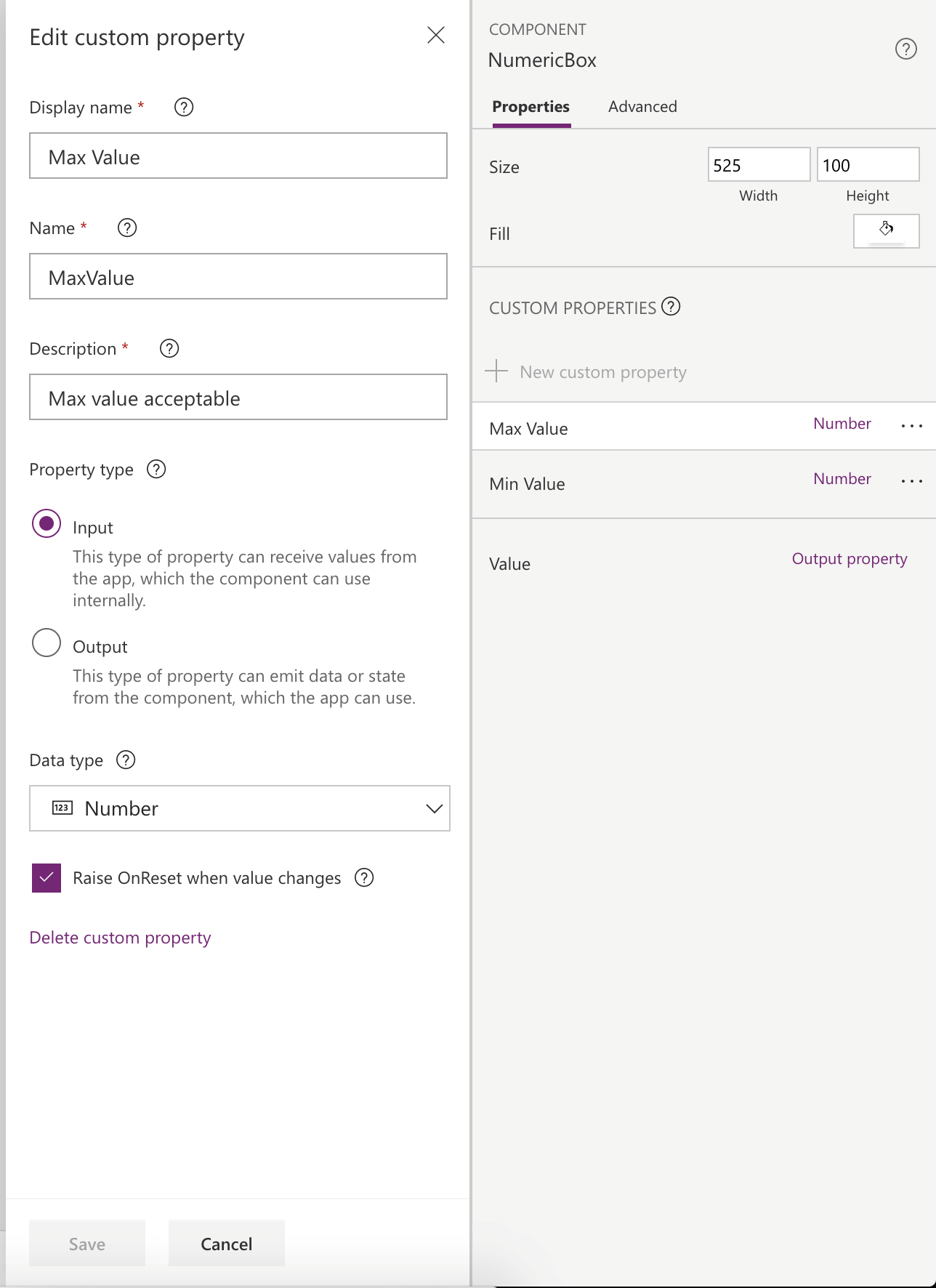
Click on the newly added component to see the component properties. Now begin with defining the input and output parameters for the control. Next, create MinValue and MaxValue as input properties. You can set the value of these properties and the number control will validate accordingly.
Add two properties of Input type and set the Data type as ‘Number’.
Now add another property but set this as Output type and name it as Value. This is the property which users will access to read the value entered in this control.
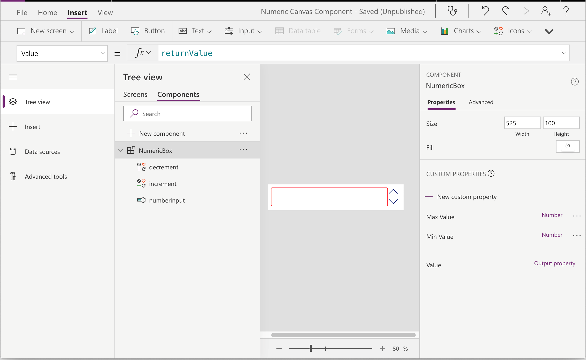
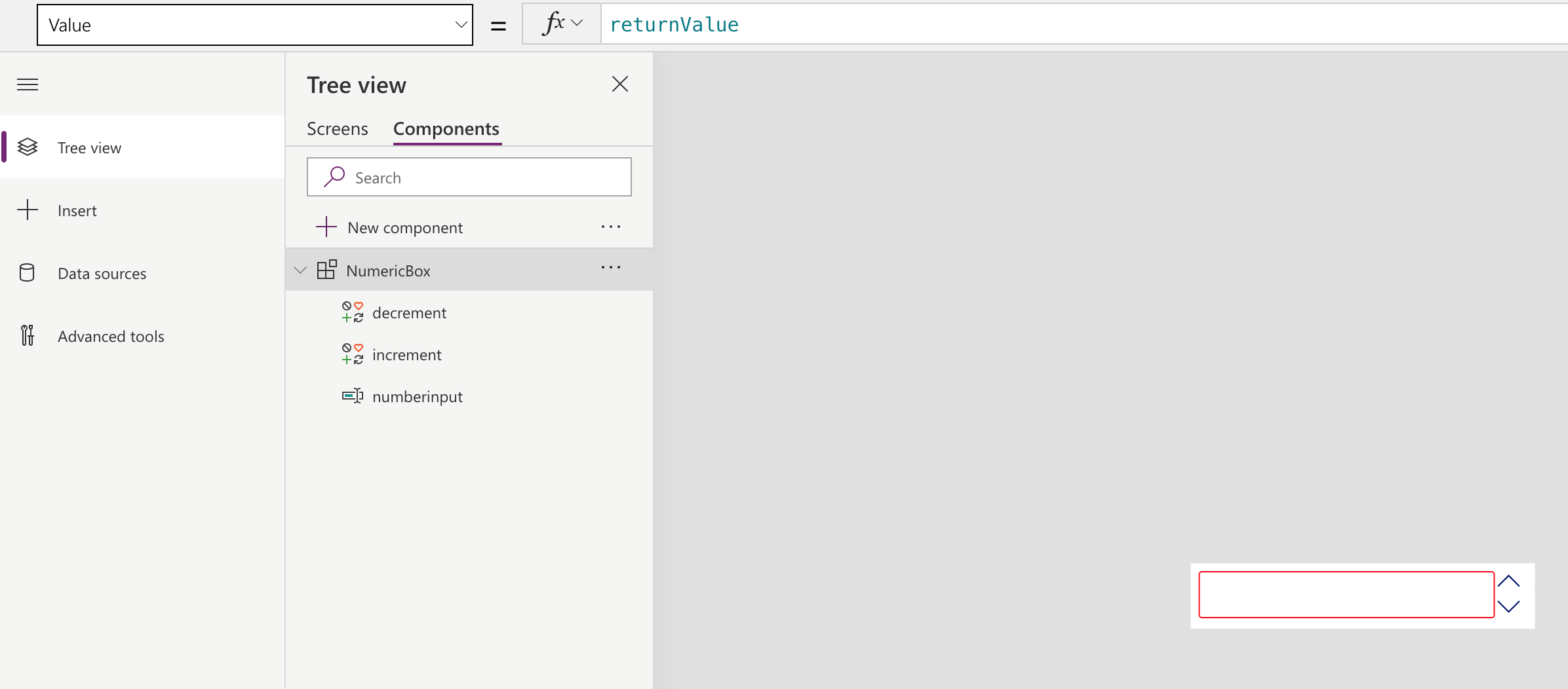
Next, let’s move to designing the control. Here, we will add a textbox and 2 icons for the increment and decrement controls. The canvas should look as follows:
Let’s begin with adding support to validate the min and max range provided for the control.
OnChange of numberinput add the following script:
If(
    Value(numberinput.Text) < NumericBox.MinValue, Set( IsValid, false ), If( Value(numberinput.Text) > NumericBox.MaxValue,
        Set(
            IsValid,
            false
        ),

        Set(
            returnValue,
            Value(numberinput.Text)
        );
        Set (
            IsValid,
            true
        );
    )
)
Here we are checking if the value entered by user in the textbox falls within the range specified. If yes, we set the IsValid global variable to true and also set the user entered value to another global variable returnValue.
We will use both the global variables created here in other sections of this control.
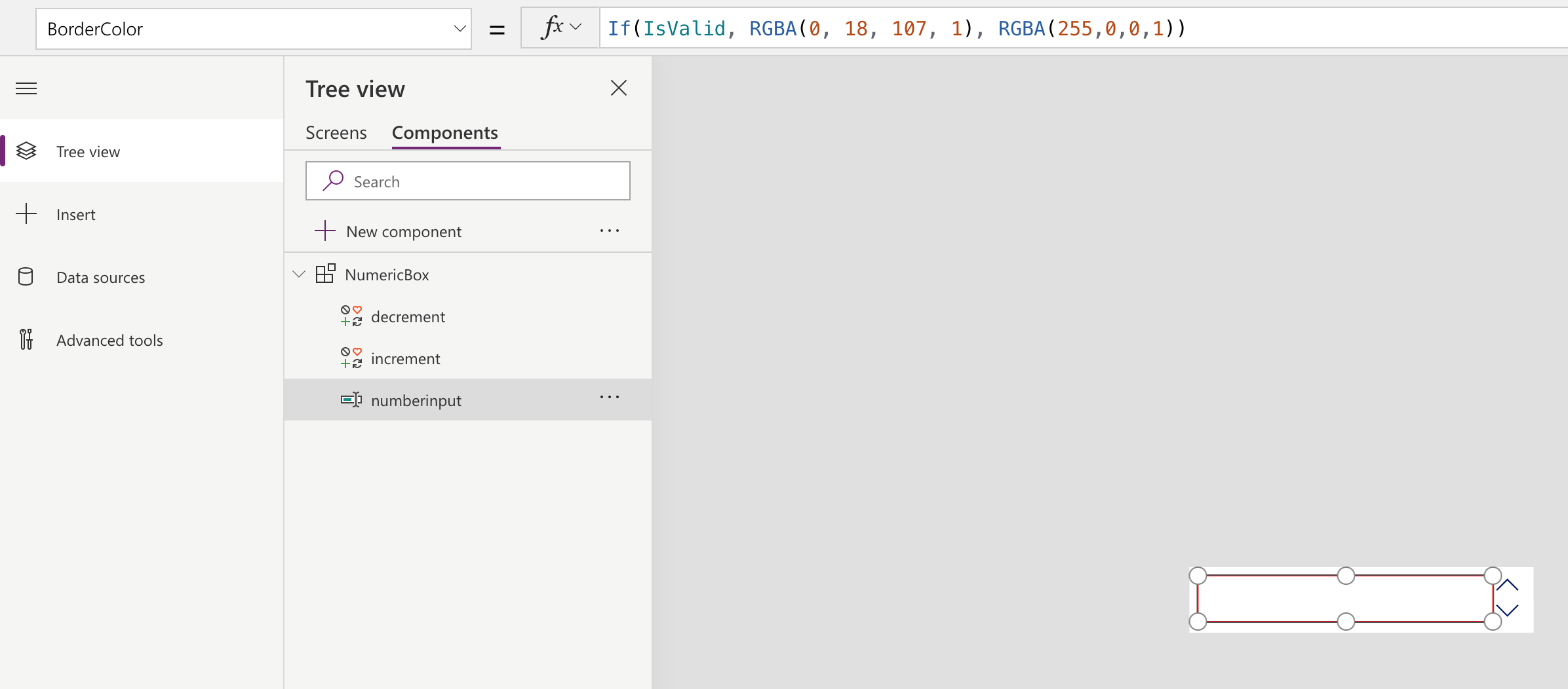
To indicate an incorrect value has been entered, let’s change the border color of the textbox to red. This will be done by setting the following code in the BorderColor property of the numberinput.
Next let’s focus on the increment/decrement controls.
OnSelect of these controls add the following code:-
Increment:
If (Value(numberinput.Text) < NumericBox.MaxValue, Set(returnValue, Value(numberinput.Text) + 1), Set(returnValue, Value(numberinput.Text)))
Decrement:
If (Value(numberinput.Text) > NumericBox.MinValue, Set(returnValue, Value(numberinput.Text) – 1), Set(returnValue, Value(numberinput.Text)))
Note: We need to continue to honour the range provided, therefore, check to ensure we do not increment or decrement the value beyond the set range.
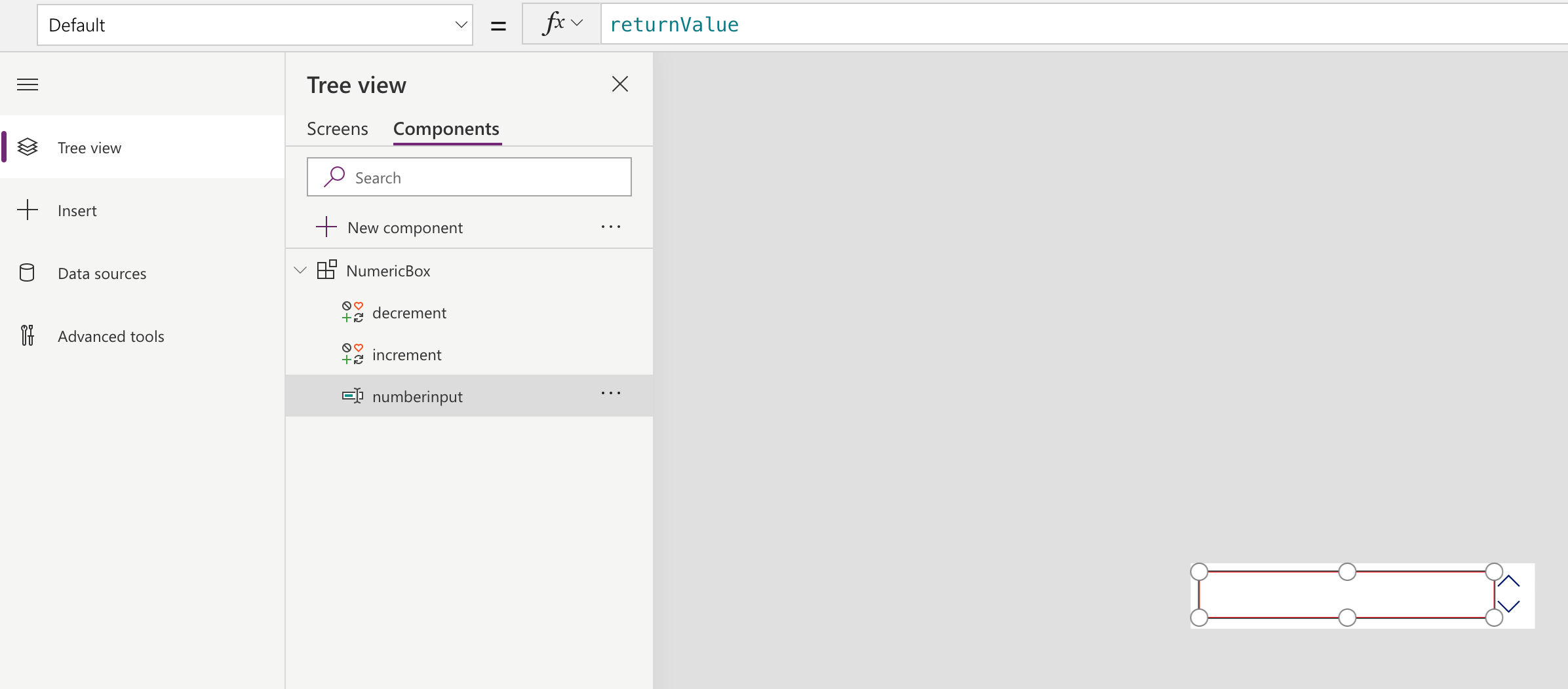
Since we are performing all calculations and storing the updated value in the global variable returnValue, we will set the default of the numberinput to returnValue to make sure all updates to global variable is reflected on the screen automatically.
Finally, set the output parameter to the global variable returnValue that we are using to store the updated value.
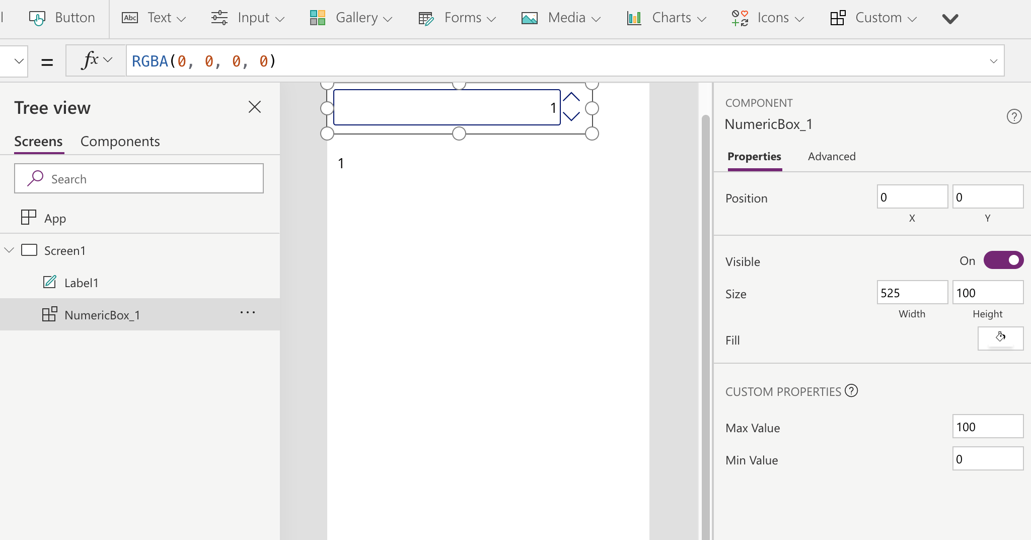
Time to test, switch to the Screens tab. Choose the Custom button from the ribbon bar and you will notice your component listed there.
Place it on the form and set the properties for the control.
I have added a label to the canvas to display the result of the number control.
Once you have tested the control and is ready to be shared within your team to be used in other apps, export the component using Custom à Export Components.
This will download a file with .msapp extension. You import this component in your other canvas applications and reuse it there using the Import component option.
Conclusion
Similar to components designed by using PowerApps Component Framework, it is possible to design reusable components for Canvas Apps as well. But unlike PowerApps Components that can be added to Canvas Apps, you cannot add Canvas App components directly to model driven apps, though you can add the entire Canvas App to the model driven app.
Cut short 90% of your manual work and repetitive data entry!
Get 1 Click apps and say goodbye to all repetitive data entry in CRM –
Click2Clone – Clone/Copy Dynamics 365 CRM records in 1 Click
Click2Export – Export Dynamics 365 CRM Report/CRM Views/Word/Excel template in 1 Click
Click2Undo – Undo & Restore Dynamics 365 CRM data in 1 Click
