Introduction
Dynamics 365 CRM Unified Interface version 9.x. and above has brought many changes in the UI forms. This has made forms more appealing to eyes when used on different sized screens.
You must have experienced the different behavior of sub-grid while operating on different screens (like Web, Tablet, Phone, etc.) For example, when you are on phone (narrower screen) you might have seen that sub-grid changed to list view due to responsive nature of Unified Interface. This responsive user experience in Unified Interface is the key while designing forms.
Microsoft has introduced the concept of ‘REFLOW’ which helps the sub-grid to be responsive while rearranging itself as per the window size.
Recently one of our client had a requirement where the user wanted to experience the sub-grids in Unified Interface in the same way as classic web sub-grid.
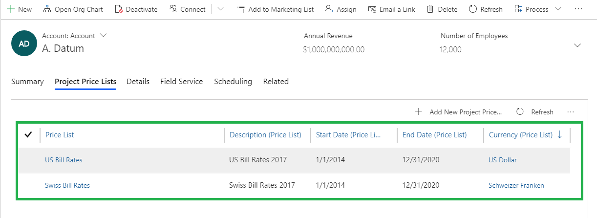
Let’s go through the below sub-grid example in Grid mode:
Layout1 (Desktop sized screen):
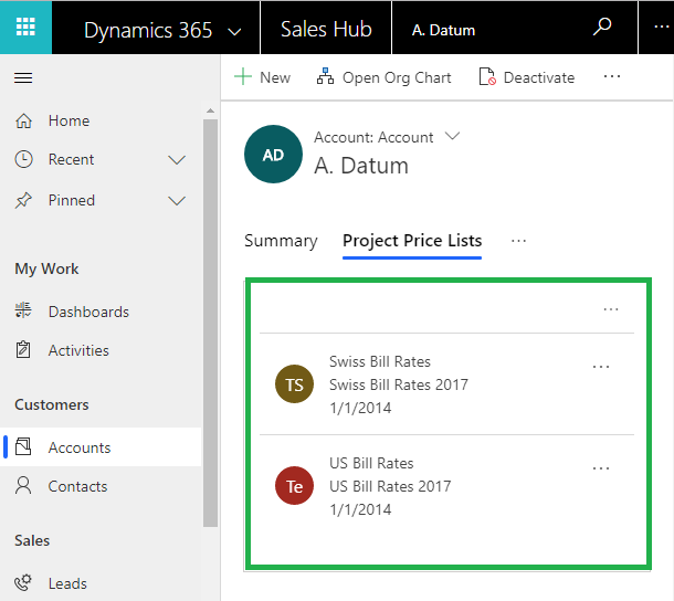
When client was operating the same sub-grid on phone screen, they experienced change in layout of sub-grid to list mode due to responsive nature of UCI.
Layout2 (Phone sized screen):
As you can see below only limited columns were displayed for records in the List layout:
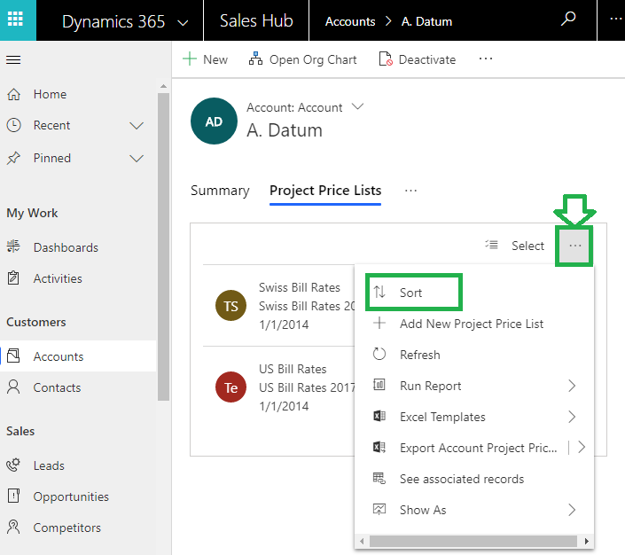
However, if user would like to sort with other columns in Unified Interface, let’s say with 5th column in our example i.e. Currency (Price List) column then, to do so there is an option available under eclipse highlighted below:
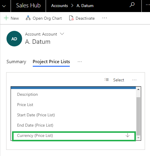
By clicking on eclipse all the available columns in the sub-grid would be displayed for sorting. Let’s continue sorting with Currency (Price List) as shown below:
Records would be sorted on Currency (Price List) column as shown below:
But the client was not looking for this kind of REFLOW behaviour of Sub-grid, they were looking for traditional sub-grid layout which will show all the columns/data in the grid layout.
So we explored more and observed that above Sub-Grid List layout in Unified Interface can be configured by configuring ‘Reflow Behavior’
The available layouts for sub-grid are as follows:
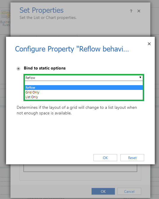
- Reflow: Grid can be changed to List layout or Grid layout depending upon actual size available
- Grid Only View: By default user will experience Grid Mode only, irrespective of actual size
- List Only View: By default user will experience List Mode only, irrespective of actual size
For setting one of the above layout, you must follow the steps given below:
1. Open the sub-grid to be configured from form editor
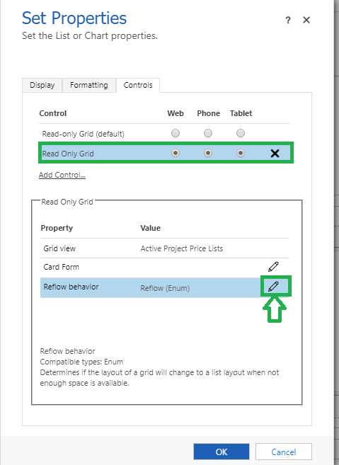
2. Add new ‘Read Only Grid’ control which is available on all types of mediums (Web, Tablet, and Phone) as shown below:
Note: The Read Only Grid control specifies how a grid should reflow to different sized screens.
3. Click on edit option to configure ‘Reflow Behavior’ as shown in below screen:
4. As you can see above, it gives us control to decide whether the Sub-grid is to be shown as Reflow, Grid or List Layout.
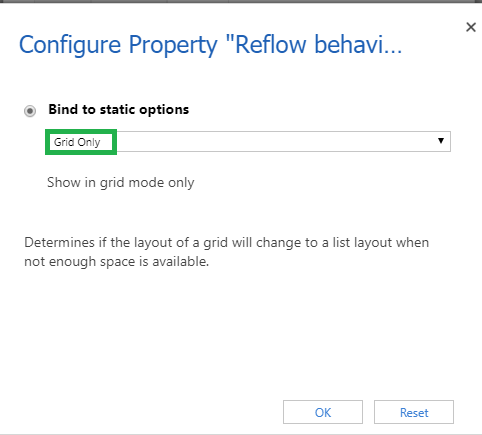
5. Let’s say that the client requirement, irrespective of window screen size, is for sub-grid to be displayed in Grid layout only. Then to achieve this requirement select the option ‘Grid Only’ as shown below:
6. Once done with configuration, check on any window screen size and you will get the same Grid layout experience of sub-grid irrespective of different window sizes.
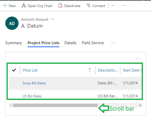
As shown below in Layout1 and Layout2 you will experience the same Grid layout (Configured above) for all window screen size.
Layout1 (Desktop sized screen):
Layout2 (Phone sized screen):
Note: As shown in Layout2, user can scroll back and forth with the help of available scroll bar to view all columns as they are restricted to few columns in the list layout of sub-grid before.
Conclusion
The concept of Reflow behavior is very useful in Unified Interface while designing forms and sub-grids on different window sizes.
70% of global 2000 companies apply gamification to improve productivity and returns!
Gamifics365 – Spin the magic of games within Microsoft Dynamics 365 CRM to improve user adoption, enhance productivity, and achieve company goals!


The article is interesting to read throughout. It has illustrated Subgrids view and a unified interface in an effortless manner. The pictorial representations of screenshots are providing a better understanding of the topic. It is a complete guide that defines how to set different layouts.
Another Issue is the new UCI Subgrid is simply ignoring the Width of Columns.
Yes, when you are on the phone screen (narrower screen), sub-grid arranges itself in List layout/new UCI sub-grid, and as a result, only limited columns are displayed. It is ignoring the width of the column to simply adjust as per the phone (narrower screen) due to the responsive nature of Unified Interface.
Hope this helps!
Thanks!