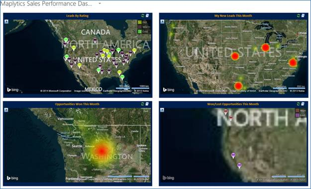
Picture speaks more than a thousand words and what better than a graphic representation of Dynamics CRM data on Bing Map for geographical analysis. Dynamics CRM introduced Bing Maps component with Dynamics CRM 2013 but right now this is only restricted to displaying a single address on a map.
Maplytics a geo-analytics solution targeted at helping businesses take better decisions now provides the ability to get a geographic view of your data. Maplytics Dashboards provides a fast and easy way to view and communicate business data in a visual format. Similar to the native charts available in Dynamics CRM, you can include Maplytics web resources on the Dashboard and have your Dynamics CRM data represented on a Map as can be seen below.
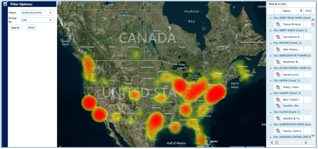
Maplytics also provides Heat Map representation of the data. Darker areas represent more concentration of records in this segment than in others. You can decide to group the data by City, County, State or Country. This can be used to locate the problem regions by representing all of your Incidents registered in CRM. This will let you take appropriate decisions by the region.
Dashboards are generated using FetchXML queries that you can create yourselves using the interface provided in the product. This allows for creating unlimited custom dashboards for any Dynamics CRM Entity.
To know more about the features supported by Maplytics visit our website. You can also download the community version of the solution from here.

