To enhance the look and feel of the Canvas App, we can use a fluent UI framework by using the Creator Kit. The Creator Kit helps create Power Apps experiences on the web and mobile platforms with convenient components appearing in modern software.
Prerequisites –
The Power Apps code components for the Canvas Apps feature should be enabled (the System Administrator security role is needed to enable the feature).
Following are the steps to enable Power Apps code components:
Power Platform admin center > Select the environment (In which you want to create the app) > Settings > Product > Features
Enable “Power Apps component framework for Canvas Apps”.
- The System Customizer security role is needed to use the Creator Kit components.
- Install the Creator kit in your environment from AppSource.
To add fluent UI components in Canvas App, follow the below steps:
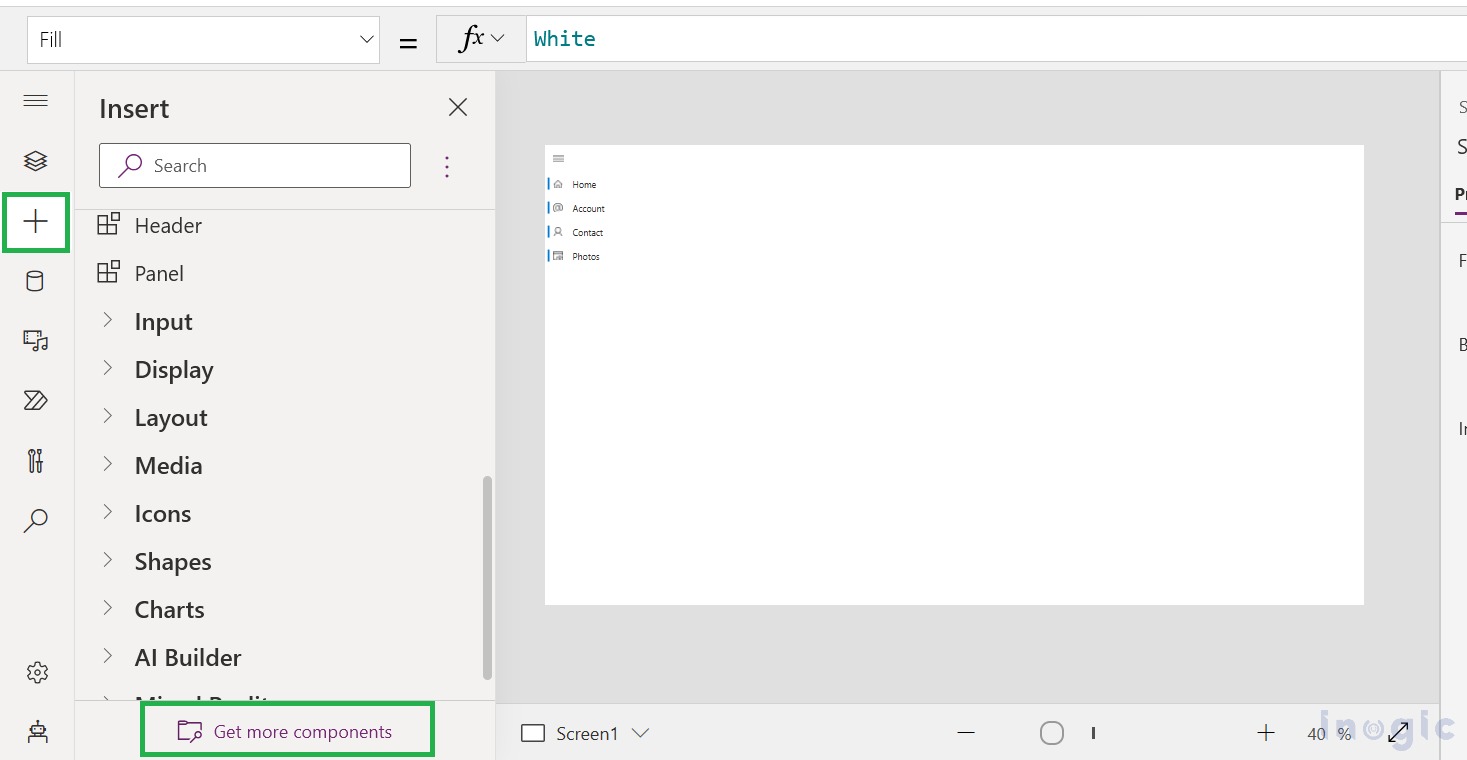
1. You can open the components panel in the existing Canvas App or create a new one. Click on the “Get more components” option as shown below.
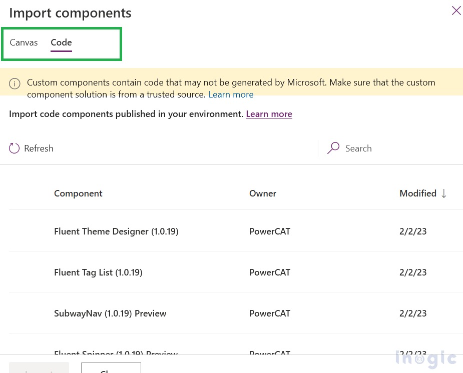
2. An Import component panel will appear on the right side of the screen. Canvas and Code tab will display. In the Canvas tab, you will get some pre-built canvas components to use. And in the Code tab, you will find fluent UI code-based components.
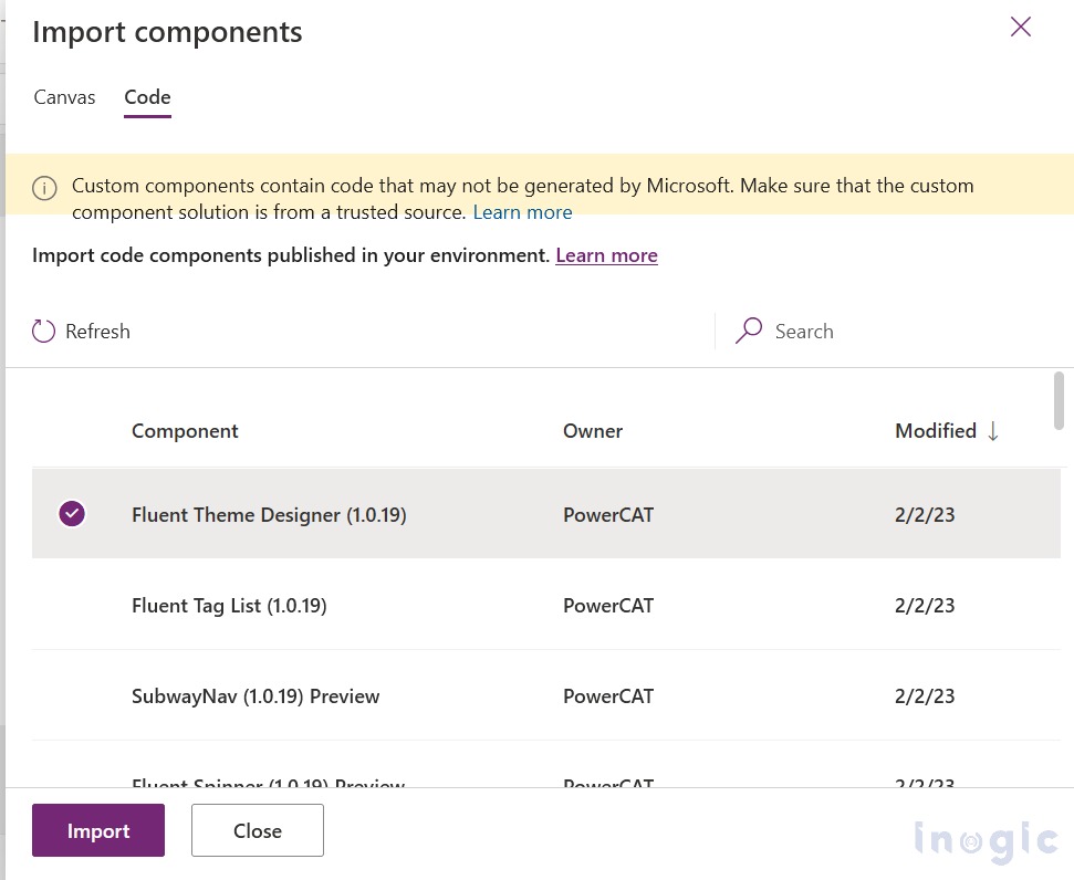
Select the required component for the Canvas Apps and click on the import button.
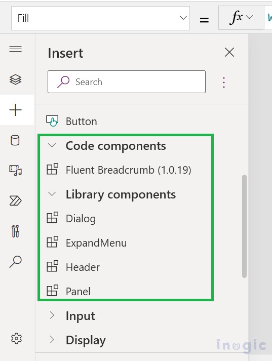
3. After importing the selected component, You will see the component in the components section to be used.
Here are some examples to understand how to use these components in Power Apps:-
- ExpandMenu –
Expand menus are like ‘Nav’ components used to provide navigation, which provides links to the main areas of an app or site. It also allows the ability to expand and collapse the menu, giving the user an option for more space if desired.
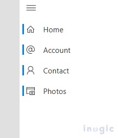
Formula to create “Expand Menu”:
Table(

{           Icon: "Home",

Label: "Home",

Screen:App.ActiveScreen,

Tooltip:"Home Page of app"               },

{           Icon: "Accounts",

Label: "Account",

Screen:App.ActiveScreen,

Tooltip:"Account List" },

{           Icon: "Contact",

Label: "Contact",

Screen:App.ActiveScreen,

Tooltip:"Contact List"  },

{           Icon: "BrowserScreenShot",

Label: "Photos",

Screen:App.ActiveScreen, Tooltip:

"BrowserScreenShot"              }           )
Here, you can use “Office UI Fabric Icons” icons by just placing their name in the icon property of the code. Reference link for the icons could be found here :- https://uifabricicons.azurewebsites.net/
- Breadcrumbs –
Breadcrumbs should be used as a navigational aid in your app or site. They indicate the current page’s location within a hierarchy and help the user understand where they are in relation to the rest of that hierarchy.
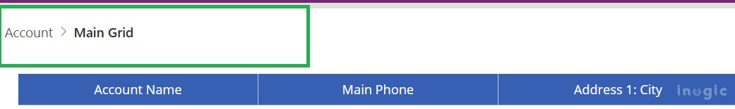
Formula to create “Expand Menu”:
Table(

{

ItemKey:"1",

ItemDisplayName:"Account",

ItemClickale:true        },


{

ItemKey:"2",

ItemDisplayName:"Main Grid",

ItemClickale:true } )
Conclusion:
In this way, a user can improve the look and feel of the Canvas App by using Fluent UI components.